SALONE DEL MOBILE 2018
The end of the fitted kitchen
Where will the future kitchen be and what will it look like? That is the covert leading topic of the Eurocucina in Milan and the Fuori Salone presentations scattered around town. A long-established trend now: open-plan living spaces mean that preparing and serving meals no longer require a room of their own tucked away somewhere in the apartment, but instead take center stage. The kitchen therefore has to boast correspondingly chic furniture and at least keep up with the rest of the interior design and its stylistic options and combinations, if not outstrip them. The race to be best manufacturer has long since started. And the makers are all hell-bent on coming up with kitchen altars that are as sublime as possible, most certainly worth worshipping, but not necessarily ideal for cleaning vegetables, chopping or roasting meat, reducing sauces, or steaming entire courses.
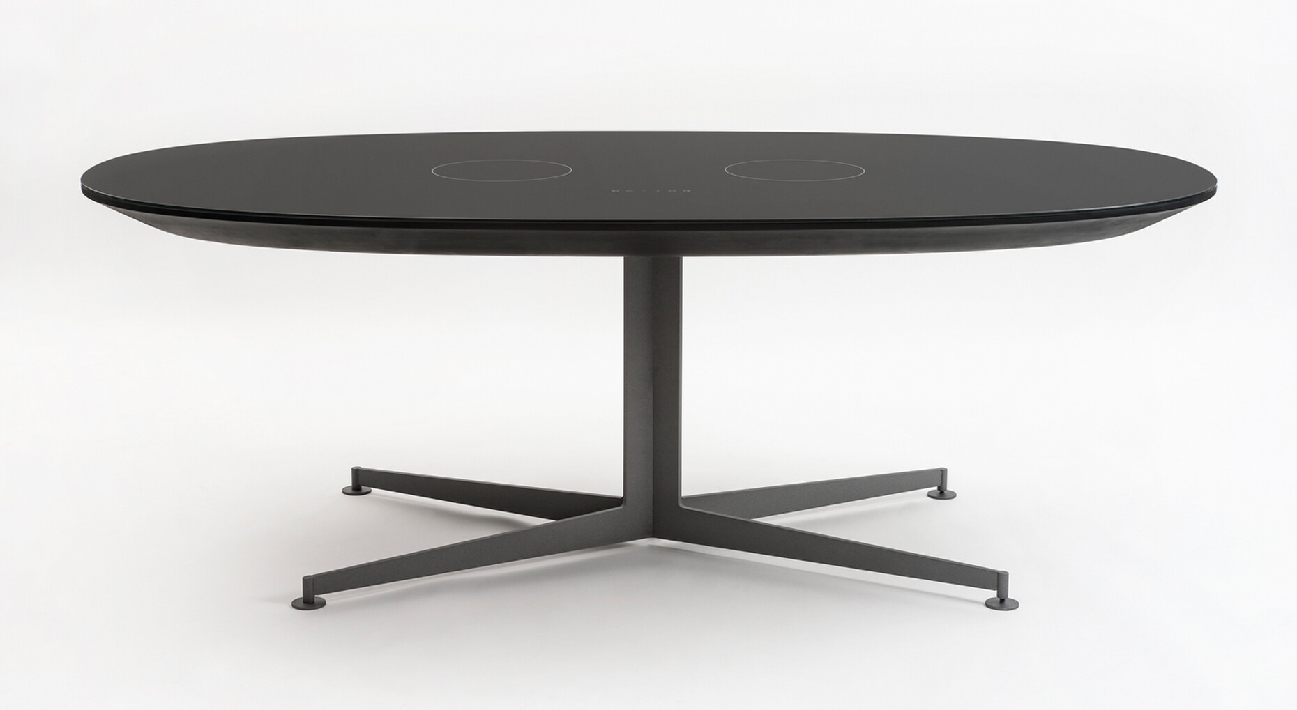
What evidently counts most at a trade fair is the visual and haptic impression. And the intention? To boost quality at all levels, refine surfaces and tops, conceal cutlery even better. “Combine” is the name, for example, of a new collection of architectural modules that Piero Lissoni has designed for Boffi. While the individual functional blocks can be spread around the room and (above all with the layer-like Lithoverde stone front) bring a miniature but brazen Italian palazzo to mind, thanks to small castors the accompanying tables can be docked exactly where they happen to be needed. They then serve as the work or storage tops, or can be regrouped to form seating spaces for quick snacks. The sublime and the ephemeral, the improvised and the permanent meld here. Incidentally, Lithoverde is a surface made up of wide, thin pieces of marble that would otherwise be waste – offcuts from larger pieces. Lissoni has also been active elsewhere. He designed the “I-table” for Kartell, not a full-range kitchen, but a table with power sockets and an integrated induction hob. Whereas he distributed the functions across many different items of precisely detailed furniture for Boffi, with “I-table” he compresses them into a very confined space. The approach is a little similar to the “Smartslab” Reed Kram and Clemens Weisshaar created: a high-tech table for cooling and warming food that was on view in Milan two years ago as a study for the Iris Ceramica Group. Light is also integrated into the latest kitchen models, gleaming but not dazzling.
The “Concept” kitchen in Siematic’s “Pure” stylistic world combined the brand’s traditional values with ingenious precision. Indeed, the company from central Germany, which now has a Chinese majority shareholder, was the trailblazer of the handle-free kitchen – it launched its first model in 1960. The latest model is set to go into production by about the fall and was on display in Milan in a bright and a dark version. The shadow joint between the horizontal and vertical handle recesses is home to a glare-free controllable LED luminaire. The new model, on show in Siematic’s flagship store Monte Santo (now twice as large), seems almost too good to be used for cooking. The gleaming metal surface of the handle recesses could easily be used, as could the tinted glass of the vitrine doors, for the interior fittings of an upmarket jewelry store. Likewise only on display in town and not at the fair was Poggenpohl’s “+Venovo,” a new kitchen model destined to stand in the middle of the living room without any of the trappings of a monolithic, alien body. Modular in structure, it boasts a three-meter-long element that incorporates all the functions. It rests on U-shaped chromed runners and for all its weight therefore seems to float. The brainchild of Hamburg designers Sören Jungclaus and Mathias Knigge, “+Venovo” is intended for urbanites who no longer wish to accord kitchen furniture a special status, but to seamlessly integrate it into the usually tight footprint of an apartment. The program also features a sideboard and overhead cabinet units.
Since 2016 Arclinea has been part of B&B Italia, thus emulating Boffi and de Padova as well as Driade and Valcucine, who have established such brand networks between furniture and kitchen-furniture makers. Arclinea even advertised the new showroom at Via Durini 7 directly opposite B&B on the Milan metro and the opening was scheduled to coincide with the beginning of Milan Design Week. Six kitchens are on view – across a total of 450 square meters. There is a separate meeting room, where clients, architects and planners can compare materials and surfaces. This is impressive evidence that brands are increasingly seeking to create their own unique world, defining and embodying rules vis-à-vis the surroundings. The kitchens were masterminded by Antonio Citterio with a refined and harmonious mix of stainless steel, black anodized aluminum, marble, and homely woods. The showroom architecture is courtesy of Gianluca Tronconi and takes the backseat while also creating points of emphasis, for example with the long corridor on one side with a characteristic stone wall with natural daylight entering from the skylights. Or the suspended ceiling marked off as in the 1970s with lacquered round wooden panel edging. While Arclinea has in recent years always presented itself as a green brand with decorative herbs, with the emphasis always being on the availability of the best ingredients, the décor in the new showroom is far more restrained and coherent. The mood is almost as strict as in a monastery. Large-size photos show glass objects and kitchen utensils, not in use but alienated to the point that they are aesthetic symbols.
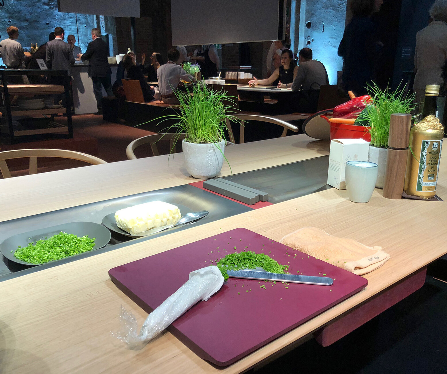
For the second time, Bulthaup has opted for a temporary showroom in the San Carpoforo church in Brera, deconsecrated back in the 19th century. The basilica layout is ideal for use by the Brera Academy and for the occasional event. In kitchen year 2018 it was the venue for one of the most inspiring presentations. Like all manufacturers in the segment, Bulthaup, a trifle unsettled, seeks to balance present and future. MD Marc O. Eckert initially talks of the change in retailing in order to arrive at his own answers that then culminate in future product ideas. US retail giant Amazon has not only acquired huge organic food chain stores and is preparing to enter the French food market as a Monoprix partner. Conceivably, in fact probably, customary supermarkets will in future increasingly give way to delivery services whose offerings are purchased online. Today, companies like Amazon are busy collecting information on our habits and preferences. It may be the case that Eckert has come up with a quasi-sci-fi vision where in the future our intelligent personal assistant (“Echo,” “Siri,” et al.) reminds us “You like to eat a schnitzel on Wednesdays, shall I order you one?” And a moment later the drone arrives to deliver your favorite slice of meat. According to Eckert we can expect that for shoppers the actual process will be extremely simplified and far swifter. What household appliance and PC makers have long since been promising will then apply to cooking and the housework as a whole. “What to do with the time thus gained?” is Eckert’s key question. He thinks processes in the home will be restructured. He paints a far broader picture than his rivals, who are busy thinking about how to expel the kitchen-esque from the kitchen. Eckert’s answer goes by the name of “b.architecture” and is in use at San Carpoforo as a concept.
Meal preparation itself (under changed time schedules) becomes a new communicative experience for friends and family. The yardstick for wannabe chefs is no longer the real chef in a stainless-steel pro kitchen, but your granny who sits next to you on the bench, peeling spuds and telling a story. Well, not quite. As the kitchen bench of yore has morphed into a Bulthaup bench, enriched with leather seats and backrests. At the center stands the technologically beefed-up table with its minimalist design, again slightly reminiscent of Kram/Weisshaar in 2016. Thanks to various add-ons (Bulthaup calls them apps) it’s able to cool ingredients or wine bottles or keep things warm using water. How that actually works is not revealed. Even if the concept boasts new induction hobs with intuitive heat regulators à la classic wood-fired ovens, the water unit is far more important than the hearth.
And that has to do with the partnership with Munich-based super-chef Tohru Nakamura (renowned from the TV show Geisels Werneckhof) who was involved at the development stage and who says he can spend six hours in a kitchen without power or fire, but not even 10 minutes without water. Nakamura and his team are busy testing the new furniture on site, and visitors can share in the creation of simple meals. Because, or so Marc O. Eckert says, “water is the element of deceleration. In its various physical states it encourages a human response.” And Bulthaup’s furniture is meant to reinforce this interaction. The “b.architecture” concept seeks by means of large blinds (that also provide light) to define spaces. Movable wings covered in Japan paper, behind which the kitchen briefly disappears or from which it re-emerges, are just as much part of the concept as are the different water points on the various vertical levels. Here, celebrating food and life itself plays a certain role, even if at the end of the day the goal is to offer plausible designs for future kitchens. The setting in the church is animated, the atmosphere enjoyable. In its 2019 jubilee year (when Bulthaup turns 70) we will get to see how the 3D product sketch looks when transformed into a real product, what the details are like, how the technology functions. For the time being, the Bulthaup aesthetes should be praised for their courage in seeking a different approach than that of simply making things ever more refined and minimalist.


