Stockholm Furniture & Light Fair 2020
Harmony from contrasts
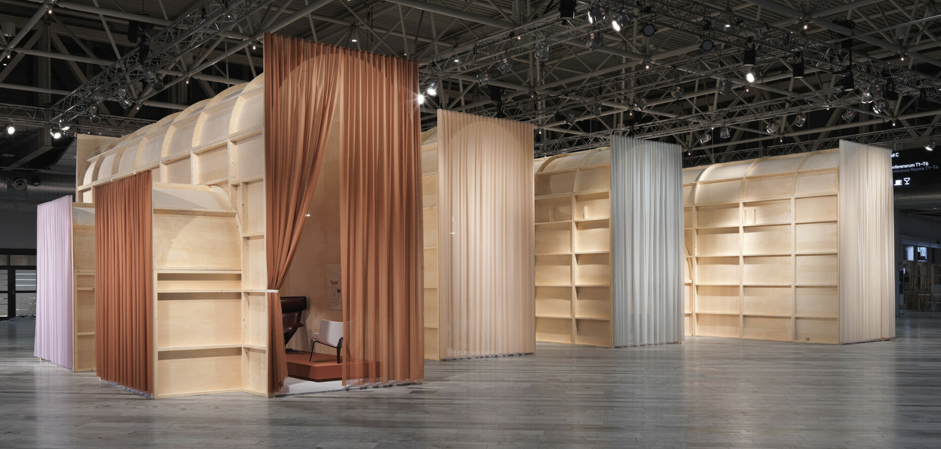
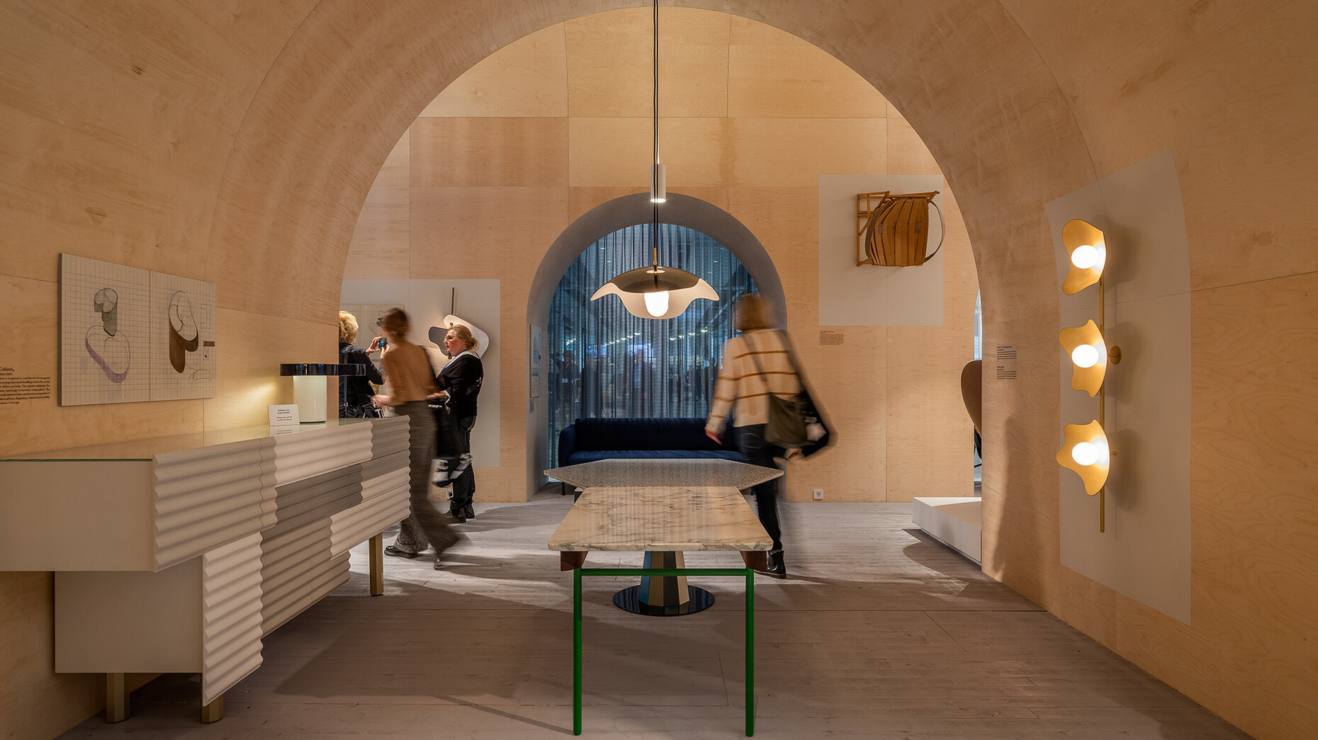
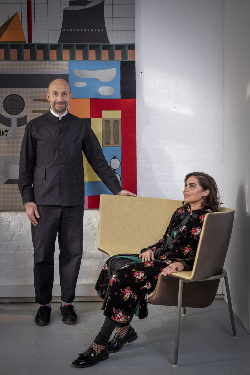
You are the guests of honor at Stockholm Furniture Fair. And you have created an impressive temporary exhibition space especially for this occasion. What influenced your design?
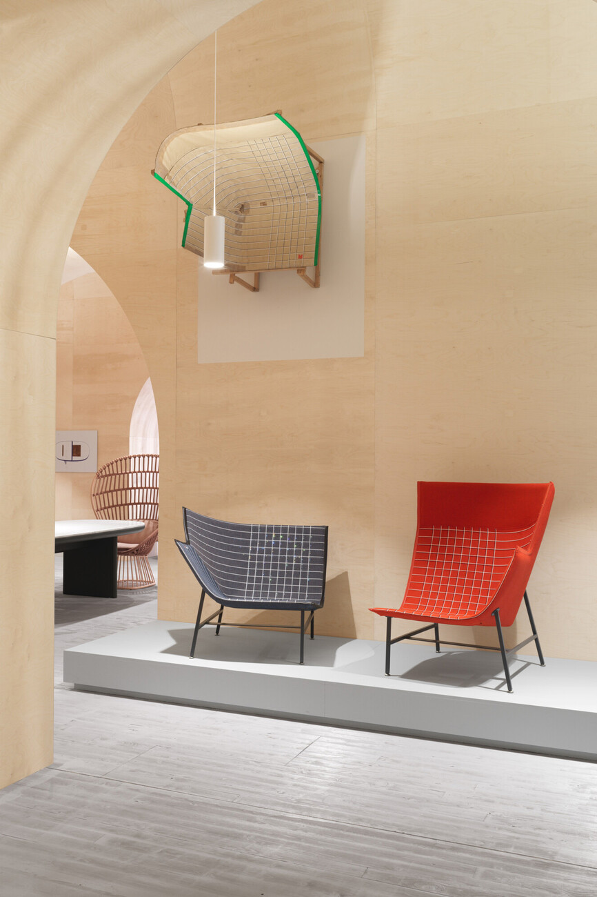
Jonathan Levien: We knew that we wanted to give people an insight into our work and how we approach it. We wanted to showcase our drawings, models and prototypes. So, we had to create a space which made precisely that possible.
You came up with a small pavilion whose top finishes with arches and vaults. What made you opt for such a classic architectural vocabulary?
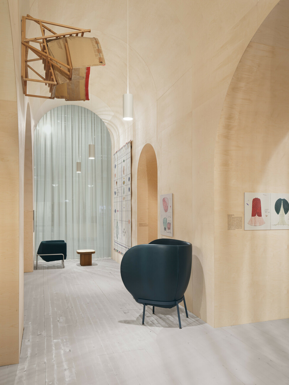
Jonathan Levien: We were in Sicily when we got the call telling us we were invited to Stockholm as guests of honor and would be able to realize this installation. We were deeply impressed by the Church of San Cataldo in Palermo. Its interior has something very emotional and intimate about it, with its square vaulted ceilings and yellow stained-glass windows. We sensed intuitively that we would really like to have this atmosphere in our exhibition.
The pavilion is made entirely of plywood. What made you choose this particular material?
Jonathan Levien: It was important to us that the entire construction be made from local materials. All the wood employed to make it comes from Scandinavia. We also wanted to ensure that after the exhibition all the pavilion’s parts could be put to some other use. After all, the fair only lasts a few days.
Even though you are not architects – you have nonetheless explored the topic of space in many of your furniture designs.
Jonathan Levien: That’s right. For example, we regard a chair as if it were a space. It actually only forms the material framework for the space that the sitter occupier on it. Simultaneously, a chair is an intermediary between the sitter and the architecture. We always see our designs as sculptures that define a specific space – make it stand out from its surroundings.
Simultaneously, many of your designs seem to start in the two-dimensional and move to the third dimension?
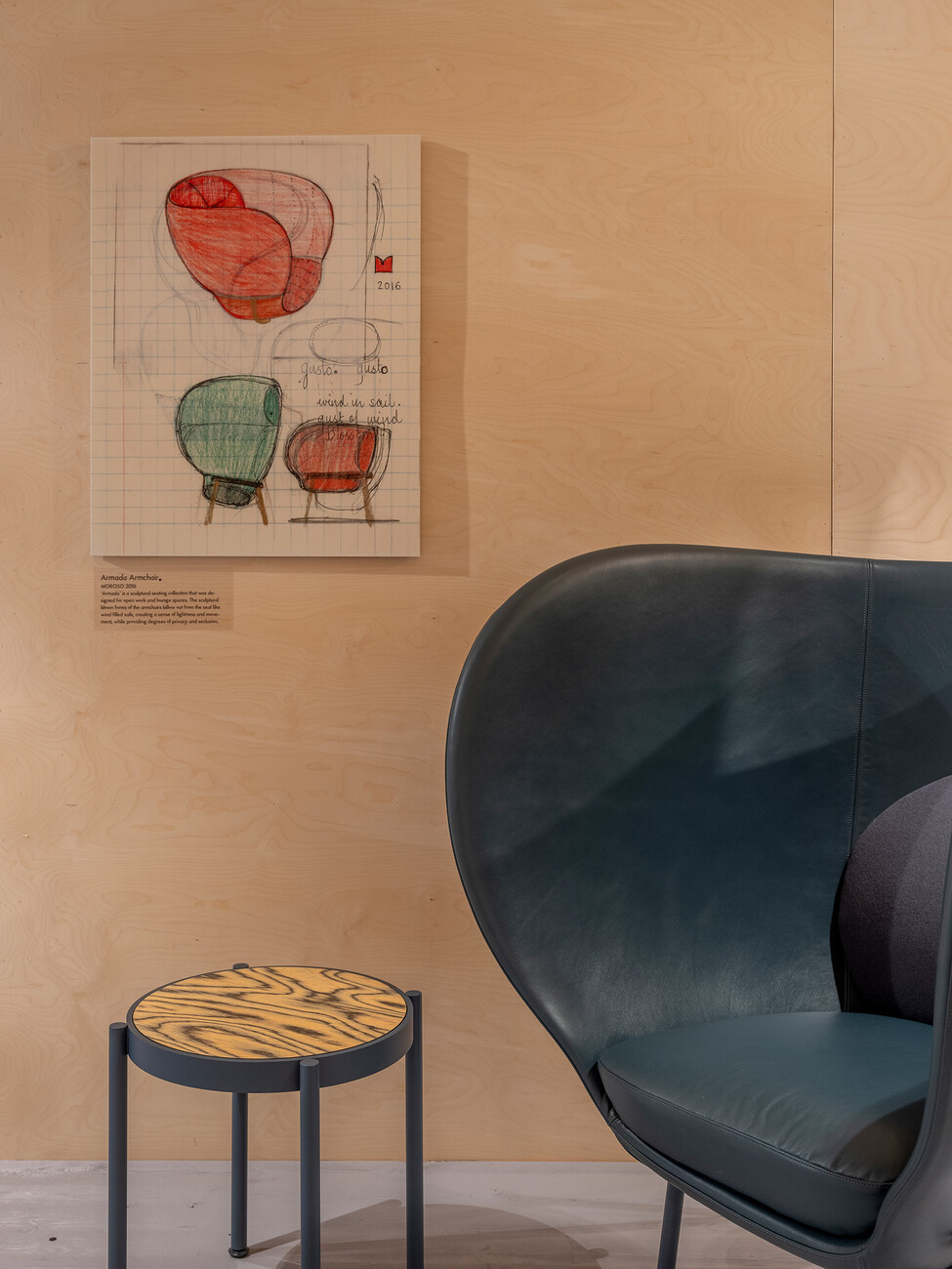
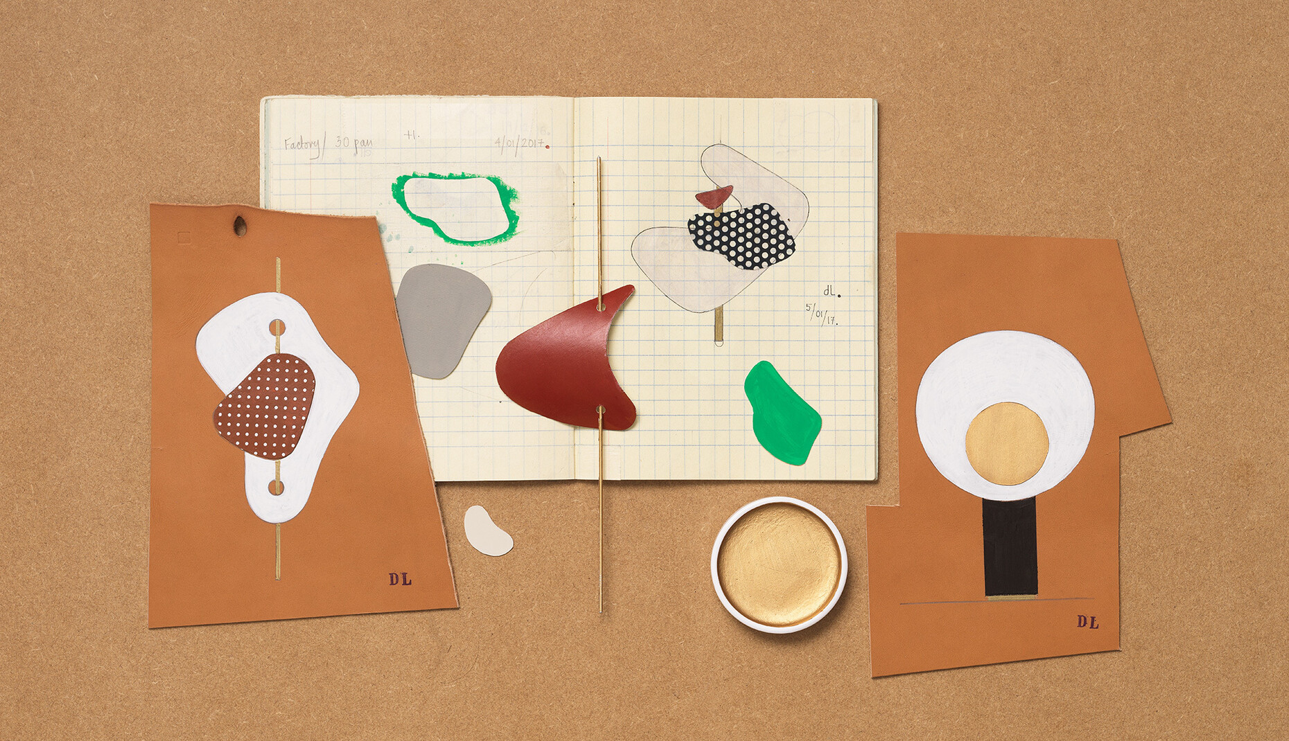
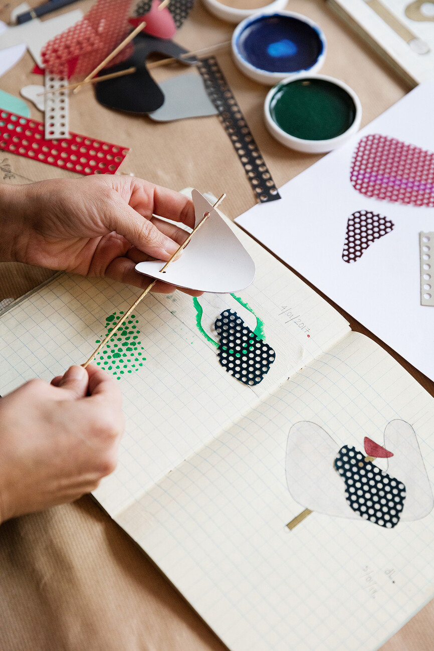
Jonathan Levien: Absolutely! Not least of all because most of our designs naturally begin life as a two-dimensional drawing, which then becomes a three-dimensional object. Nipa in particular is highly skilled at both drawing and painting. These are her most important tools. As for me, I’m a craftsman. I build and sculpt the objects she has drawn. However, sometimes it’s the other way around and she draws the things I have built. But it is always about the translation between the spatial and non-spatial – and that should be legible in our designs.
Textiles are an important element in your creative work as designers. What do you find so fascinating about them?
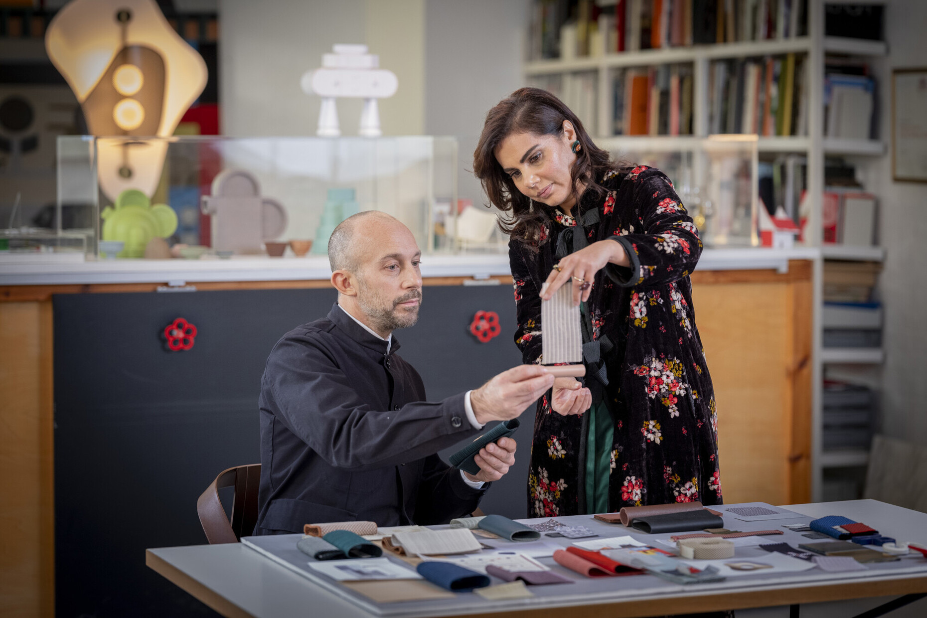
Nipa Doshi: Textiles are very structural materials. They can take on both a two-dimensional or a three-dimensional form. And even the simplest textiles are still in many respects “high-tech”. I love the structural aspect of working with textiles, the fact that you can never say what will happen until you try it out, how they will behave, how they will move, how they will fall. And finally, what I like about textiles is also the fact that you can wear them as clothes, but can also sit on them and use them to build spaces, not to mention the options you have that arise from using colors and artisan techniques.
How did you come to explore the topic of textiles?
Nipa Doshi: In India where I grew up textiles play a much greater role in people’s everyday lives than they do in the West. For example, my mother had hundreds of saris, made of every conceivable fabric. Which is why I have a close affinity with the medium textiles, even though previously I never wanted people to automatically put me in an ethnic category. But when I started to apply myself to fabrics because they played a role in our furniture designs I realized that I have a real talent for textile designs.
You have just designed two new fabric collections, “Maya” and “Jaali”, for Kvadrat, which were presented at Stockholm Furniture Fair for the first time. What is so special about these fabrics?
Nipa Doshi: In Hindi “Maya” means something like “illusion”. Our “Maya” is a transparent curtain fabric that allows its users to look through it while remaining hidden themselves. I was inspired by the Indian Chanderi saris – made of hand-woven silk, semi-transparent saris that women wear during the summer months. Like these saris “Maya” scatters the light but lets air through.
Is “Jaali” also intended for curtains?
Nipa Doshi: No, we primarily designed “Jaali” as an upholstery fabric. Its conception is highly architectural and it combines patterns with texture, surface with depth, light with shadows. Moreover, the color also plays a big role, of course.
Apart from such abstract textile designs you also created a series of tapestries for the Paris gallery Kreo with realistic motifs. What aspects shape the design for you?
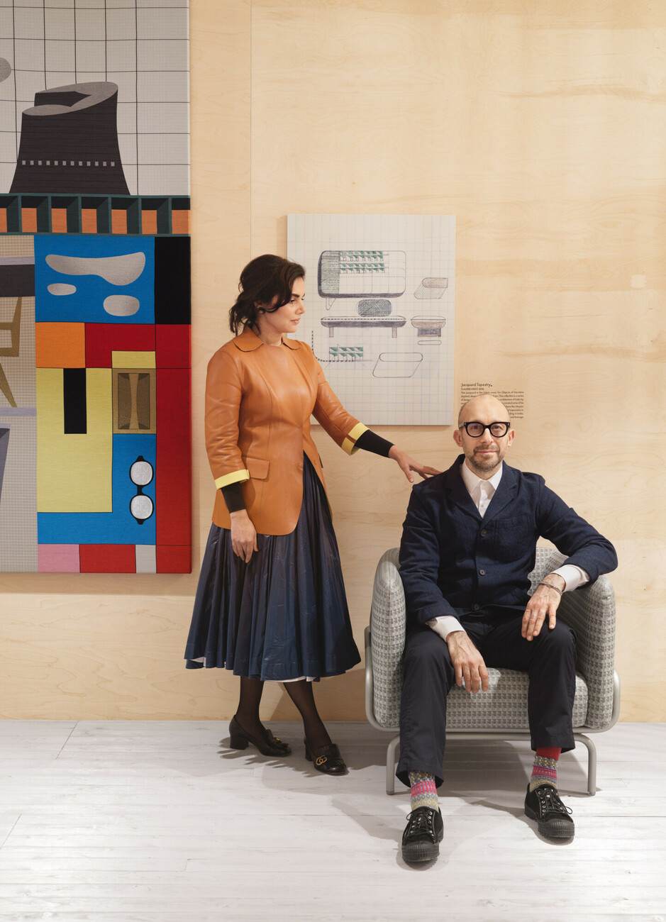
Nipa Doshi: I’m an incredibly visual person. I spend a lot of time in the studio simply looking at things. When I look at pictures, say, by Picasso or Le Corbusier I try to relate to it and translate it into my own designs. The tapestries are my interpretation of Le Corbusier’s design for Chandigarh, his famous city in India.
What meaning does Chandigarh have for you?
Nipa Doshi: Not only Chandigarh, modernism as a whole in India was a formative cultural experience for me during my youth. I grew up in Ahmedabad where Le Corbusier designed the Sanskar Kendra Museum and the Mill Owners’ Association Building amongst other things. My aunt’s house was designed by the assistant of Balkrishna Doshi. When they think of India people always have a very traditional picture in mind, but I grew up in a very modern India.
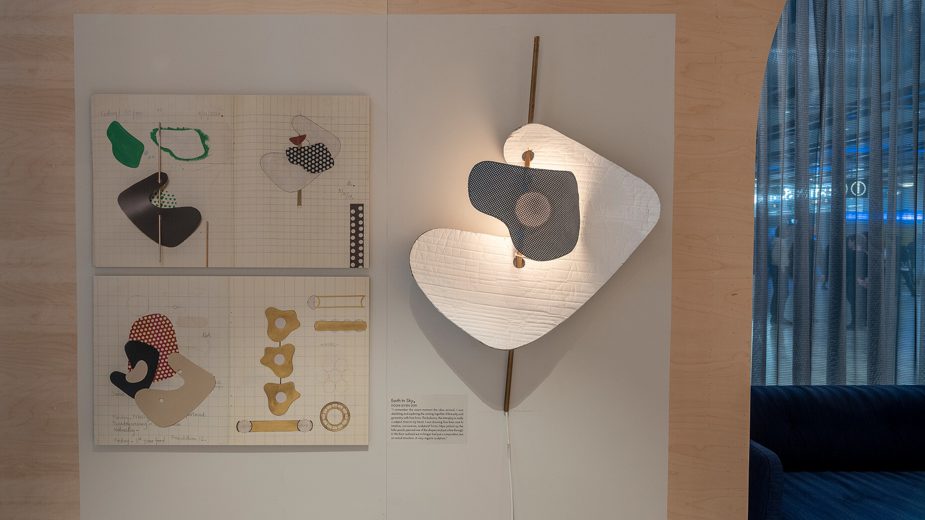
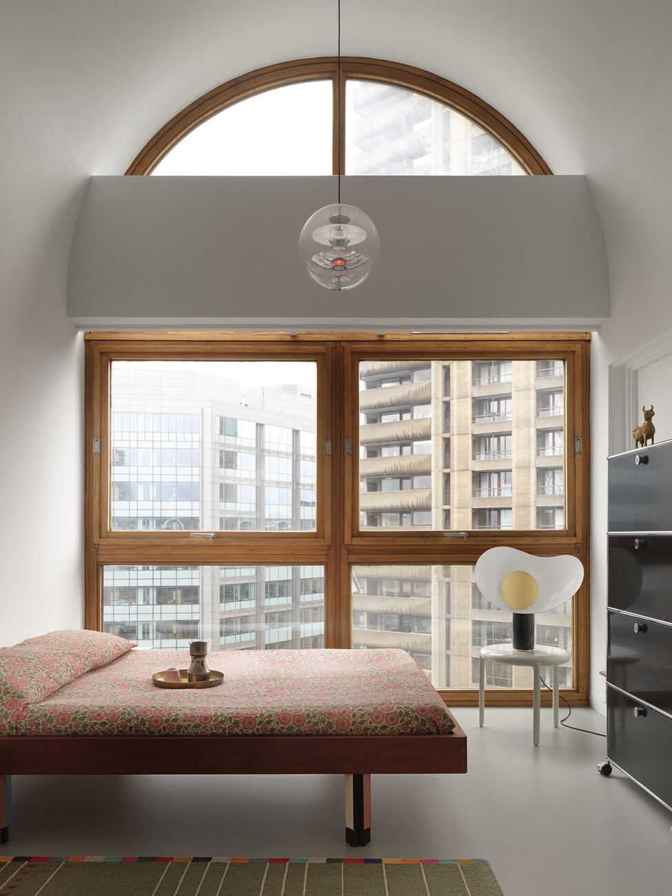
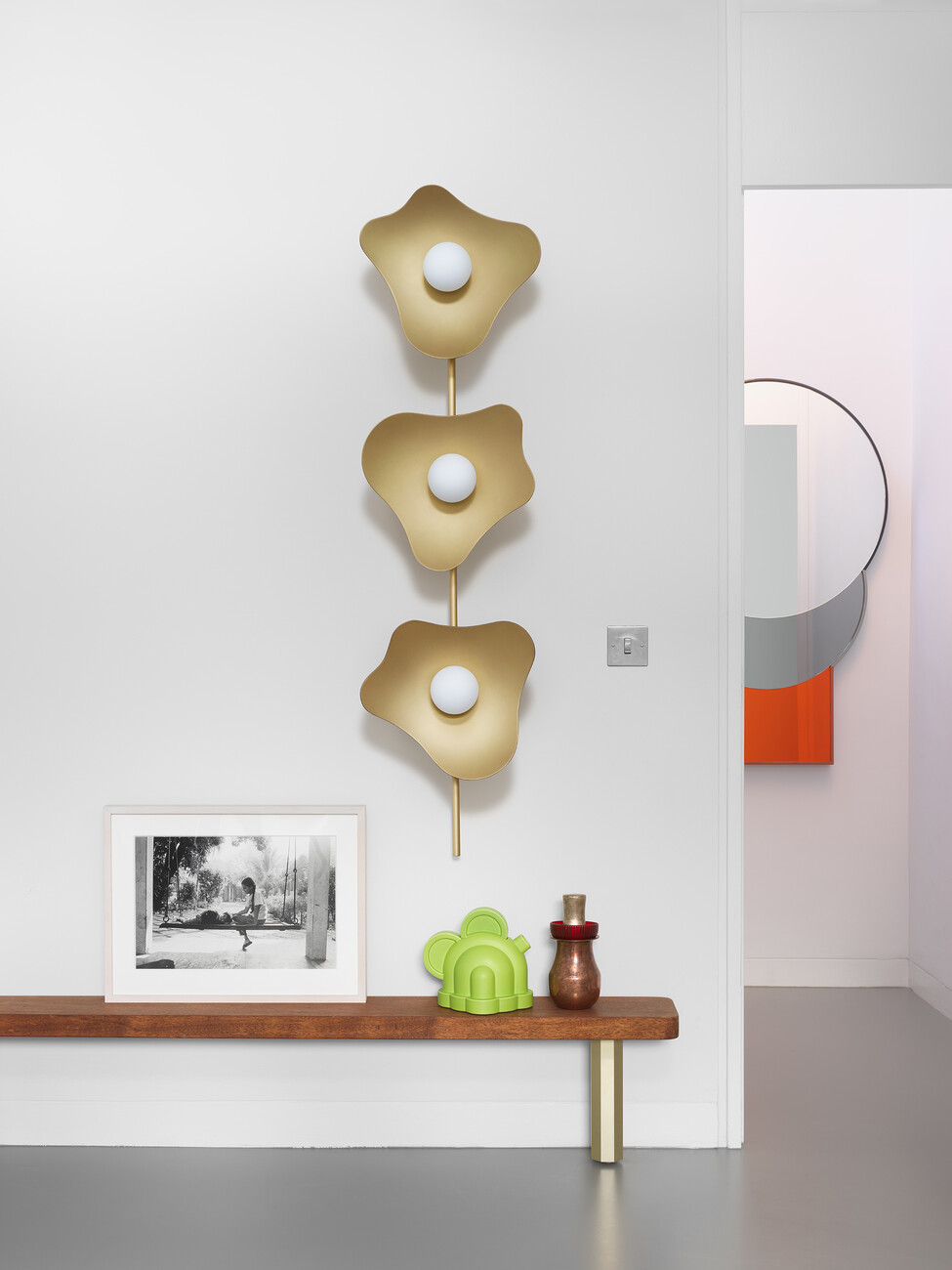
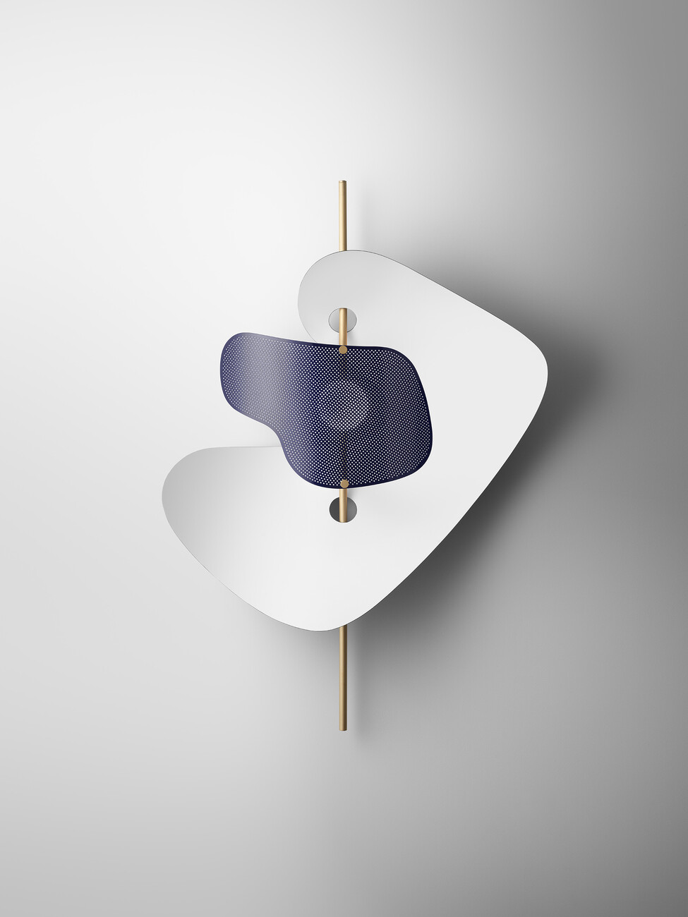
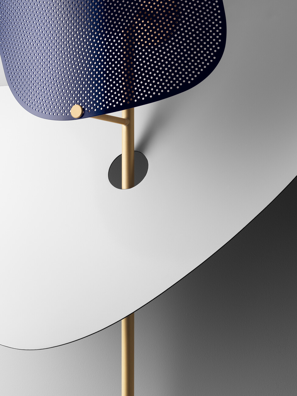
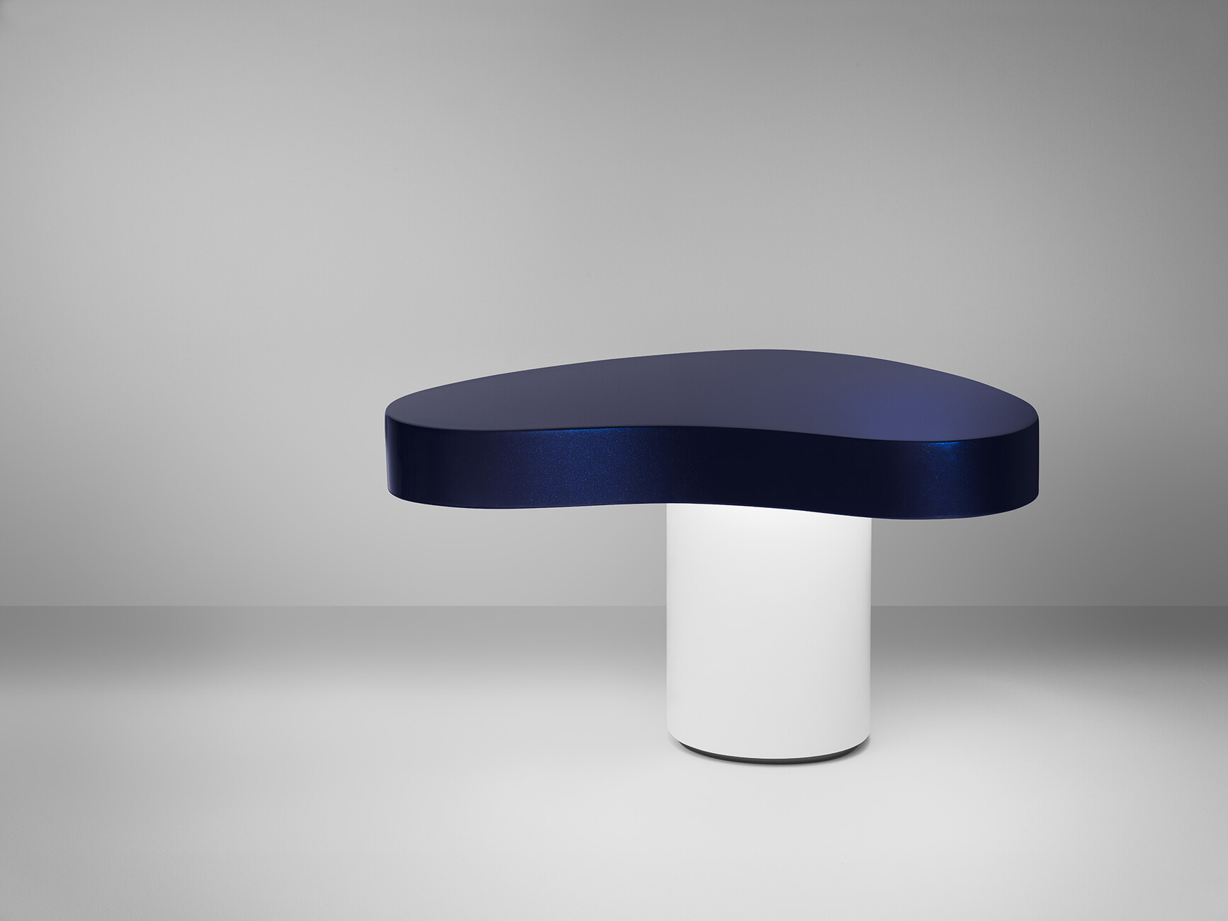
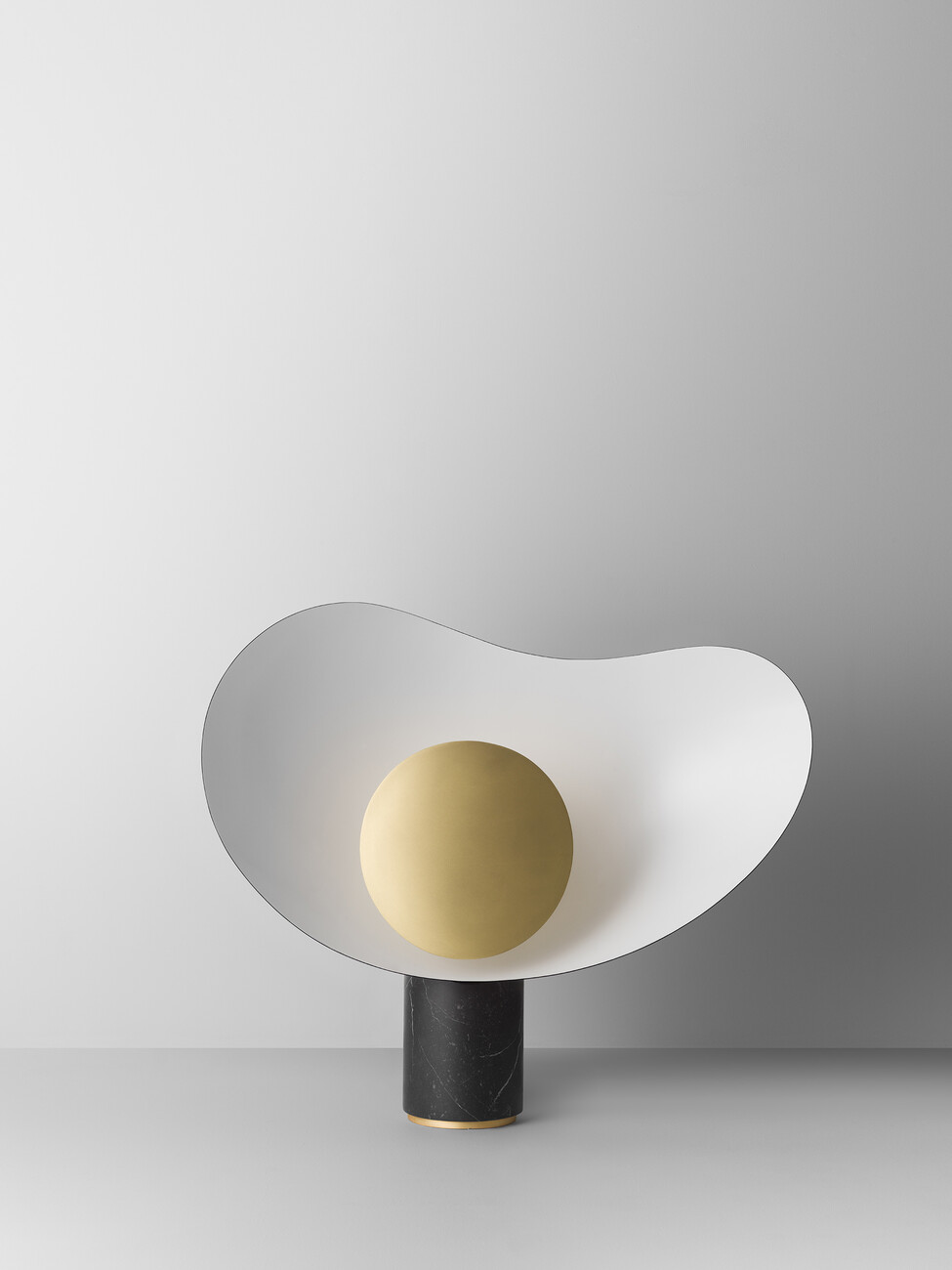
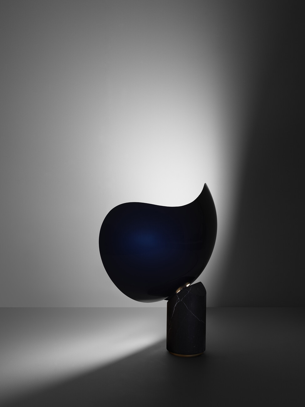
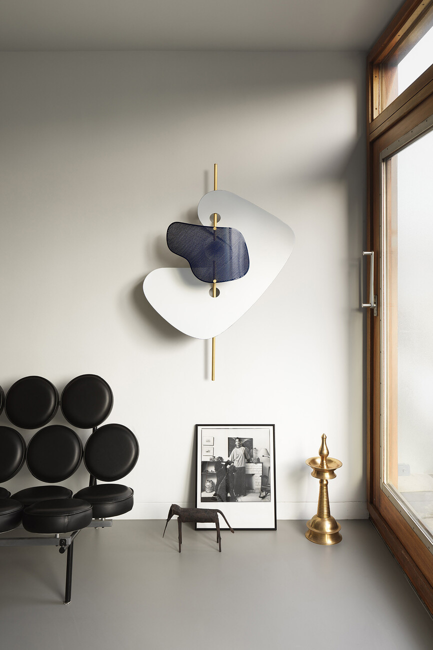
It seems to me that the abstract art of the 1940s and 1950s was an important point of reference for you in designing your new luminaire series “From Earth to Sky”. Is that the case?
Nipa Doshi: Absolutely. In preparing myself for the project I examined numerous drawings and paintings, especially works by Jean Arp and Alexander Calder.
Jonathan Levien: I have long been fascinated by the interplay between geometry and free form. There is something factual and non-debatable about geometry, while free form as I understand it is intuitive and emotional. In our work we always play with this contrast between the cerebral and emotional.
With the luminaires from the “From Earth to Sky” collection you not only experiment with forms but also with materials by juxtaposing the expensive with the cheap and the perfectly with untreated. What is the idea behind that?
Jonathan Levien: Contrast is elementary for us. And it was from the start when we first set up our own studio in 2000; it’s the basis of our creative work as designers. We have always rejected every kind of purism and never believed that there is such a thing as one good design or one good taste. In our designs we were always concerned with depth, complexity, and telling a story.
