Masters of Purism
Kathrin Spohr: What are you currently working on?
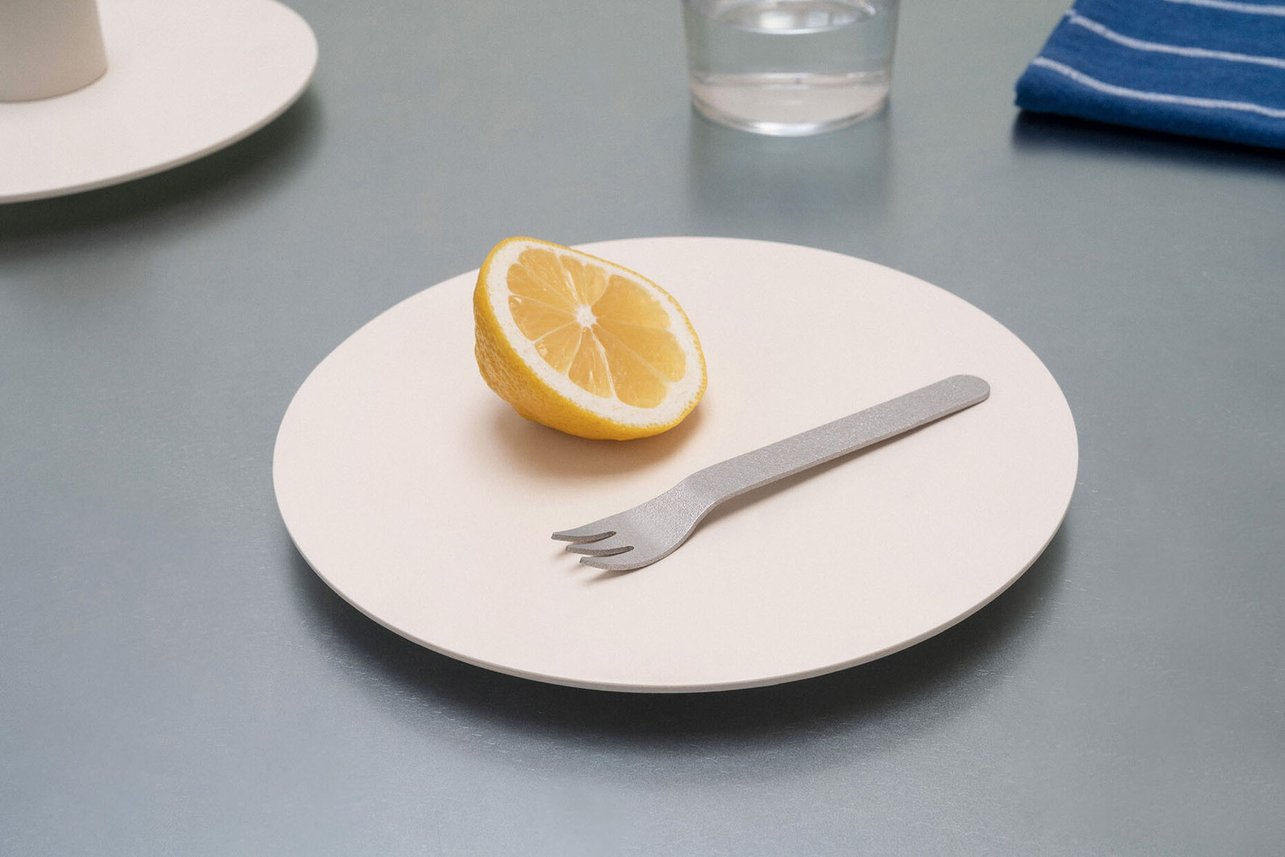
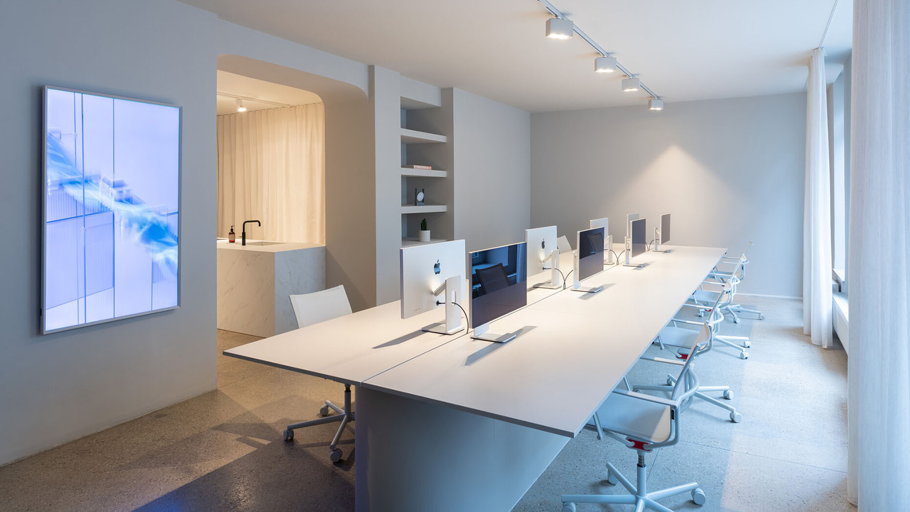
Designstudio Gerdesmeyer Krohn: We are developing some projects for the private sector such as kitchens and furniture. In the food segment, we are designing a new concept for a baker’s. We are also working on a tableware and cutlery collection. And we have completed the interior for Cologne-based digital agency Dayy. An exciting topic!
Why is it so exciting?
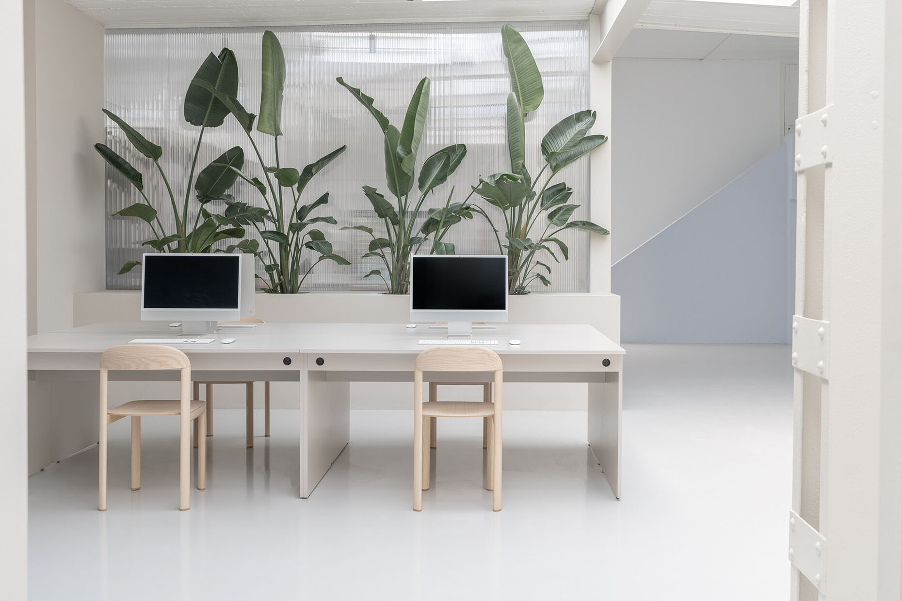
Designstudio Gerdesmeyer Krohn: Since the pandemic, many companies have reduced their office size, but they also want to make this remaining space more attractive so that in addition to working remotely staff will also actually want to come into the office. So, it’s about creating a feelgood atmosphere combined with work options. Furniture and spaces that can be used flexibly. For example, we developed a multi-purpose table for Dayy complete with a motorized monitor that is concealed when not in use. When it’s not needed, it’s simply a beautiful enormous table where you could also host a dinner evening, for example. Generally speaking, everyone in the company works with a laptop and they can change their workplace regularly. Our table can provide calm and clarity amidst this hive of activity.
What kind of mindset is needed to produce as diverse a range as you do?
Designstudio Gerdesmeyer Krohn: It’s exciting to repeatedly immerse ourselves in new areas and topics!
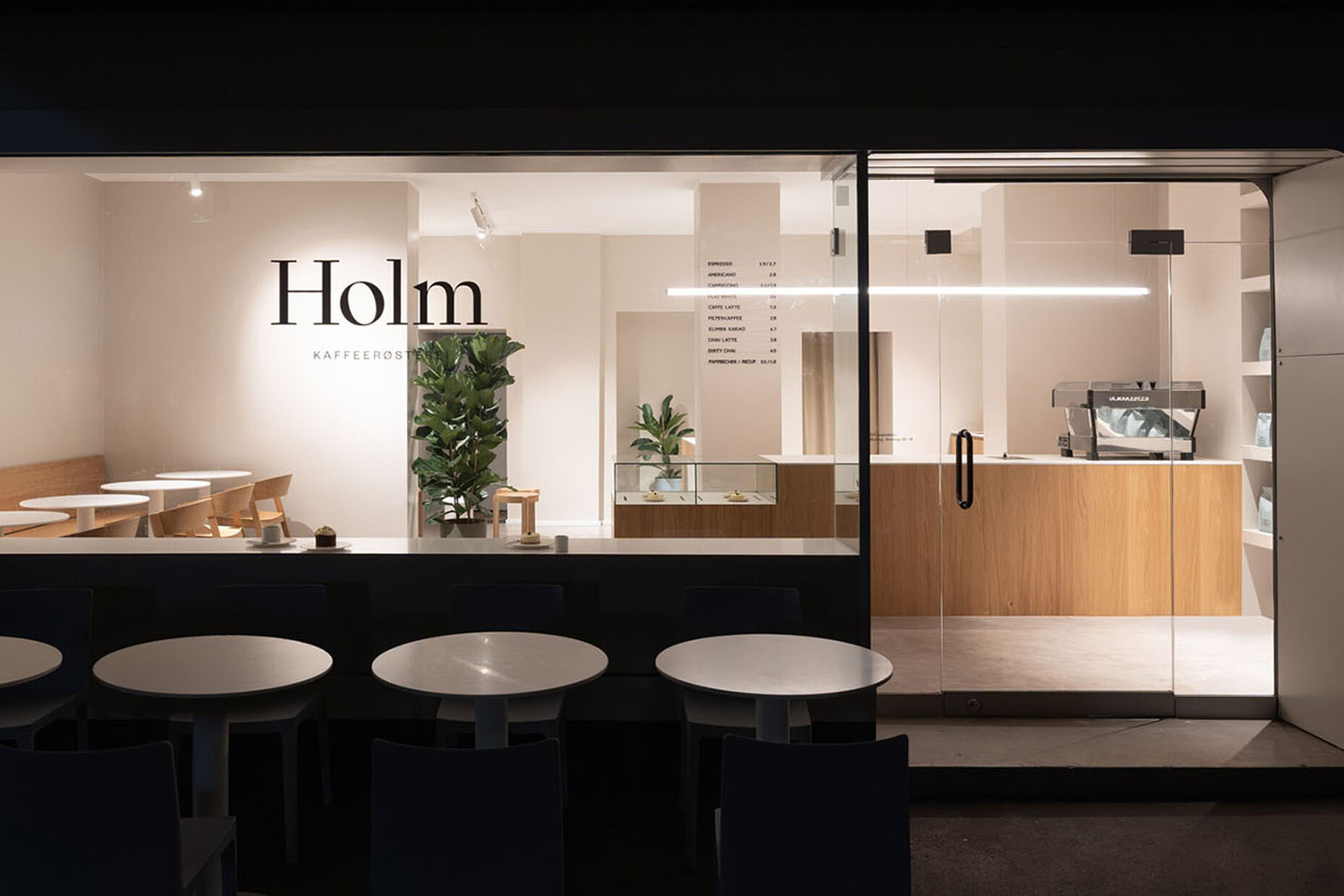
You have designed popular café bars such as the “Van Dyck” and the “Holm” in Cologne or the “Kliewe” in Münster. The look is minimalist, but not too cold. How do you go about creating a modern espresso bar atmosphere? And how would you describe your style?
Designstudio Gerdesmeyer Krohn: Well, of course there are always different priorities and USPs that have to be factored into the question. Sometimes, the idea is for people to linger for longer. Other times not. Say if the café is also a showroom for coffee makers or is a coffee roastery. The task is therefore to tease out this essence for each project. The interior should have a consistent look about it. It should appear pared back and streamlined. As we see it, people and the bustle in a café already fill out the space.
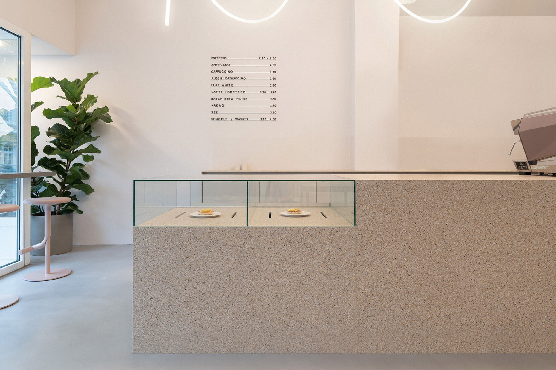
You realized the Van Dyck café in Cologne as a “Modbar” – a brand of La Marzocco, which has the espresso machine partly above counter and the rest tucked away beneath it. How does this technical solution alter the interior design of the café?
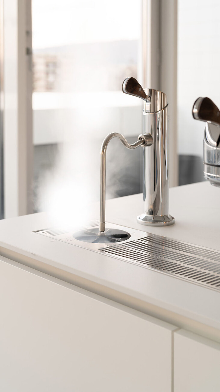
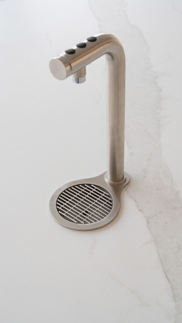
Designstudio Gerdesmeyer Krohn: With “Modbar” all you see on the counter itself is a tap-like element for dispensing the espresso, steam or pour-over. It immediately becomes much airier, minimalist. This enables better communication between the customers and the barista. In the case of the “Modbar”, the interior planning is completely different: You don’t design a counter that has enough space for an espresso machine but realize a counter that fits around the machine. That makes for completely new design potential.
You are specialists for places that allow guests to experience the ultimate in coffee enjoyment. A perfect espresso bar is …?
Designstudio Gerdesmeyer Krohn: Minimalist. You create the special feel of the place through the materials and a few details.
Are there materials you prefer working with?
Designstudio Gerdesmeyer Krohn: It all depends on the use, the function. Furniture has to be enduring. You would like to be able to use a kitchen for 20 years. That’s different with a store or a café concept: Then you need teasers that tempt you to step in. A counter can also be pink. Ceramic is a great, long-lasting material. As designers, we can always select the material that suits the respective project. We have our own materials library and keep an eye out for new materials. A lot is happening in this area, a prime example being recycled materials that resemble natural stone and so on.
Your projects are characterized by minimalism, simplicity, and straight lines. How do you identify the essentials of a project?
Designstudio Gerdesmeyer Krohn: Our aim is not to impose a minimalist idea on something but rather to tease out the essence of a project. That only works if you can communicate well with your clients, understand where they are coming from, what he or she wants. The brief might be, say, to design a “cool bakery”. Then you have to first work out: Who are the customers? What exactly is meant by “cool”? And what potential does the property offer? That is what makes our job so fascinating: Through this intensive interaction with our clients, you get to know a wide variety of sectors.
What did you come up with for Kliewe Coffee-Elements in Münster, where the client wanted a combined showroom and café?
Designstudio Gerdesmeyer Krohn: Kliewe Coffee-Elements sells high-quality espresso machines and accessories like coffee grinders. The narrow property was already well suited to making a cut and dividing the space into two sections. The café was to showcase what Kliewe supplies: a coffee experience. This is why the café can also be used independently. We separated off the rear section, the showroom by using a transparent sliding door. If required, the entire premises can be used as one large space. Customers can actually see the machines in use in the café. And needless to say, that also works the other way around: For guests in the café the showroom becomes a kind of teaser, a source of inspiration. However, if there is a private class being held in the rear room then the two spaces can be separated from each other simply by sliding the door closed.
You designed the new Hemro Group head office in Zurich, Switzerland. The company manufacturer coffee grinders, grinder components and technology solutions. What is the main design idea here?
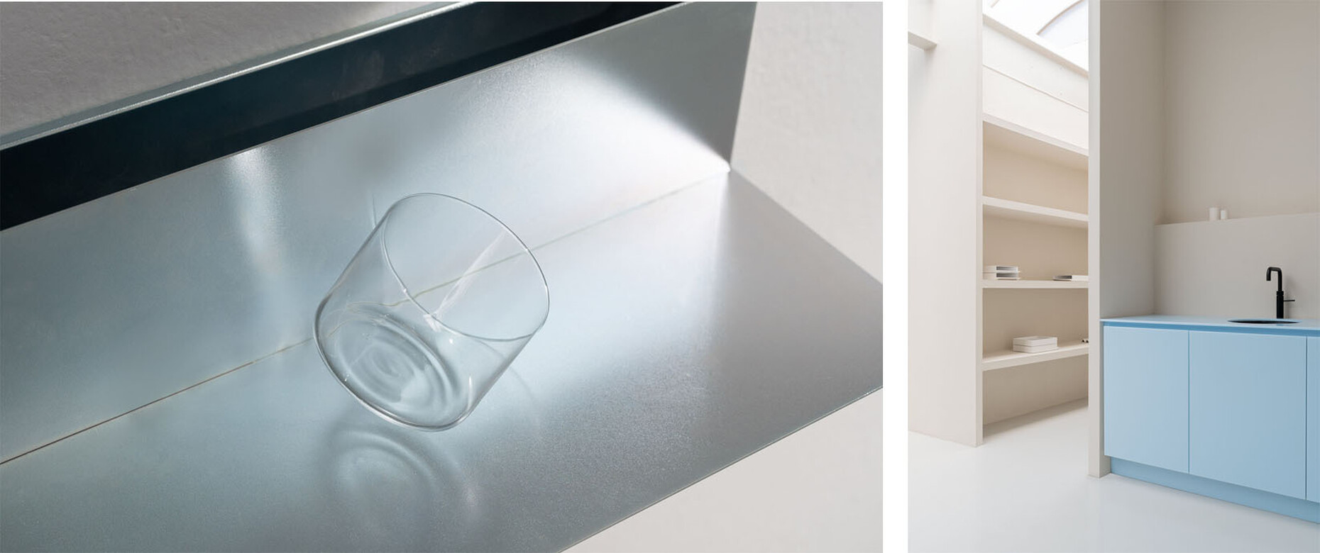
Designstudio Gerdesmeyer Krohn: In line with the manufacturer’s identity, our guiding idea here was innovation and quality. Hemro wanted a multi-purpose show space: So we designed a large space that can be divided into three zones. These can be separated from one another using curtains. The first section is really quite fancy: a Modbar with a meeting space. It’s a place to come together, drink a coffee at the table, and work on a laptop. Adjacent to it is a brand space-cum-showroom, where the new grinders and grinding components, for example, are presented. The highlight is a minimalist shelving system with a lighting concept which creates an ideal setting for the grinders. Behind that there is an academy space with two identically sized islands where using cutting-edge technology and in a lab-like atmosphere company staff members and Hemro partners receive top-notch training in preparing espresso and filter coffee. A modern and timeless interior has resulted from this combination of streamlined shapes, a variety of high-quality materials, and subtle colors.
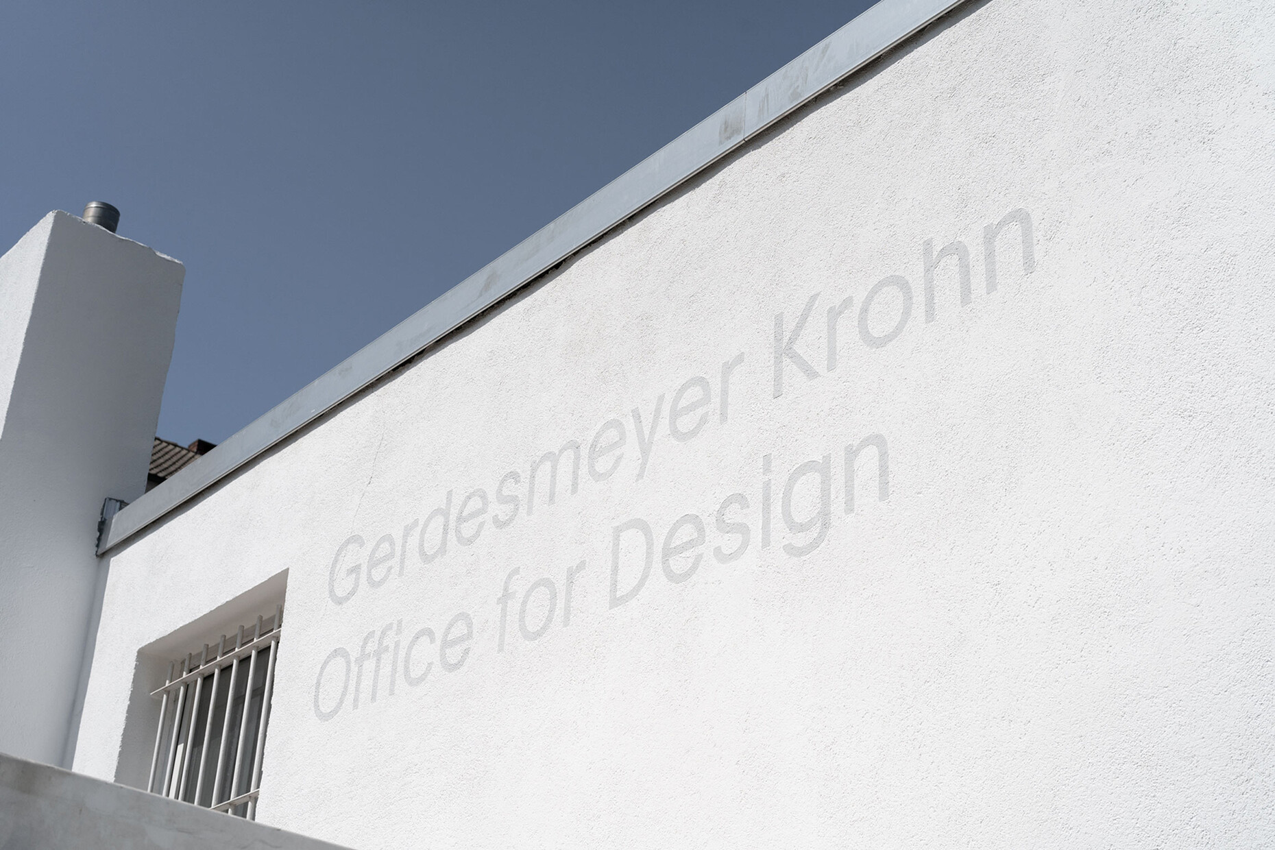
You have just moved into your new office in what was once a factory building in Cologne Ehrenfeld. Your ambition here was to demonstrate your entire creative process in the property. How did you achieve this?
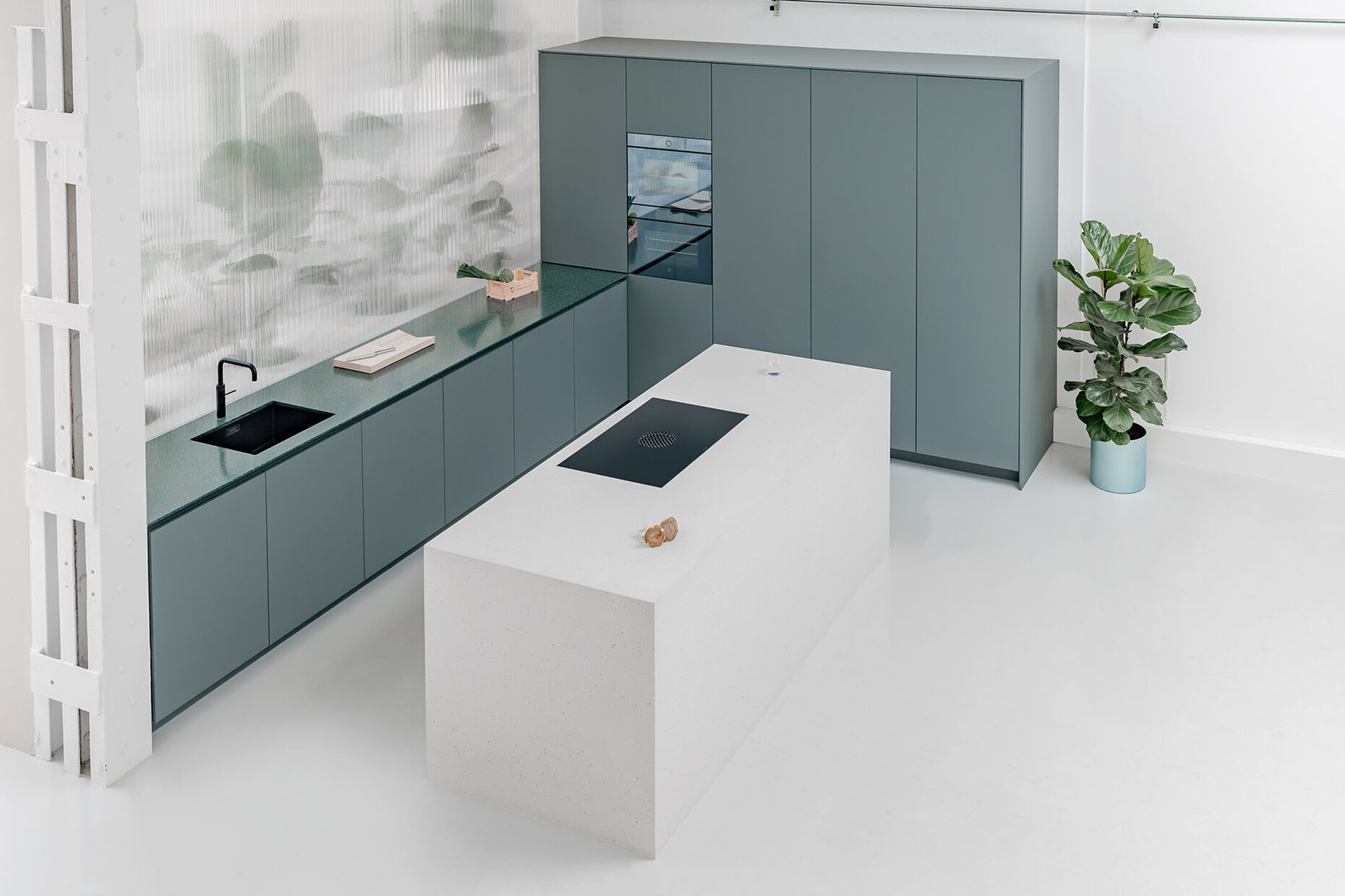
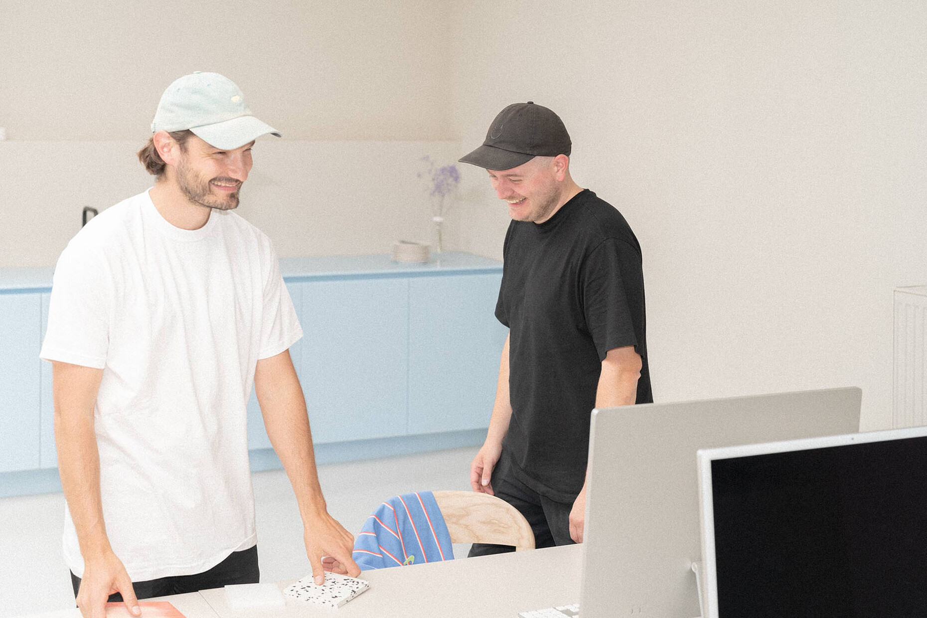
Designstudio Gerdesmeyer Krohn: It took a long time for us to find this new space of some 330 square meters. After all, we wanted a place that is charming and offers potential for development. Somewhere to accommodate all the areas of our work: from ideas, through to realization, construction, and assembly, and presentation. We combined a showspace and customer area with a kitchen and a large table for customer meetings, but where the team can also get together. There are separate rooms for classic office work where you can be alone, say to make phone calls. Our design hub is in a middle section; this is where the designing takes place from the idea through to the visualization and construction, in other words the whole process. The workshop leads off from here. And on the top floor there is a materials and samples room. The walls are decorated in subtle, warm tones that help produce a calm and focused work atmosphere.
To what extent does the new office influence the quality of your work?
Designstudio Gerdesmeyer Krohn: Everything is close together. The entire space can be used as a presentation area for our furniture and interior design projects. This means that our work is very transparent and palpable for our clients.
Meaning that you make the customized kitchens all on your own?
Designstudio Gerdesmeyer Krohn: No. And that is something we like to stress: We are a design office that develops customized interiors. We have a large network of partners: cabinetmakers, locksmiths, etc. In other words we outsource the production of the materials, the cuts. What we do is the planning, preassembly and realization. We assemble all the elements such as the countertops here and test everything before it goes to the clients. We have enough space to do this at our new location.
You have your own online shop. What can people buy there?
Designstudio Gerdesmeyer Krohn: There we offer some of the products that we have designed and advanced over the years and which we are convinced have sales potential, examples being the “Frame” table or “Cap”, a minimalist shelf with a back pocket. Or the smart espresso tamper “Supertamp” for Coto Studio. Adjustable pressure and precision tamping make for simpler consistent tamping and a better espresso.
Where do you get your inspiration?
Designstudio Gerdesmeyer Krohn: By swapping ideas and talking with other designers. But also from trips, design- and architecture media. By keeping our eyes open!
