RETAIL
Contrasting pinks
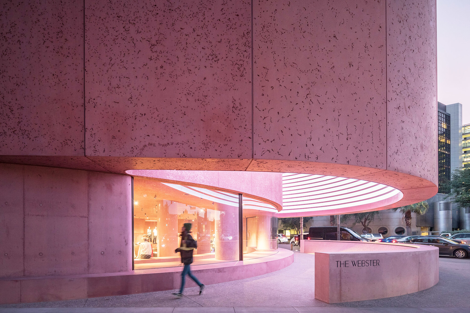
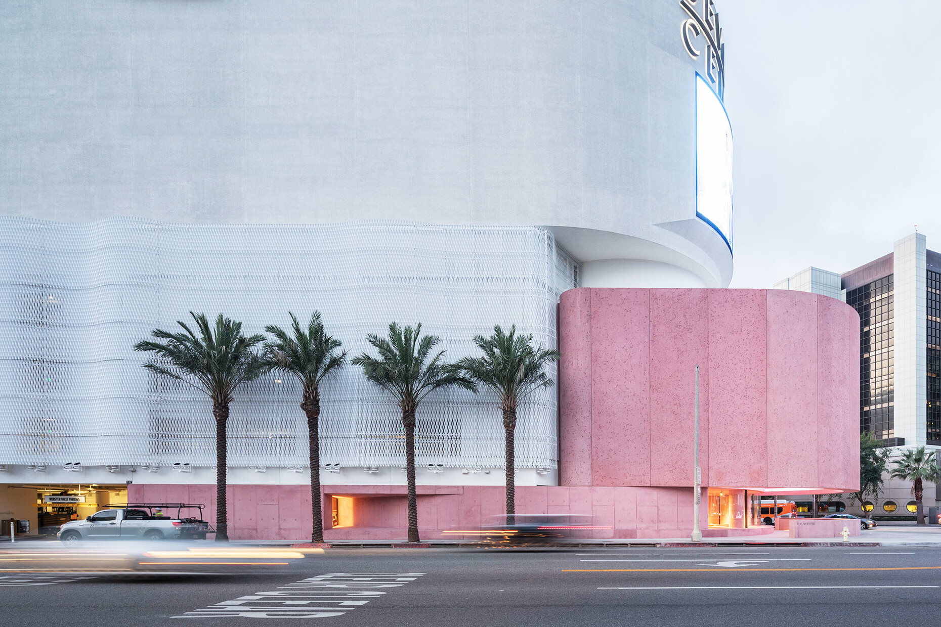
Since the early 1980s the monolithic Beverly Center has characterized the corner where San Vicente Blvd. forks off into La Cienega Blvd. The brutalist structure by A. Alfred Taubman, Sheldon Gordon and E. Phillip Lyon with its dynamic curve houses rows of shops as well as chain department stores such as Macy’s or Bloomingdale’s on three floors. To the shopping center David Adjaye has now added an extension spanning 11,000 square feet: He has created a concrete building that dovetails with the original Beverly Center for the new flagship store of luxury brand retailer “The Webster”.
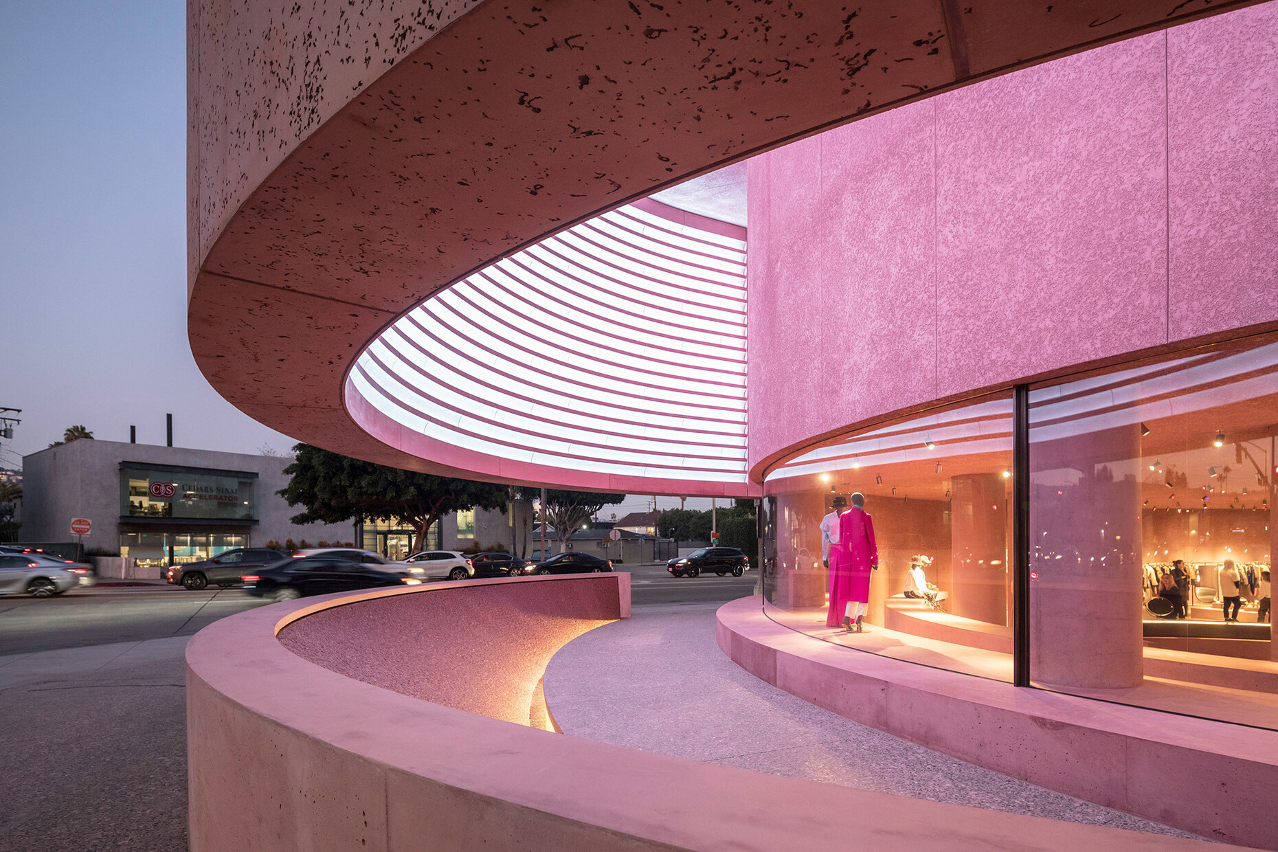
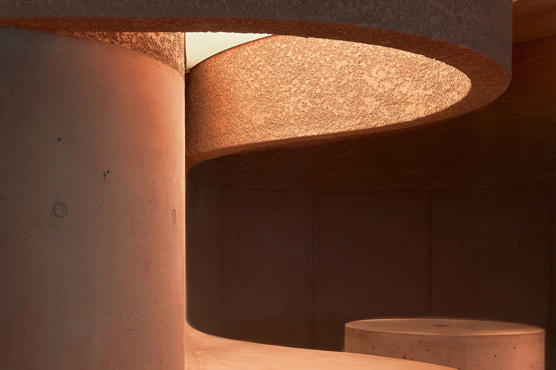
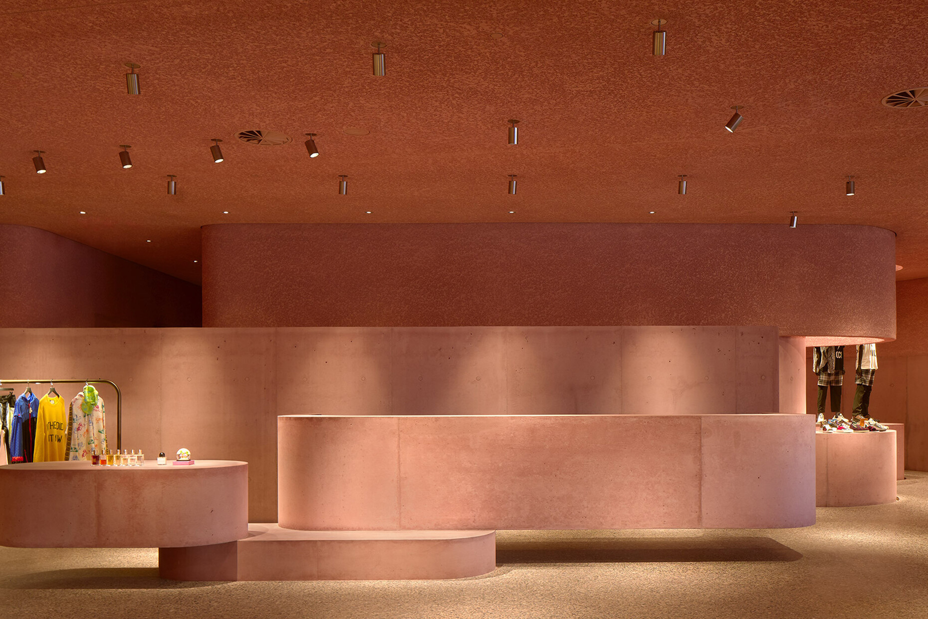
Yet despite drawing on the pre-existing structure’s formal language, the new building stands out immediately thanks to its choice of color: By tinting the concrete pink, Adjaye has given the material that usually gives off a cool impression a fresh twist. The pink pigments cover the grey concrete like a warm filter and make it appear less severe. The architect has deployed three large curved panorama windows to connect the interior and exterior of the store – the windows cover the entire frontage. Behind the curved concrete projection that envelops the entrance to the store like a low parapet, visitors face a minimalistic amphitheater equipped with an indirectly lit fountain, seating and an LED screen hidden in the ceiling. In view of its spectacular architecture, shopping initially takes a backseat in “The Webster”: Guests feel as though they were entering the lobby of a luxurious hotel rather than a shop.
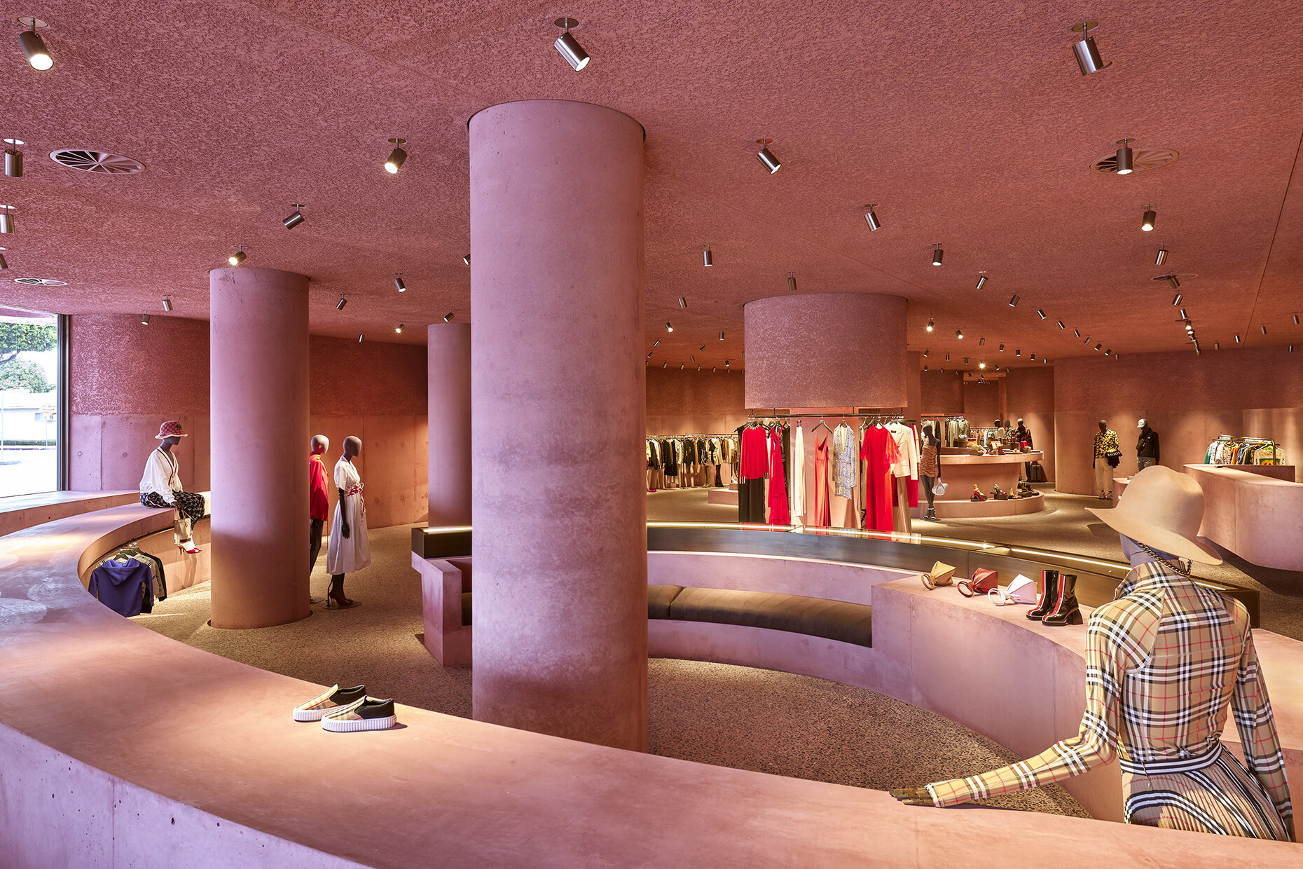
Rough and smooth surfaces alternate on the curved walls, while the floor surface gains a terrazzo feel thanks to black cherry marble pieces having been set into the concrete. Positioned like in a pinball machine, pedestals and illuminated alcoves jut out from the floor, the carefully selected items of clothing presented on these like artworks on plinths in a gallery. Bronze mounts and mirror frames reflect the light of the numerous spot lights. In the changing rooms floral wallpaper in rose provides a surprising segue to the otherwise unadorned walls. With the experimental contrast between the soft color and the hard material David Adjaye challenges our viewing habits and allows us to see concrete and the possibilities it holds in a new light.
