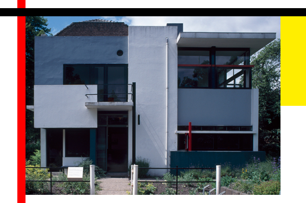
Cubism, Futurism, Suprematism and De Stijl: at the beginning of the 20th century all of these artistic movements reacted to the modified perception of space in a variety of different ways and with their own individual concepts. Gerrit Rietveld’s buildings can also be placed within the same arena as all such attempts to think of and design space under these new conditions. Rietveld initially took his cue from Frank Lloyd Wright, interpreting the house as a flowing space, which is structured using interfusing surfaces both vertical and horizontal; placing emphasis on simple methods, new materials and consistent coloring. His accentuation of the constructive elements is an attempt to stimulate the senses and make people aware of how they live. He wanted to involve the user in his architecture, simplify the production process and probe out new technological possibilities in the hope of reducing the burden on construction workers and improving their quality of life in small, inexpensive apartments. Rietveld’s appreciation of space is therefore by no means formalistic. The structure of the room and the way one can live in it are two complementary factors. The Rietveld Schröder House, built in Utrecht built in 1924, provides a good example of these concepts and was Rietveld’s first ever architectural work. I. The Rietveld Schröder House. Crouched on Prins Hendriklaan in Utrecht, the house Rietveld designed and built for and above all with his late partner Truus Schröder still catches passers-by unawares. Schröder rejected the initial design proposal; it wasn’t open enough, more like a huge monolith. Endless discussions between the couple led to a house that goes far beyond a variation of that which had been commonplace up to that point. Truus Schröder would later say: “We built it together. It is like a child, you can’t separate what they inherit from their mother from what they inherit from their father.” It was Truus Schröder who pressed the point that the house’s whole design should facilitate a different lifestyle and support its development. The couple achieved this effect by creating an open, more or less transparent constellation that activates the space itself and the perception of the space in equal measure. This is augmented by Rietveld’s use of color to accentuate those elements that define and structure space as such. While the interior was barely isolated from the exterior, the transitions and boundaries were clearly marked out. The Rietveld Schröder House is anything but a living machine. It is essentially an inhabitable structure with sculptural and artistic elements in which Rietveld’s constructive principles are put to use on a larger scale. II. The Red and Blue chair as a model. It is not by chance that Rietveld saw the project as the ideal opportunity to build a house based on the same principles as his “Red and Blue Chair”. He could have taken his Berlin chair, another amalgamation of construction and function, as a template but he wasn’t especially fond of this particular design. The decisive factor here is the move away from working with masses and volumes toward a consideration of the space in the building and its continuation into the outdoor space. III. Openness in the attic. On the ground level the couple adhered to an almost conventional division of the space. The upper storey however – declared as nothing more than an attic in the planning application for fear of rejection – was kept entirely open, without a single solid wall. This space contains the entire repertoire of everything that distinguishes Rietveld’s construction of the space: space nodes, colored surfaces, variability and openness. The house works as though it were a space delineated by a few surfaces which permeate the entire structure. Moving through the ground level, one constantly encounters elements that give the impression of walking through a three-dimensional translation of one of Mondrian’s paintings. But however abstract the construction may seem it also harbors a practical value. In any place where the space runs the danger of appearing cramped or restricted, Rietveld intervened to create the opposite effect. Movable walls, built-in fittings, tables and chairs: all of these elements combine to create a moveable living environment fit for a new kind of lifestyle that radically breaks with the hierarchy and conventions of the traditional bourgeois family. In this way, Truus Schröder’s family ideal takes shape in Rietveld’s spatial structure: a framework of independent parts that intertwine. A notion that could definitely be described as revolutionary, and not only for its own time. IV. Erasmuslaan. When in 1930 the building ban on the south east of the Schröder House was lifted Truus Schröder purchased the large area measuring more than 1,000 square-meters opposite her own house. In the period that followed the Schröder/Rietveld office developed a building complex there containing several apartment units, which were jointly designed by the couple and are today counted as some of the most beautiful and famous exemplars. These may not come close to the Rietveld Schröder House in their radicalness, but the project to building a housing block on Erasmuslaan caused quite a furor. White-washed rendering, steel doors and large, horizontal glass façades all suggested that the building has been made using the latest technological achievements. As De Telegraaf wrote of the master house, which was presented to the public in October 1931, with this stroke of genius Rietveld had succeeded in making the heads of a good proportion of the population spin. Another newspaper included the headline: “Houses made of glass and steel. Glory of light.” V. Prefabricated core. In the 1930s, Rietveld built many one-family homes, light and airy buildings with in parts rather elaborate floor plans: “inventions” that, as fellow architect Oud wrote to him in 1935, were “always tremendously attractive”, but were “more reminiscent of a ‘model’ or a sculpture than architecture.” The unconventionality and originality with which Rietveld proceeded and his envisagement of the use of industrial prefabrication in the construction sector is illustrated by an idea that he revived and modified continuously: “Houses for the working class with a central living core.” Essentially, this is the matter of a typology proper, a norm for affordable living. Rietveld did not want to create a smaller edition of a luxury product but a basic type; if necessary, a starting point for the development of a luxury edition of such a one-family house. It is about nothing less than a redistribution of the living space. Hallway, bike stands and appliances are bundled together, while the kitchen also serves as a dinning room, freeing up more space in the living room. In a later version the kitchen, shower, toilet and washbasin would be brought together and housed in a prefabricated plastic “core”. VI. Rietveld and De Stijl. 1951 would be the year that suddenly propelled Rietveld to international fame. As was the case back in 1918, De Stijl played an important role here too. The Dutch government was originally planning to hold an exhibition of contemporary architecture in the Museum of Modern Art in New York. However, the MoMA architecture department and its director Philip Johnson were not very interested in reconstruction but all the more in an exhibition on De Stijl. Rietveld was a member of the committee that prepared the exhibition in Amsterdam, which travelled from there to Venice to then move on to New York and Richmond. Not only did they produce a canonization of De Stijl but also granted Rietveld the long-overdue international recognition as an architect and designer that he deserved, including a flood of subsequent contracts such as the Dutch pavilion at the Venice Biennale (1955) and the design for the Van Gogh museum in Amsterdam. VII. Space and function. No matter which materials and production techniques Rietveld tried his hand at, no matter how much his aesthetic changed over the course of 50 years, his objective – to section off a part of the unrestricted space and translate it to a human scale – remained the same. The space itself thus becomes a reality by means of a construction in which the needs and functions of a new lifestyle can be consciously perceived as a spatial constellation. Gerrit Rietveld. The Revolution of Space.
From May 17 through September 16, 2012
Vitra Design Museum, Weil am Rhein
www.design-museum.de


