That’s the standard now set!
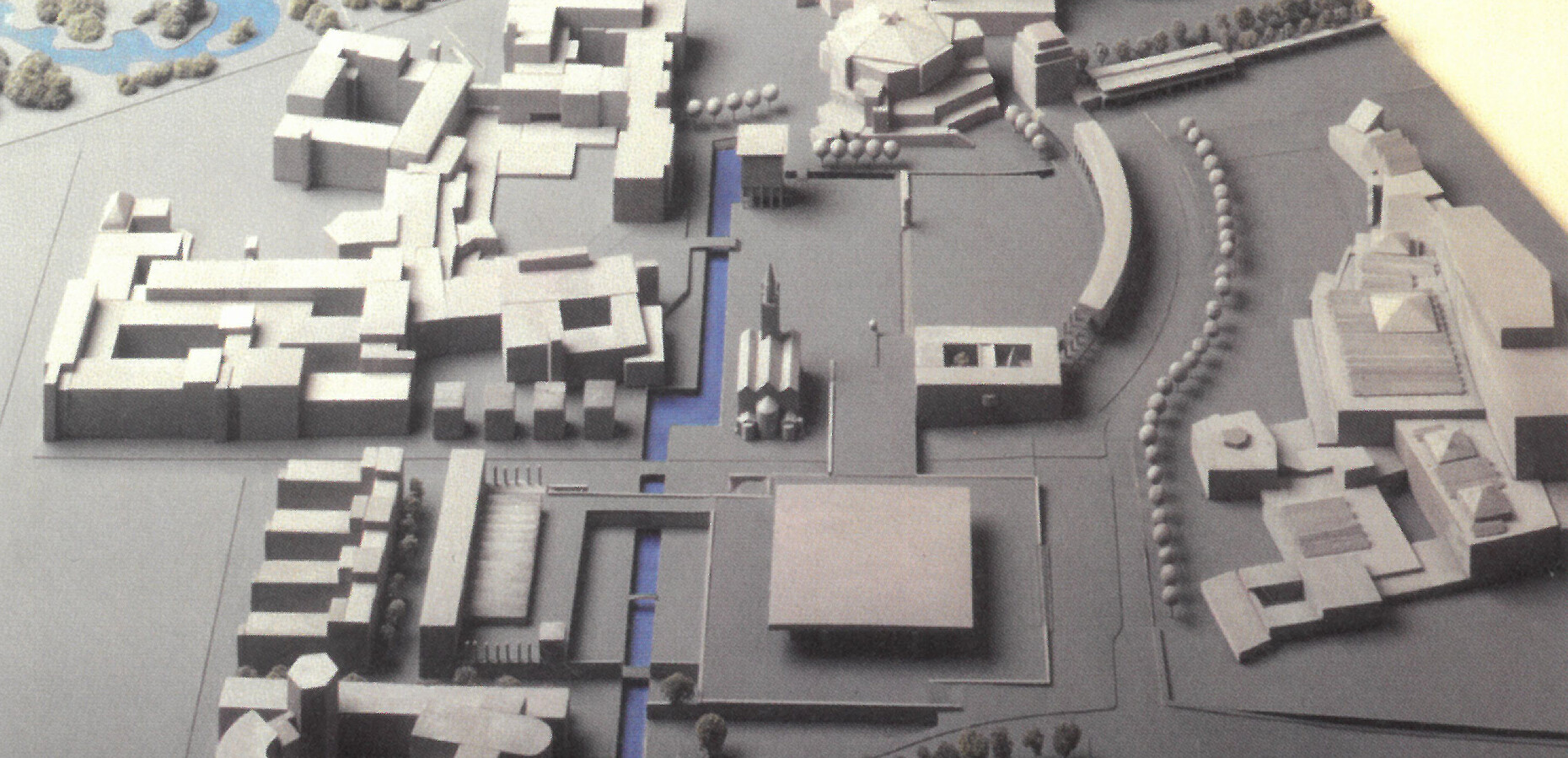
Be it the visual arts, music, literature or the sciences, at the latest since post-modernism consumer society has been calibrated to absorb trend changes and arbitrariness – and thus hardly succeeds any more in melding the broad array “of things passed down, of traditions, to form a convincing unity.” This was the conclusion literary scholar Hans Mayer reached in 1991 in a lecture at the Akademie der Künste. He cited a disaster in urban planning as proof, namely one at the heart of Berlin: the “Kulturforum.” The name suggests that the buildings for culture and for the sciences form a shared ensemble, create a meeting point for civic society. However, this unifying force is something that architecture can no longer deliver on. To this day, the Nationalgalerie, Mies van der Rohe’s baby, and the Philharmonie concert hall and the Staatsbibliothek, both the brainchild of Hans Scharoun, stand out from the local sandy soil like three monoliths, immersed in themselves.
The downtown wastelands were the result of Scharoun’s plans for Berlin: as then City Building Officer he sought to locate leisurely “urban landscapes” in between the functionally distinct centers, an idea launched in 1945 only to come to a halt soon afterwards. One plan was a “Culture Strip,” to run from Museum Island through to behind Potsdamer Platz – with precisely the “Kulturforum” as the western end. However, no attractive (pedestrian) route leads to this destination and this remains the case even after the Wall came down. Neither the streetcar stop nor the subway station “Kulturforum” give the place an urban profile. No port of call, anywhere.
The blatantly disastrous state of affairs since the 1960s has been the subject of much controversy. Various things have been planned, but nothing has happened. And now, with kick-off financing from the federal government of 200 million euros thrown at the wastelands, an architectural miracle cactus is expected to pop up and bring salvation: the “Museum of the 21st Century” designed by Basel-based architects Herzog & De Meuron. The “Culture Shed” is a straightforward brick building with a saddleback roof and with airy perforations in the manner of Italian farmyards – but its massive outer dimensions mean it forces itself on the eye in almost all conceivable lines of sight. And even a layperson standing in front of the model notices this. However, the architects do a skillful job of talking over the self-evident. With powerful phrasing citing anything from the “ur-house” to a “universal shape” they point up their no-frills design, praising it sycophantically as a profane “House for Everyone” or a child-happy “SantaHouse.” Their sentences dripping with meaning in an ingenious swirl of words, Pierre De Meuron and his partner Ascan Mergenthaler took part in the panel discussion marking the opening of the exhibition of all 40 competition entries. And it was not least their rhetorical gestures that won over the jury. The latter were truly euphoric in praising the explanatory text submitted, and rarely consulted layouts or renderings.
Vienna’s Hans Hollein, in his day likewise an architect of world renown, fared very differently. At the end of 1986 he felt it necessary to present his concept in a video that relied on Vivaldi’s “Spring” as the soundtrack. Moreover, using steel scaffolding and barrier tape (costing no less than 200,000 deutschmarks) the outlines of the buildings that would animate the Kulturforum with its plateaus, terraces and flights of stairs were visualized down to the last millimeter. Hollein’s plan with its striking “Bible Tower” and multifunctional “City Cloisters” was selected in 1983 in the competition “International Expert Opinion – Kulturforum,” but encountered much resistance for being “ruthless, obtrusive, vain” and after many years of toing and froing was tucked away in a drawer somewhere. Not least because the true-to-scale simulation on location had shown that a waterway, destined to function as a “conciliatory element,” would have run only two meters away from the outside wall of August Stüler’s Classicist St. Matthew’s Church.
In 2016 Herzog & De Meuron’s museum again gets alarmingly close to the monument. But no hullabaloo has ensured, and instead developer Hermann Parzinger, President of Stiftung Preußischer Kulturbesitz, has emphasized the “swift pace set in the competition process, possibly a record.” After all, here we have an archaeologist who ignores history and sidelines both the genius loci and the recent history of urban planning conflicts. Not for nothing, but in light of the architecture now chosen certainly in vain, the March 2004 resolution by Berlin’s Senate after the disaster with Hollein’s almost 20-meter-high “architectural marker points” stipulated that the plan was to “sensibly supplement the design with standalone buildings in keeping with the logic of Scharoun’s planning.” Lines of sight were not to be obstructed but instead “underscored.” Urban planners and politicians were of the opinion that “what is lacking is not another building, but a forum as a public space.” Ten years later Senate Director of Building Regula Lüscher sought to freshen up this gap as a “central free space” offering a “pleasant atmosphere between impressive plane trees and picturesque acacias,” defined by “spacious lawns alternating with paved sections.” That was back in 2014 and the Senate Director of Building concluded her remarks by saying that “Construction work is planned for 2016.”
Those remarks, part of “information for the general public,” are likewise not worth the paper they were written on. Not that this should detract from the fact that a real “museum plaza” is still required, “instead of a ramp termed a ‘piazzetta’ in order to at long last ensure the famous museums and collections are ‘visible.’” This Senate resolution, subject in 2004 to “financial feasibility,” also remained mere wishful thinking – and along with the 200-million project has still not been realized. For the unsuccessful, sloping piazzetta between the Kunstbibliothek, the Kupferstichkabinett, the Kunstgewerbemuseum and the Gemäldegalerie (which opened in 1998, designed by Hilmer & Sattler) is not something Herzog & De Meuron bothered about. Just as they have brushed aside the 2004 requirement that “different usages such as small hotels, offices, galleries, restaurants and stores should be encouraged on smaller footprints.” Their plans do not evidence such depth. Indeed, their consciously vague design (open for any conceivable “interpretation”) is intended to first flourish in dialog, in the developers’ “hermeneutic” reading of it, and thus give birth to the final basis for the new build.
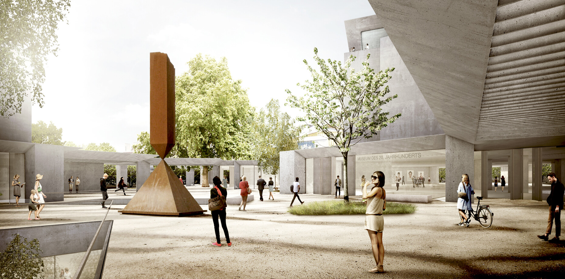
An urban planning competition was long overdue, but was explicitly excluded from the proceedings. And it gets worse: Arno Lederer as chairman of the jury enthused about the ideal “lack of conditions set, the impartial approach” that had arisen by simply forfeiting any master planning. It is strange, however, that hardly any of the architects actually made use of this extraordinary liberty, and Herzog & De Meuron were among them. Because no less “archetypal” than their winning entry were the parking-lot-like submissions tabled, now round (Christ + Gantenbein), now angular (Zaha Hadid Architects), along with the stone-wall repellent shoeboxes (Grüntuch Ernst) or glass boxes on stilts (Dominique Perrault), the cubes in lots of stacks (Behnisch) or in only a few stacks (gmp). All of them were jettisoned because Germany’s capital city “at long last needed its first Herzog & De Meuron.”
Schon Hans Hollein hatte 1983 „auf Überlegungen aufgebaut, den Durchzugsverkehr von der Potsdamer Straße herauszunehmen.“ Hermann Fehling und Daniel Gogel griffen damals im „Gutachterverfahren
Kulturforum“ nicht nur auf Scharouns Fluchtlinien zurück, sondern übernahmen auch dessen „ursprüngliche Idee die Potsdamer Straße abzusenken.“ Dann aber fiel 1989 die Mauer, der Durchgangsverkehr brandete fortan vierspurig, statt in einem Flussbett zwischen den „Weinbergen“ Philharmonie und Staatsbibliothek zu gurgeln. Diese Vorstellung Scharouns ist keine Träumerei, sie berührt eine der Schlüsselfragen, wie das Museum des 21. Jahrhunderts auszusehen hat, wie es gebaut werden muss. Denn was die Adepten jetzt für die ganz gewöhnliche Mall, die Riesenhalle mit autistischem Binnenklima, herbeiphantasieren – den „sozialen Ort der Begegnung“, die Massen-Performance oder auch das spontane „Getümmel“ – das alles hat Berlin, hat das Kulturforum längst gesehen: Im Juli 2014, als Otto Piene seine Installation „More Sky“ über dem Dach der Neuen Nationalgalerie in den lauen Sommerhimmel steigen ließ. Tausende kamen zusammen, schauten gemeinsam auf die Kunst. Open Air, mitten in der Stadt – weil die Potsdamer Straße gesperrt war.
An exception. Which need not become the rule if one studied only two of the entries a little more closely and took them seriously: Rem Koolhaas and his office OMA advanced Scharoun’s idea of the “vineyard slopes,” with multi-interlocking and softly staggered terraces, public halls, foyers and exhibition halls. And Volker Staab designed an “urban landscape” that is as attractive as it is fit for a museum, by grouping pavilions, bright inner courtyards and generously roofed entrance zones around a not all too fragile tower. Here, the spaces required by the brief (and which Herzog & De Meuron simply shove under a saddleback roof with no sense of scale) are, to quote Scharoun’s definition, “subdivided into comprehensible and restrained parts and these parts then interrelated like the woods, meadows, mountains and lakes.”
Herzog & De Meuron offer the masses of visitors streaming down the “boulevards” of their art shed any number of prospects. Koolhaas and Staab go further and also come good on the classic museum promise: enabling an encounter with art for each and every one of us, on our own. At the end of the day, this would even have pleased Hans Mayer, that dialectician who so loved good style. For in such architecture, “things passed down, traditions, form a convincing unity,” without rejecting the requirements of mass culture and the culture managers.


