Room for imagination
Anna Moldenhauer: How did the collaboration with Cleaf come about?
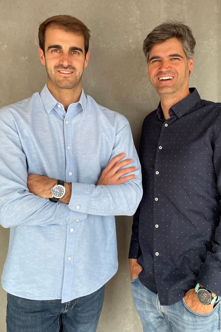
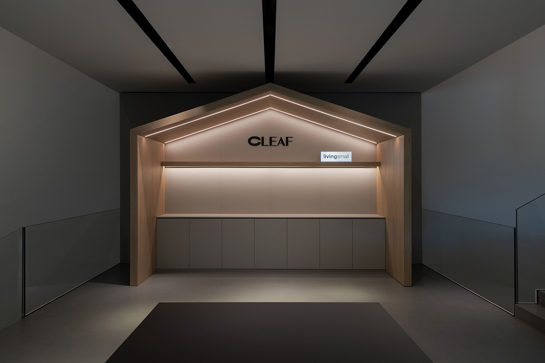
Gerard Martinez und Marc Martinez: Actually the story is very beautiful. Our community posted several images referring to the Cleaf product used for the project carried out for Grupotel for the comprehensive renovation of Grupotel Gravina, located in the center of Barcelona. Cleaf made a communication to suggest that we submit an entry to the annual award they give each year, Shaping Surfaces Third edition. We did it by sending five images and a summary of the project. It turns out that we were awarded as winners of the annual award. As an award Cleaf gave us a beautiful commission in the form of a project. Designing the showroom of the Lissone headquarters, under the title Living Small, on the occasion of the Salone del Mobile and Milan Design Week 2024 and have our project welcoming distributors, architects, designers et cetera for a whole year. It has been a great professional and personal experience for our studio. We could have never expected that thanks to a project designed in Barcelona we would be in Italy designing such an important space for Cleaf.
For the ‘Living Small Project’ in the CCube Corporate Showroom, you designed four rooms, each with a small house. Your concept offers ‘room within a room’ installations that are very diverse. Why did you decide on this type of presentation?
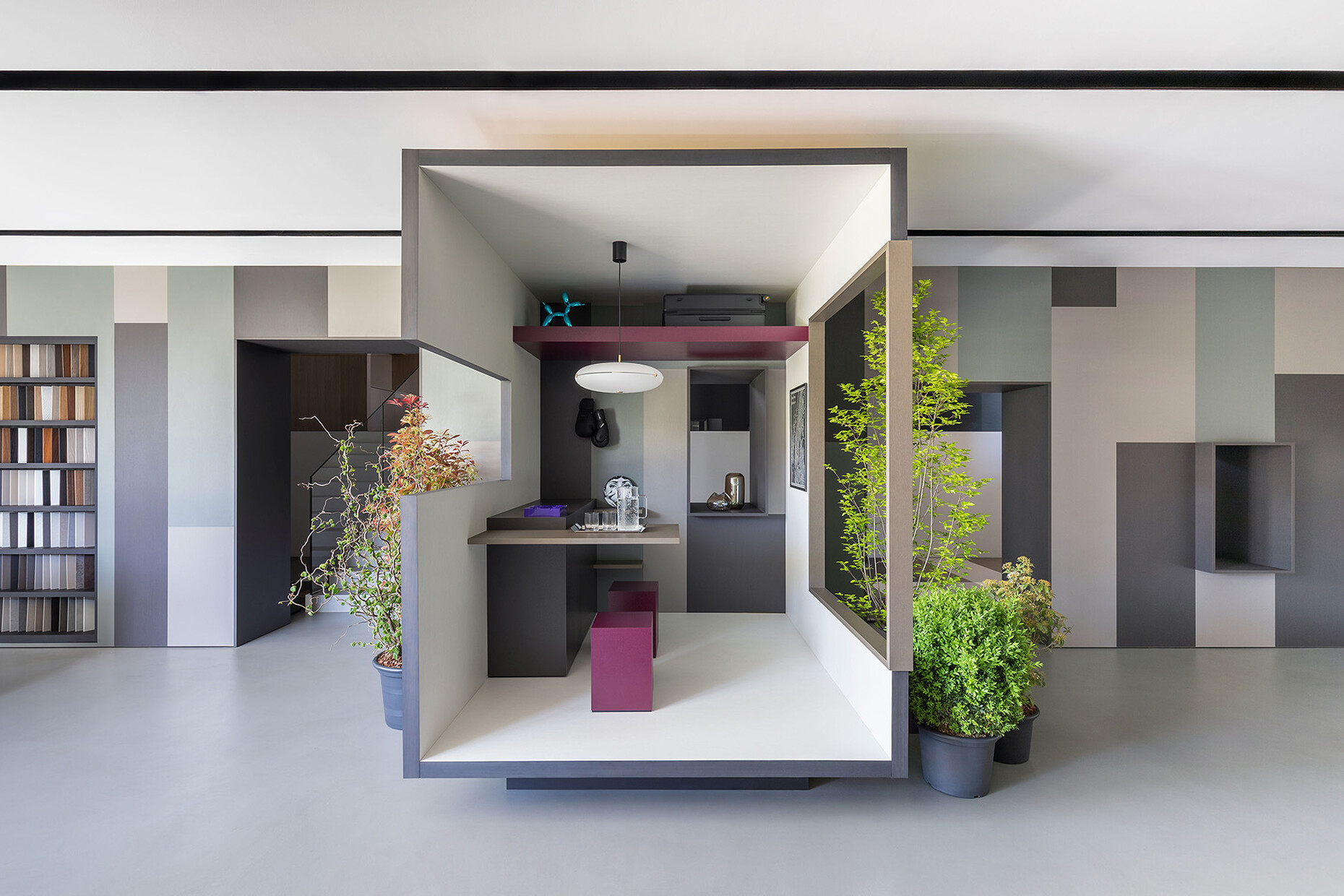
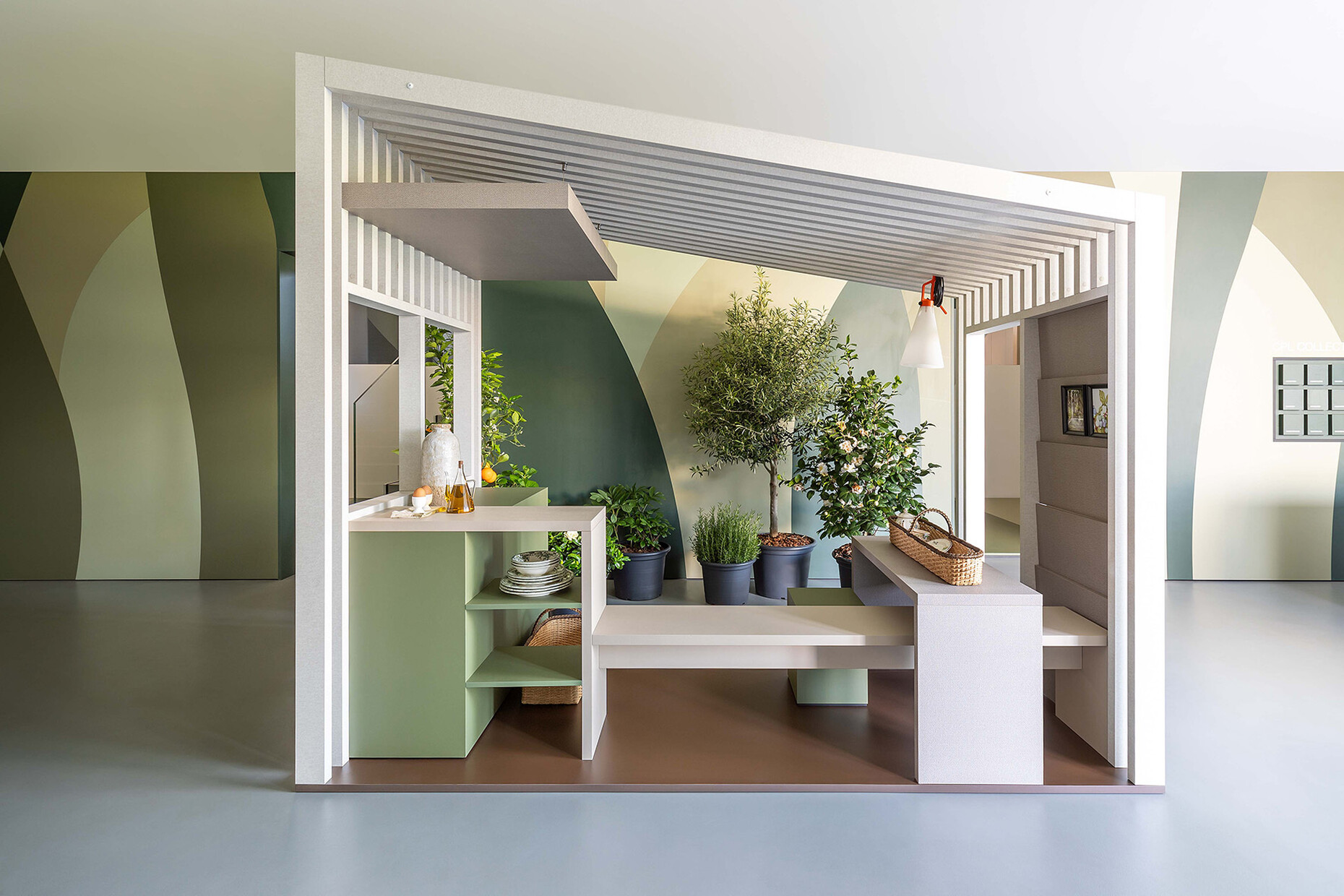
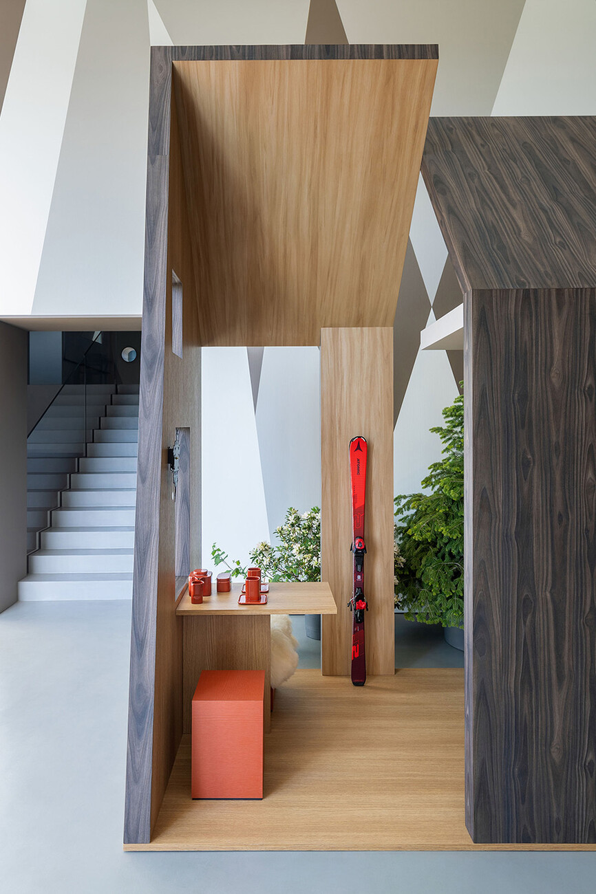
Gerard Martinez und Marc Martinez: We traveled to Lissone to visit Cleaf's central facilities in June 2023. Their team showed us the facilities and explained to us the briefing they had to design the showroom for the 2024 campaign. The team in charge of tutoring the project explained to us that they had thought of: “Developing the design of the four main environments, declining the theme of the small house (Tiny House) in four areas (sea, mountain, city, countryside), combining them with the material effects and finishes of their products (wood, stone on the upper floors, metal and fabric on the lower floors). Solid colors could be used in all environments.” In the same meeting we began an interesting brainstorming process. The project that was being proposed left a lot of room for the imagination. In our studio and after giving the concept many thoughts, our main motivation was to represent the four landscapes proposed in the briefing in an aesthetic and elegant way. The project was developed from a common thread. Inspiring and capturing the four landscapes proposed by Cleaf to transport us and remind us of different places that we have all surely lived at some point in our lives. Conceptual places where we will find various inspiring proposals under the Living Small motto.
What was it about Cleaf's products that appealed to you?
Gerard Martinez und Marc Martinez: We learned about Cleaf products through our trusted carpenter. When we saw the samples they had in the factory, we were pleasantly surprised by their very high level of finishes, innovation, with a variety of textures and decorations, with multiple tactile and visual effects. We realized that their materials would provide differentiation to our designs, which would allow us to project beautiful spaces full of personality and elegance thanks to their inspiring finishes. Specifying Cleaf products is for us a guarantee of success and peace of mind.
Why were Mare, Montagna, Citta, Campagna an important inspiration for you?
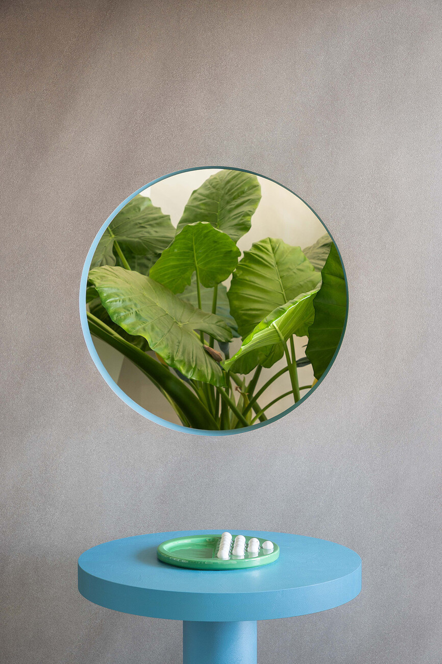
Gerard Martinez und Marc Martinez: When Cleaf proposed the briefing to us we immediately realized that the project gave us the opportunity for nature to be our source of inspiration. Our setting would be the geometric shapes, so essential in Gaudí's creations. We opted for dynamic shapes, colors, polychromatic vividness, curved or pure shapes to place the visitor in the different environments. The project gave us the possibility of being totally free to let our imagination fly both in the general scenography and in the design of the four mini-houses. Interpretation on our part totally free and conceptual of what we wanted the different houses to represent according to their environment. For us, in the Sea we find sinuous and round shapes (the wind that moves the sand, the degradation of rocks, the round windows of boats, warm colors, the contrast between sand and sea/sky). This landscape merges with the Countryside. From the sea we move to an enveloping environment rich in green colors; the trees, the fields, the peasant's lands, some irregular and sinuous, others regular and with rectangular geometries. The City, unlike the previous landscapes, is symbolized by a grid, order, geometry, cubic windows and cooler industrial colors. From human control of construction and architecture created by evolution and learning, we move to earthly lack of control. The random formation and creation of mountains. Represented as free and asymmetrical geometric shapes with cracks to observe other landscapes. We combine Mountain and City because they seem like two antagonistic worlds to us.
Four material effects can be explored in the installation: Wood, metal, stone and fabric. Can you explain the reasons for this focus?
Gerard Martinez und Marc Martinez: The different effects present in the manufacture of Cleaf have also been a source of inspiration for the creation of the spaces. We have worked together with their design team to provide each space with the most appropriate effect to enhance and explain the very diverse application possibilities of their materials. Colors, finishes and textures have been chosen for both the general sets and the mini houses. The four material effects have been the key to provide very different sensations in each of the four areas, helping the visitor to immerse themselves in the spaces with a sensation of free and dynamic transit. The samples located on the walls are in total harmony with the designed spaces, helping distributors, architects, designers or builders to visualize the very diverse applications of Cleaf products. The groups of materials were: Wood and stone / Sea and mountains / Metal and fabric / Citta and campagna.
You set accents with coloured surfaces – the Cleaf range is very extensive, what criteria did you use to select the products?
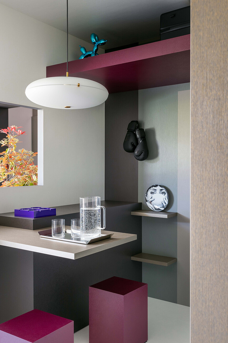
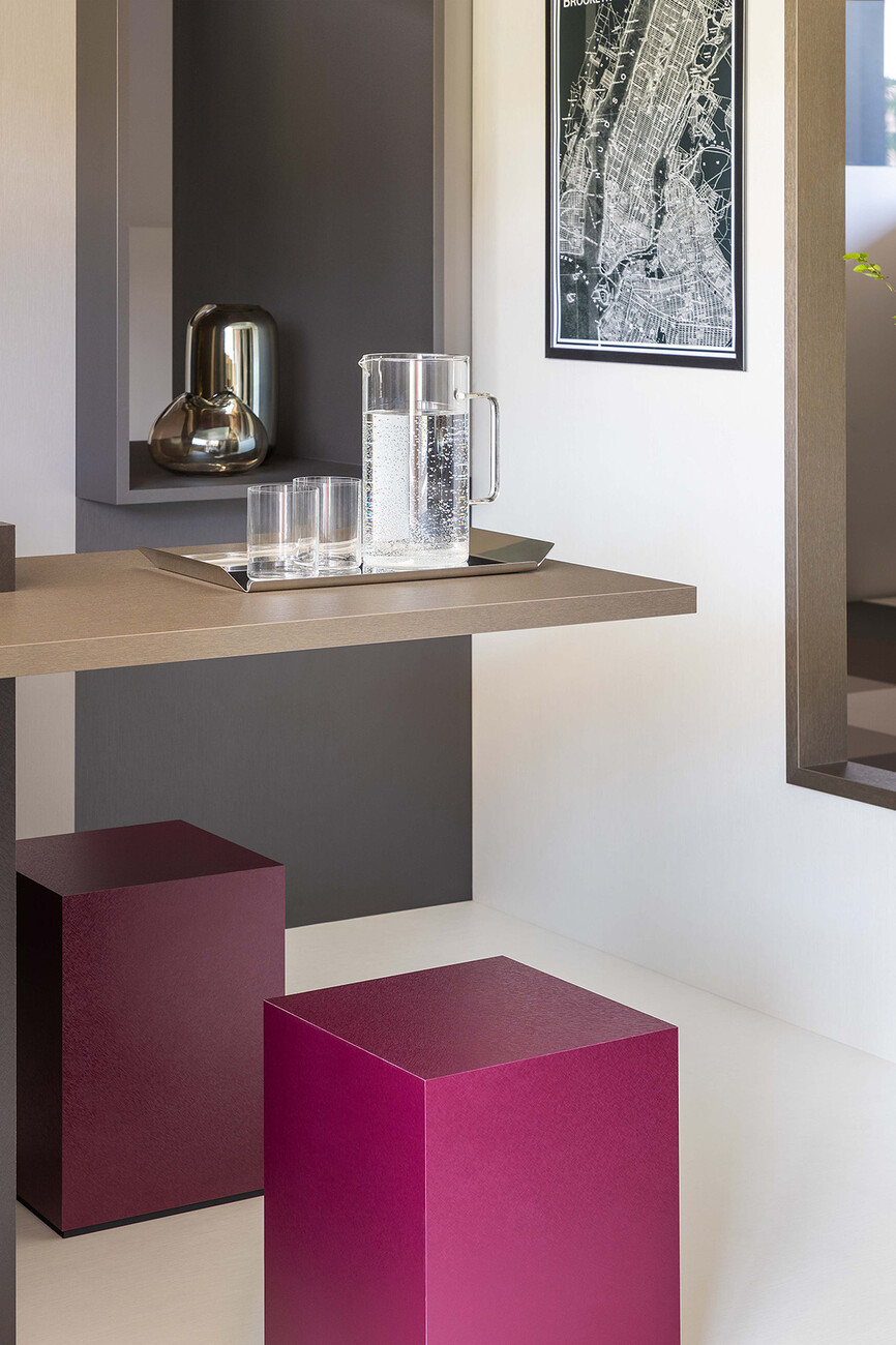
Gerard Martinez und Marc Martinez: Solid colors have been used in all environments. At Cleaf they are very clear that “color depends completely on its physical, visual, artistic and cultural context. Color is strictly and inextricably linked to emotion, so each individual color carries many possible interpretations. If creatively combined and harmonized with shapes, color can literally come to life”. And that is precisely what we have tried to convey in our project. The green colors transport us to the countryside pastures, the blues and sands to the sea, the greys, whites and magentas to the city, and the greys, browns and reds to the mountains. It is also worth highlighting the brilliant setting work done by Cleaf in each scene, to achieve the perfect context to experience the spaces.
To what extent is the set design flexibly customisable?
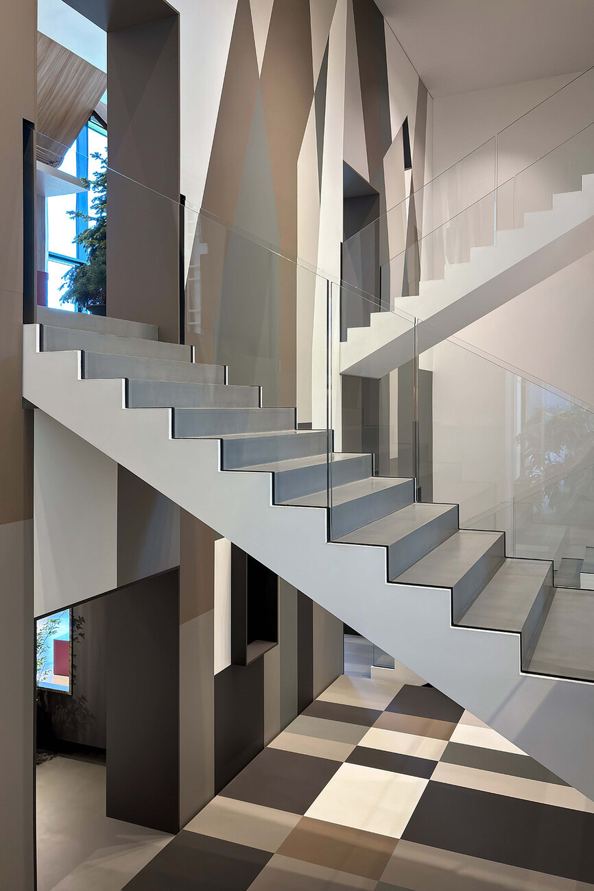
Gerard Martinez und Marc Martinez: Within the current scenography, great work has been done to personalize each corner of the CCUBE building to integrate our proposal into the architectural environment. But at the same time, the scenery is relatively customizable and will depend on the theme that Cleaf proposes for the 2025 campaign. It is true that the general scenery is very forceful and designed to immerse the visitor in our vision of the mini world represented. Depending on the topic that Cleaf presents to the winning team of the fourth edition of the Shaping Surfaces contest, it may or may not be integrated with the new proposal.
With your interior architecture and design studio based in Barcelona, you have been working on residential projects, hotels, restaurants and corporate spaces for more than 20 years. What is your design philosophy?
Gerard Martinez und Marc Martinez: We create spaces that inspire you, make you feel and adapt to your style. We like a very nice concept; "Projects that improve lives". Projects that improve lives not only transform communities, but also create a lasting impact on society. These initiatives, focused on well-being and progress, represent the very essence of the commitment to positive change and continuous improvement. We specialize in creating unique and inspiring design and architecture projects, carefully crafted to meet the specific needs of our clients. We are dedicated to fusing ergonomics, functionality and aesthetics harmoniously in each project we undertake. Our team of designers and architects strive to thoroughly understand our clients' needs and desires, working tirelessly to turn those ideas into exceptional spaces that exceed their expectations, producing projects we can all be proud of. We believe in the importance of ideas, dreams, creative concepts and uses to define the spaces we design. Rather than imposing a rigid style, we prefer to shape environments that align with the identity and needs of those who will enjoy them.
