PORTRAIT
A holistic approach
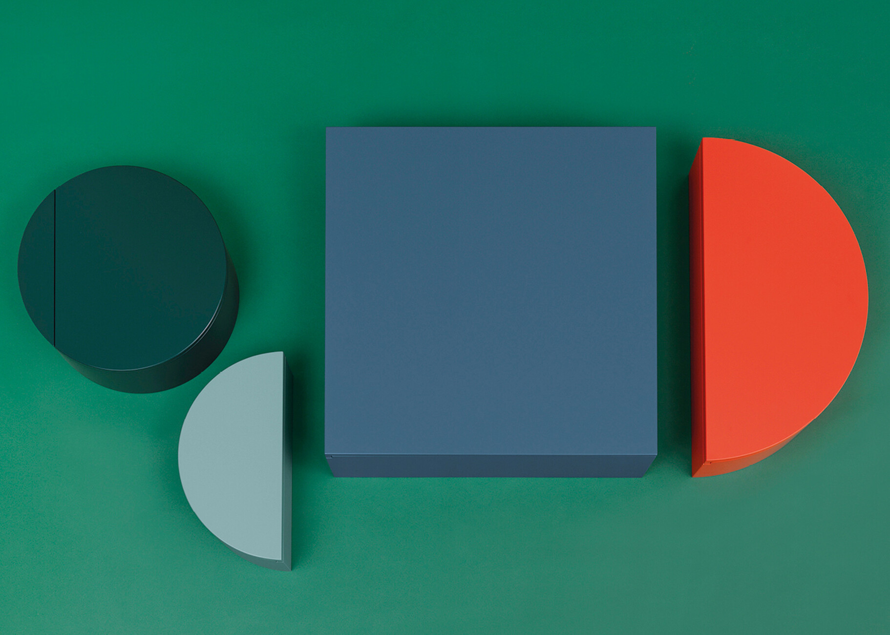
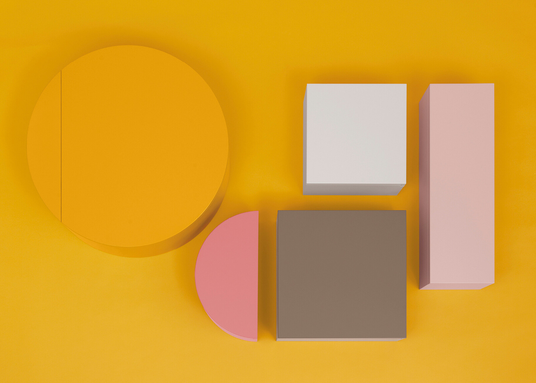
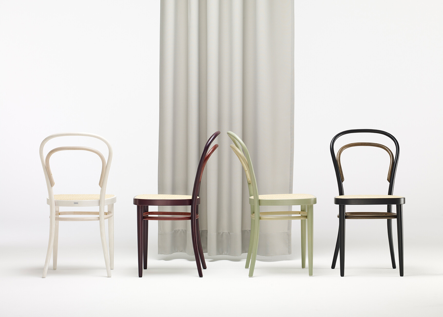
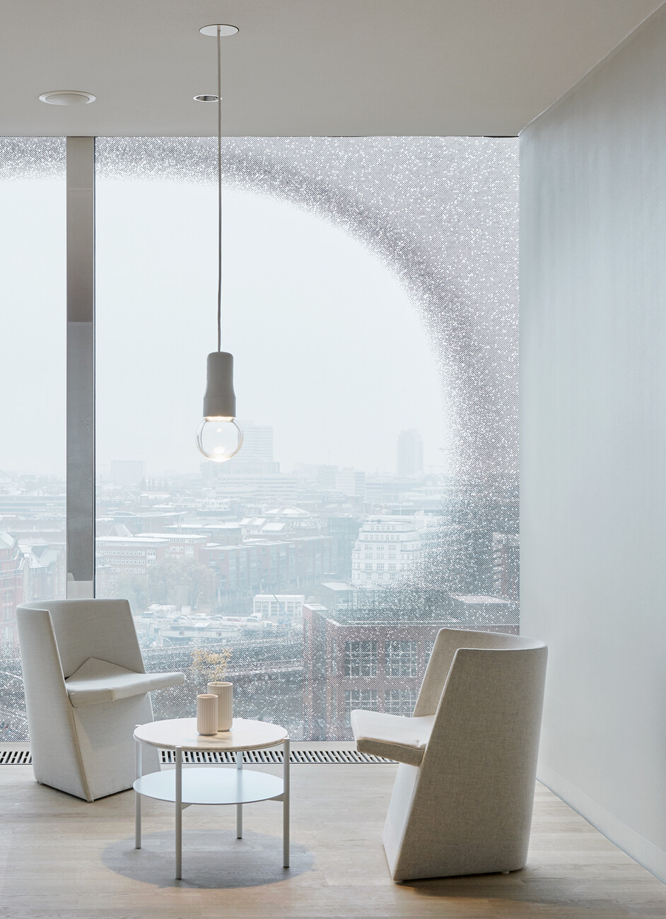
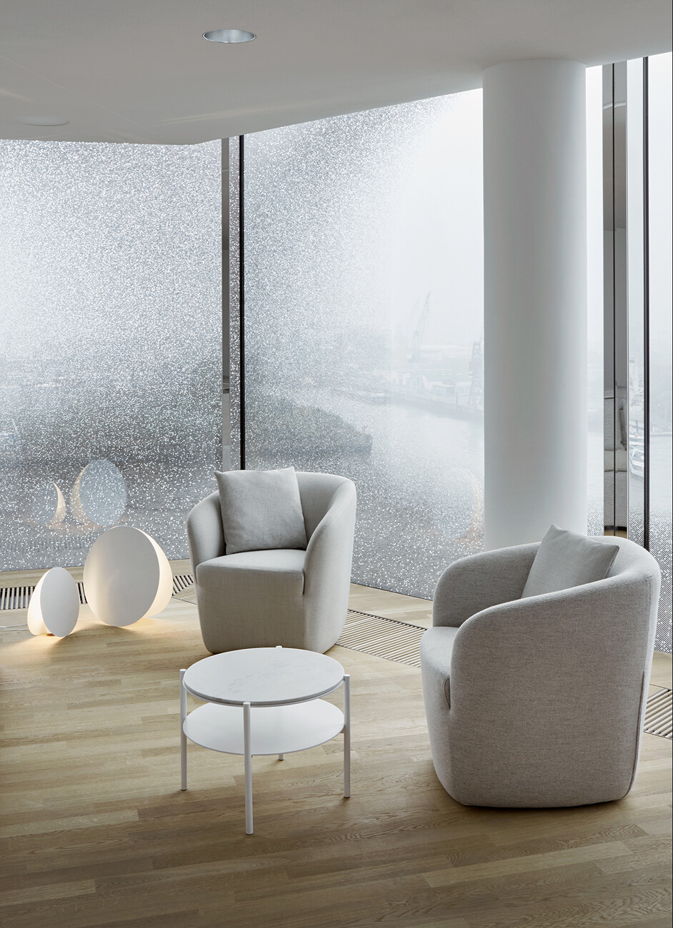
Working from premises on the ground floor of a charming old building in Hamburg’s Eimsbüttel district, Besau Maguerre kick off every new project with an internal workshop: The duo sit down with their three-strong team of architects and designers to play a kind of interdisciplinary ping-pong. This is followed up by moodboards with the help of their materials library, research on production methods 3D-sketches and first experiments in their own workshop. “It is always a shared journey,” explains Eva Marguerre. Color is an important factor in all of their projects. It assumes the role of telling stories, transporting an identity. “We are not primarily concerned with the effect but with finding the right color for the particular shape, and vice versa,” Marguerre continues. As with the color concept for the “214” coffee house chair by Thonet, which was produced in black, white, velvet red, and sage to mark the company’s 200th anniversary. By staining the connecting elements several shades lighter than the seat ring and legs a fascinating interplay of color arises and with it a modern interpretation of this classic product. The “Simetria” colored wall elements for Schönbuch which premiered at imm cologne 2020 also leave ample scope for a personal touch: Customers can choose from a large range of matt lacquers when it comes to the colors of the eight slim circular, semi-circular, rectangular or square cabinets. By contrast, Besau Maguerre chose many shades of white for their furniture series for the Elbphilharmonie concert hall, where the focus was on surfaces with a differing feel, ranging from steel via upholstery to marble. The design idiom is restrained and geometric. “A clear matter of reducing to the essentials,” the duo suggests.
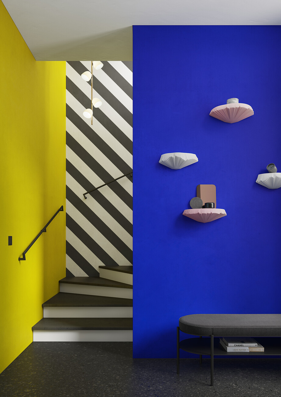
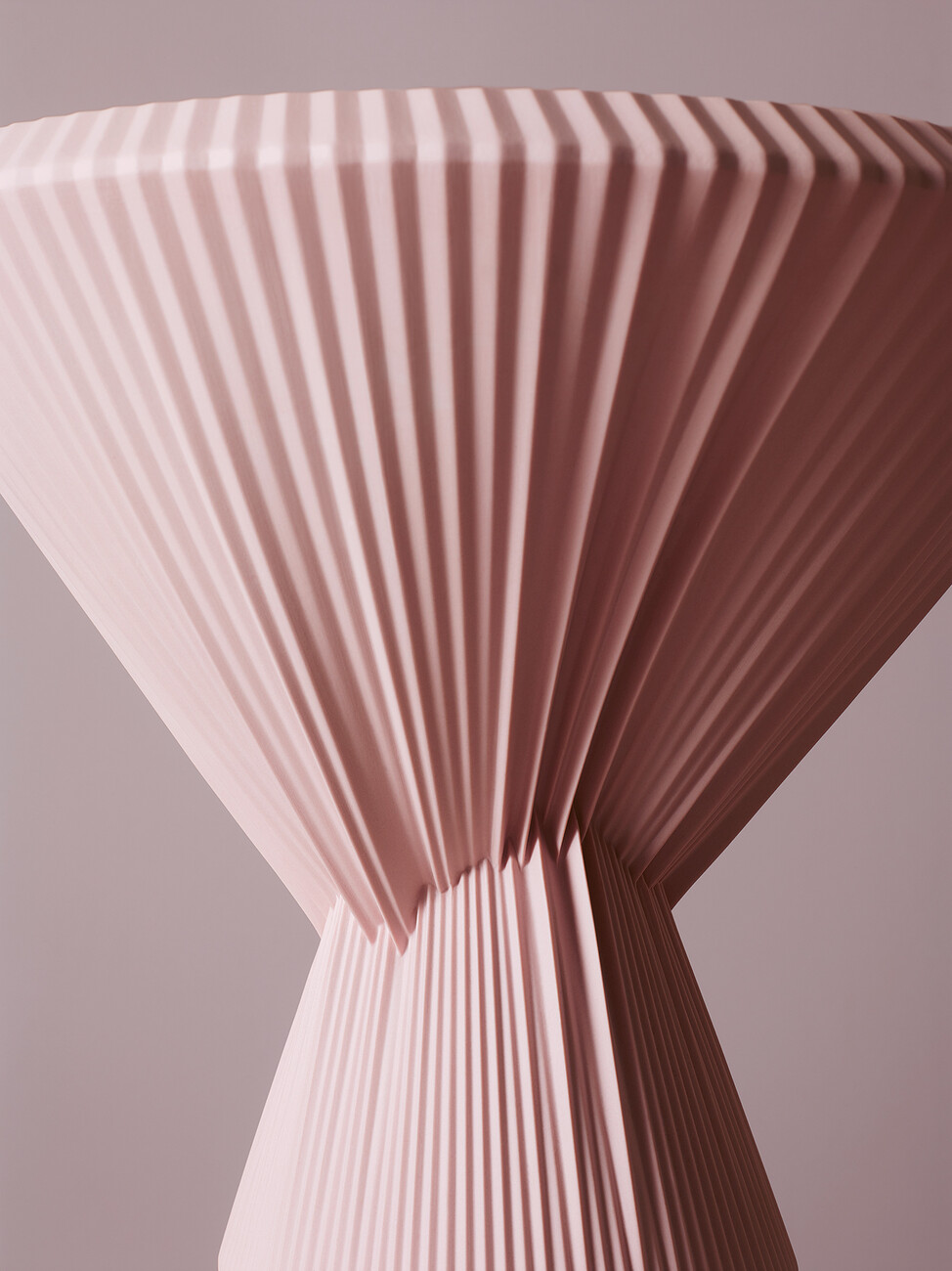
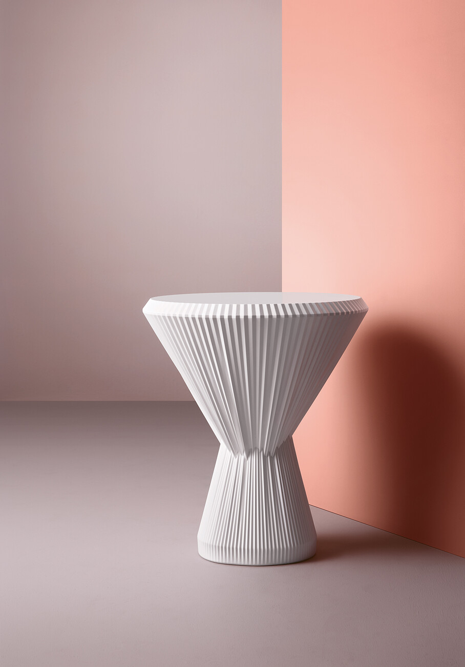
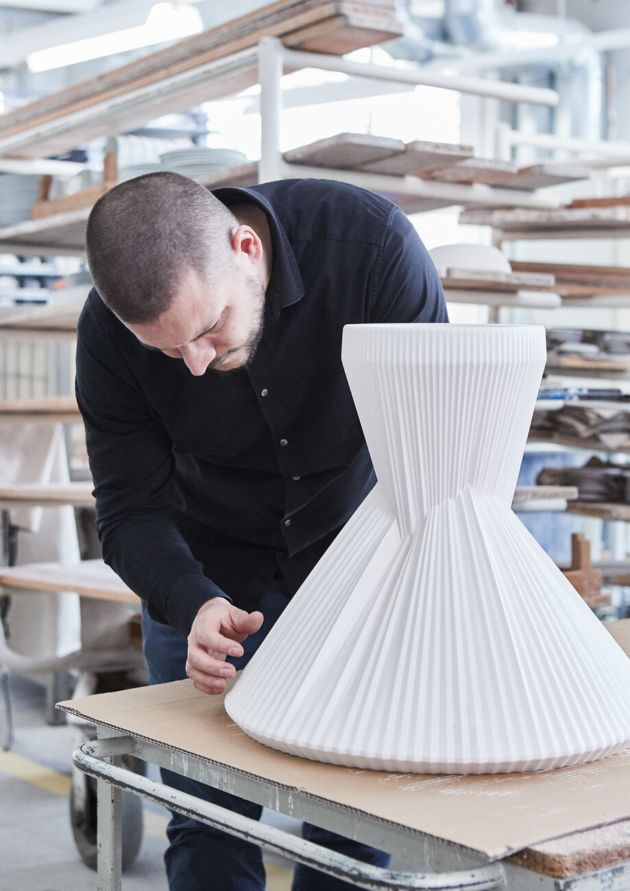
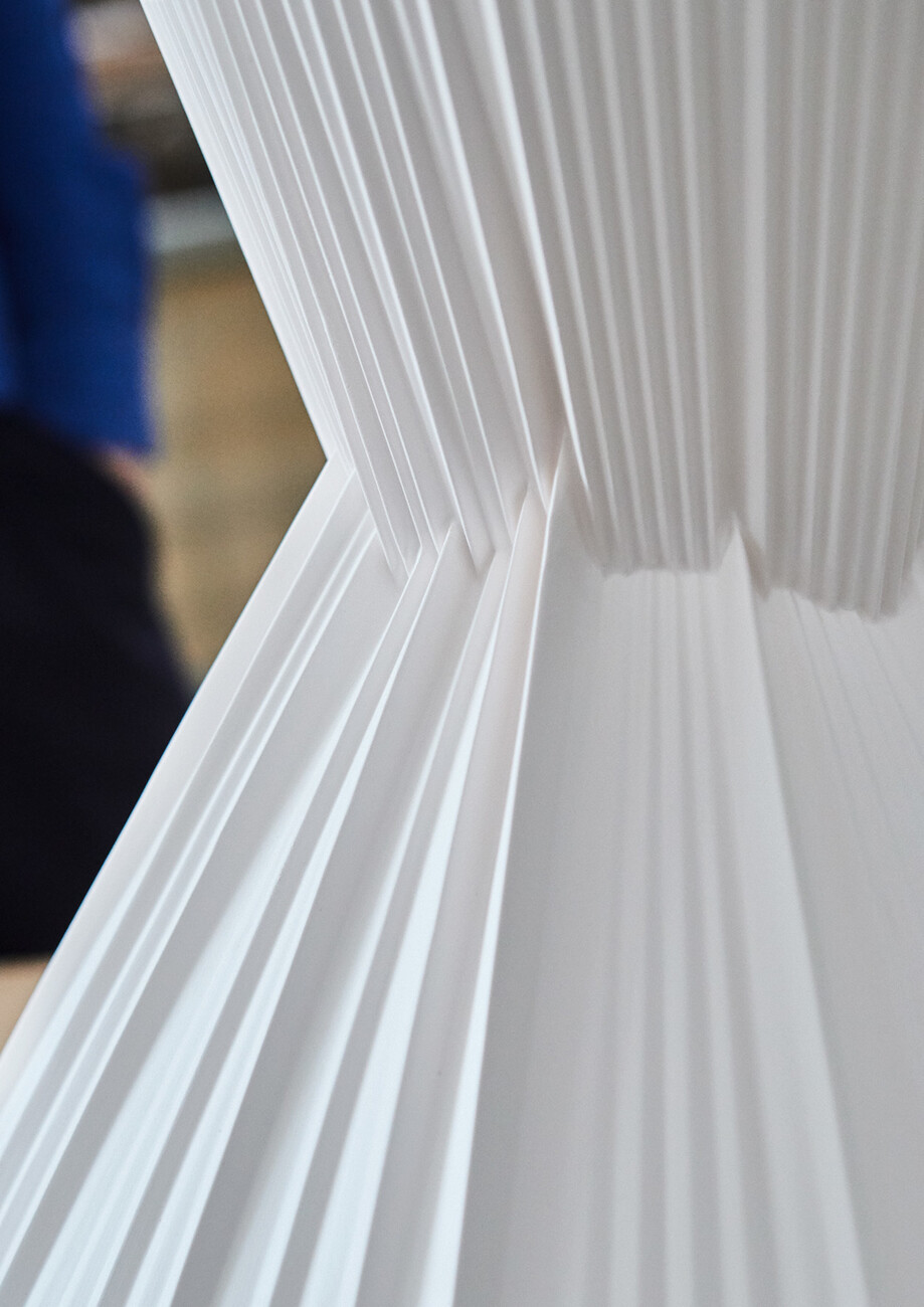
And there is always a twist to their work – as with the unusual “MOA” baskets for kkaarrlls: With an unusually large diameter of 130 centimeters the baskets consist entirely of elastic thread in various colors and resin – making them both sturdy and lightweight. Besau Marguerre love experimentation yet this is not immediately apparent in their designs, which do not appear coarse or unfinished but are inherently consistent. “Plisago” for Fürstenberg is a hybrid made entirely of porcelain and featuring two stacked intertwining cones. The surface top is diamond-cut which ensures it is very sturdy. Given a pleated look and a matt glaze “Plisago” toys with what we are accustomed to seeing, the porcelain appears soft and fabric-like. “In this project we explored the boundaries of the material,” says Eva Marguerre. The next step was to translate “Plisago” into wall shelves; other projects with Fürstenberg are to follow.
Telling stories
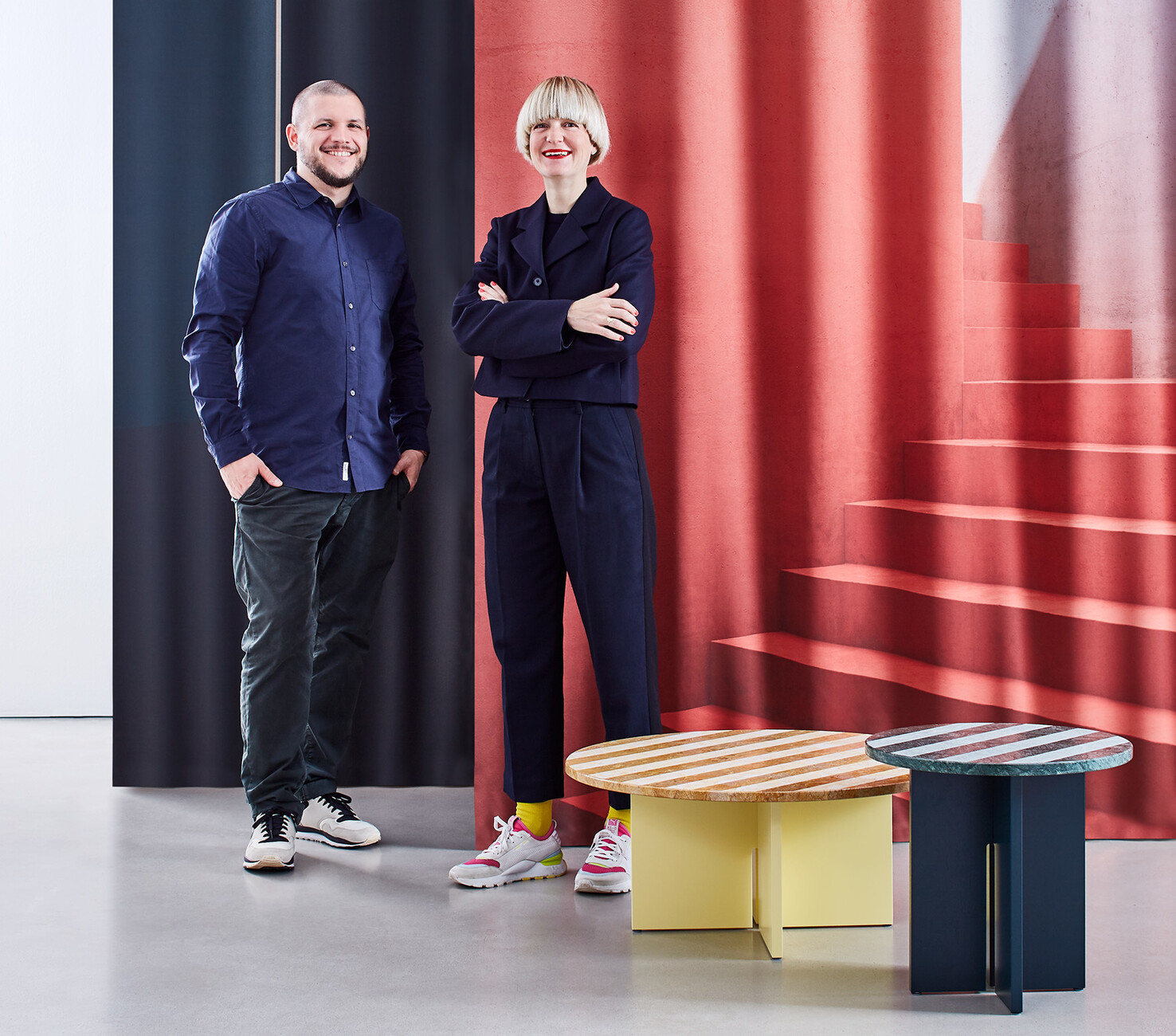
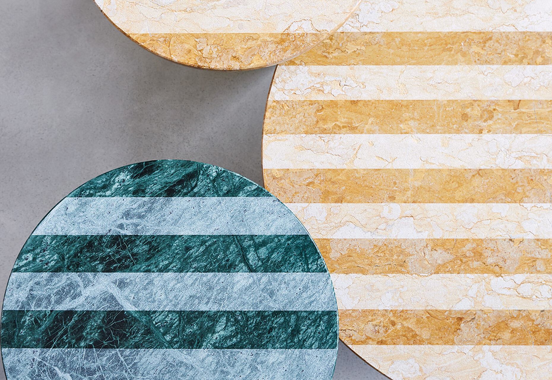
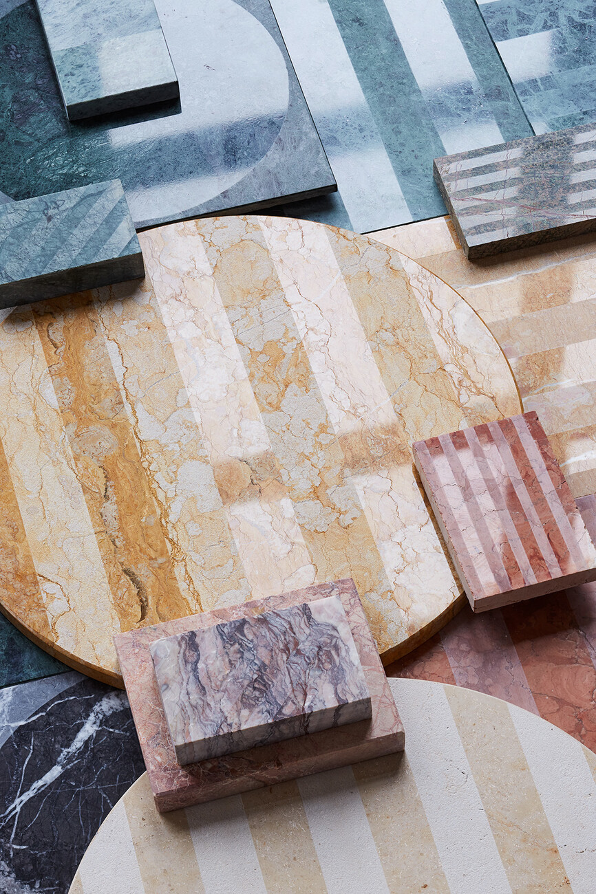
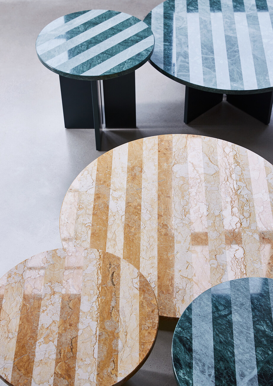
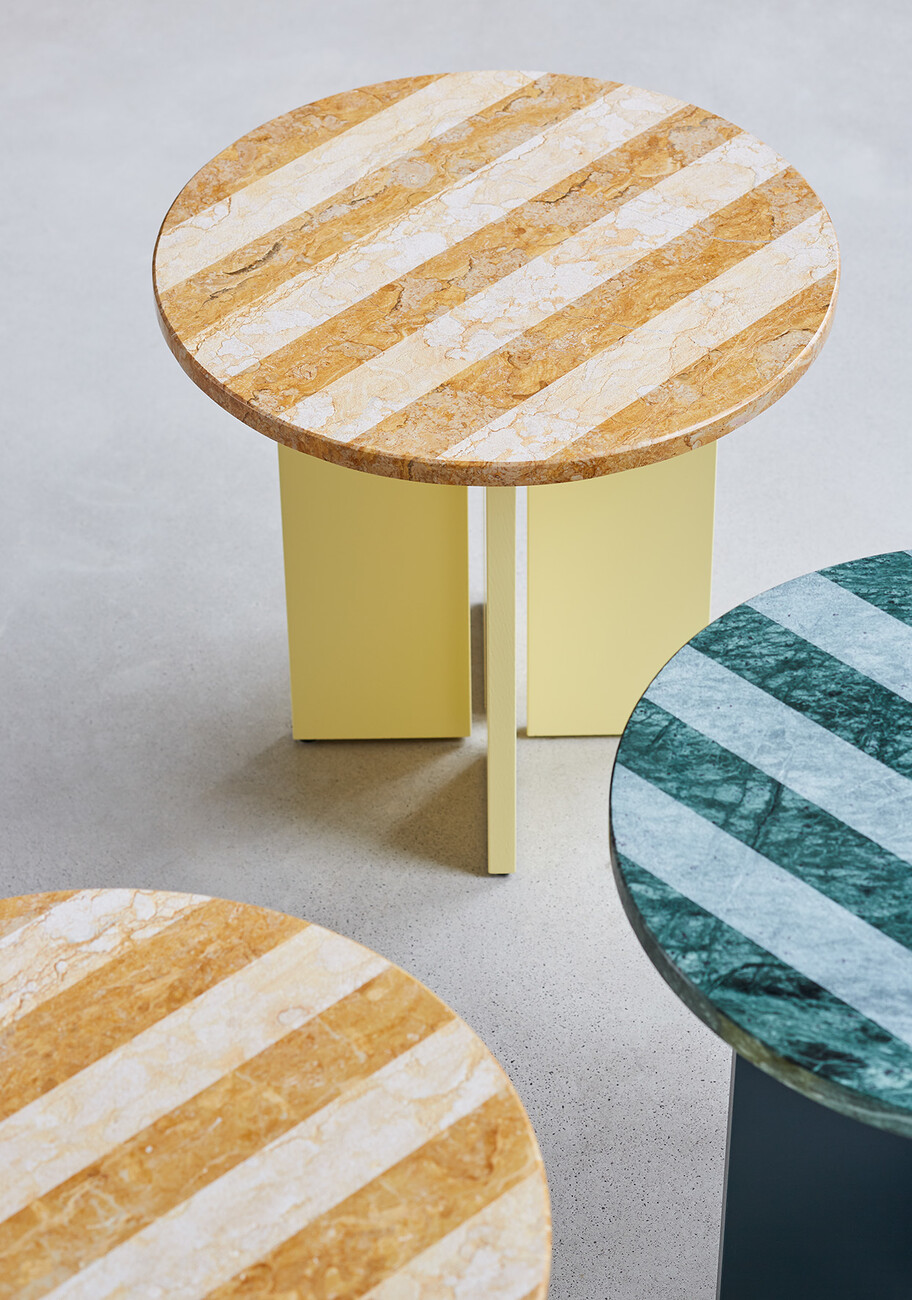
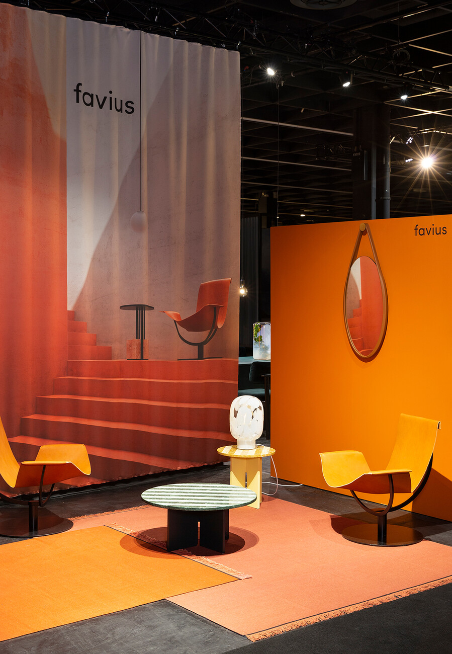
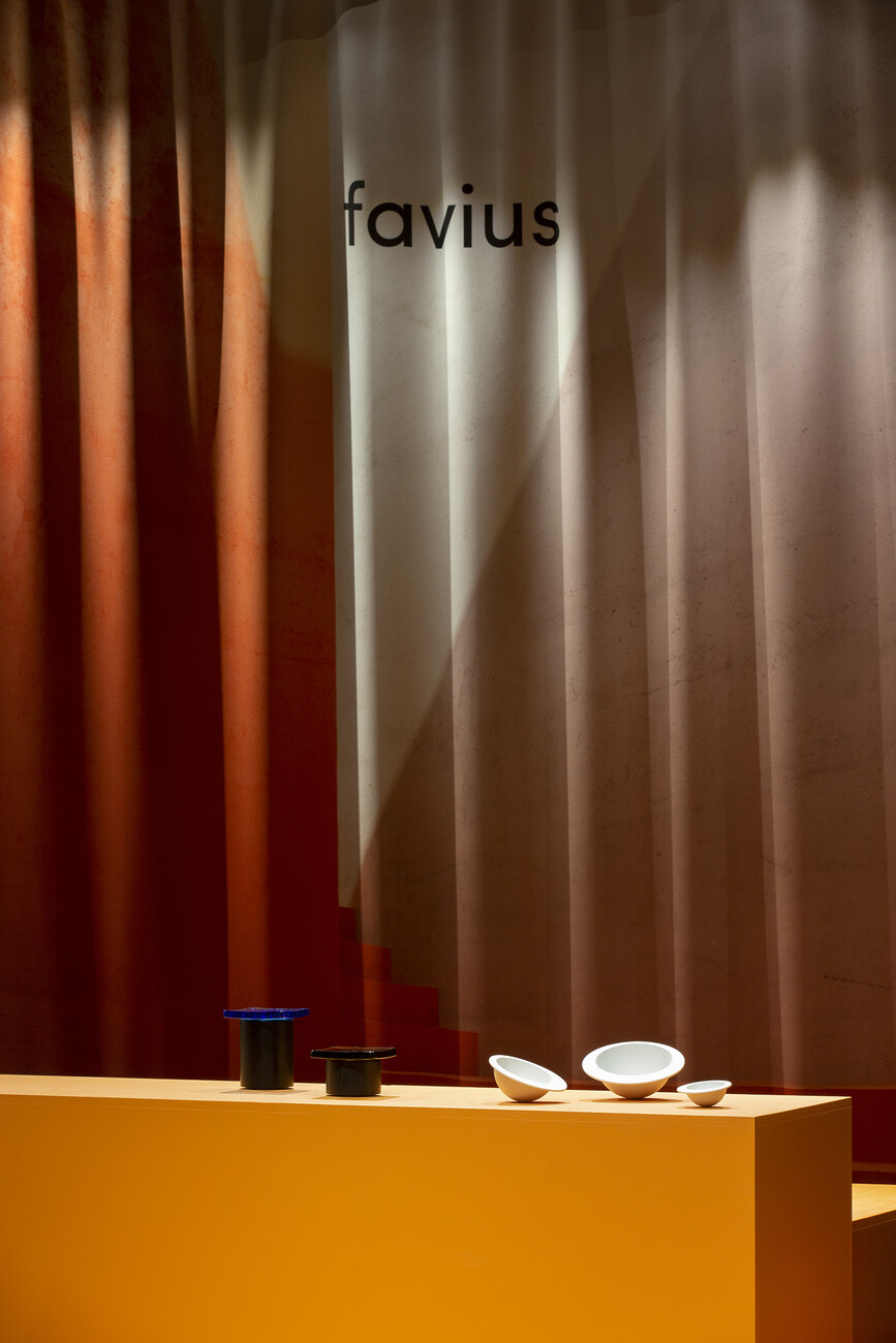
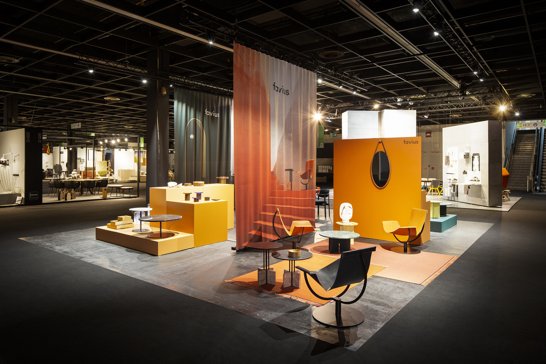
For imm cologne 2020 Besau Marguerre designed the open exhibition stand concept for the new “favius” design brand. Just a few elements were used in the installation to underscore how the manufacturer interfaces between art and architecture: Printed curtains divided the area into sections for new items, living, sales and shop presentation. Two color scenarios in cognac and dark green and the elegant presentation of the products offered many different perspectives. “Through our contribution we can be involved in shaping the route ‘favius’ takes, and we find that really exciting,” related Eva Marguerre. A product of their own design was also showcased on the platforms, namely the marble “Sediment” side and coffee table, the title alludes to the surface’s resemblance to precisely such a layer name. It visualizes Besau Marguerre’s exploration of the possible surface treatments of the material marble. Smooth and rough sections of the marbles “Giallo Reale” and “Verde Guatemala” in green and golden yellow alternate and form tops in two sizes resting on straight bases of lacquered oak. “We were given a very general briefing and the freedom to experiment to our heart’s content,” says Eva Marguerre.
In all their installations Besau Marguerre attach great importance to a harmonious combination of colors and materials. “You can’t simply impose any old color on every space,” explains Eva Marguerre. The duo also relied on this credo when developing the retail concept for the Vitra showrooms in Asia-it is already being rolled out in individual stores. Vitra recently opened its first store (of seven) covering 200 square meters in Kuala Lumpur. Bright colors alternate with bare concrete walls, while green plants and curtains lend the free spaces a cozy feel. “The challenge was to transport the history and spirit of and the idea of the Vitra Campus to the Asian market,” says Eva Marguerre. And adds: “With each and every project our knowledge grows and the sheer variety of our projects keeps us thinking afresh.
