Sharing replaces sirens
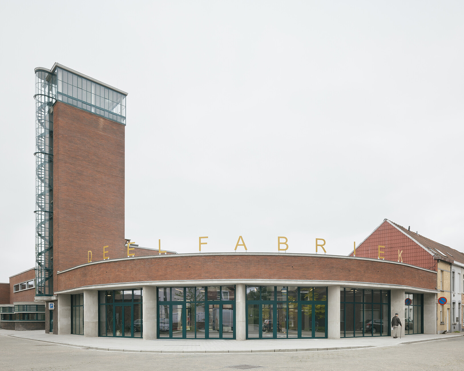
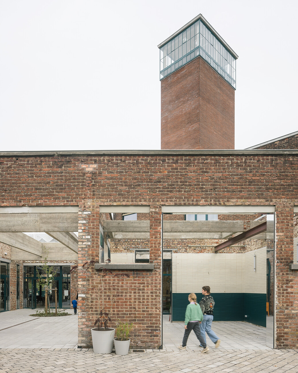
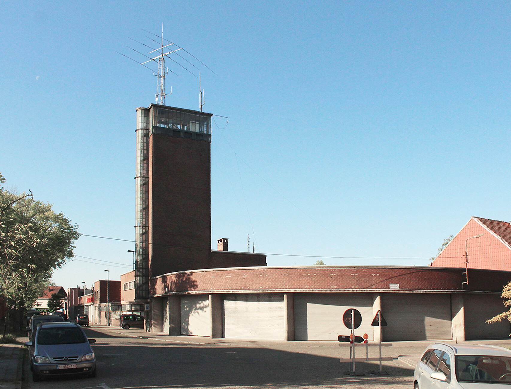
What a beautiful building! you can’t help but say as you approach the old fire station in Kortrijk. It’s located just a few hundred meters from the central station and its tall, slender tower can be seen from afar. It is reminiscent of an early Modernist church tower, sleek and angular, and topped with a transparent dome that now houses an artwork of curving LED strips which glow in the dusk.
The abandoned fire station
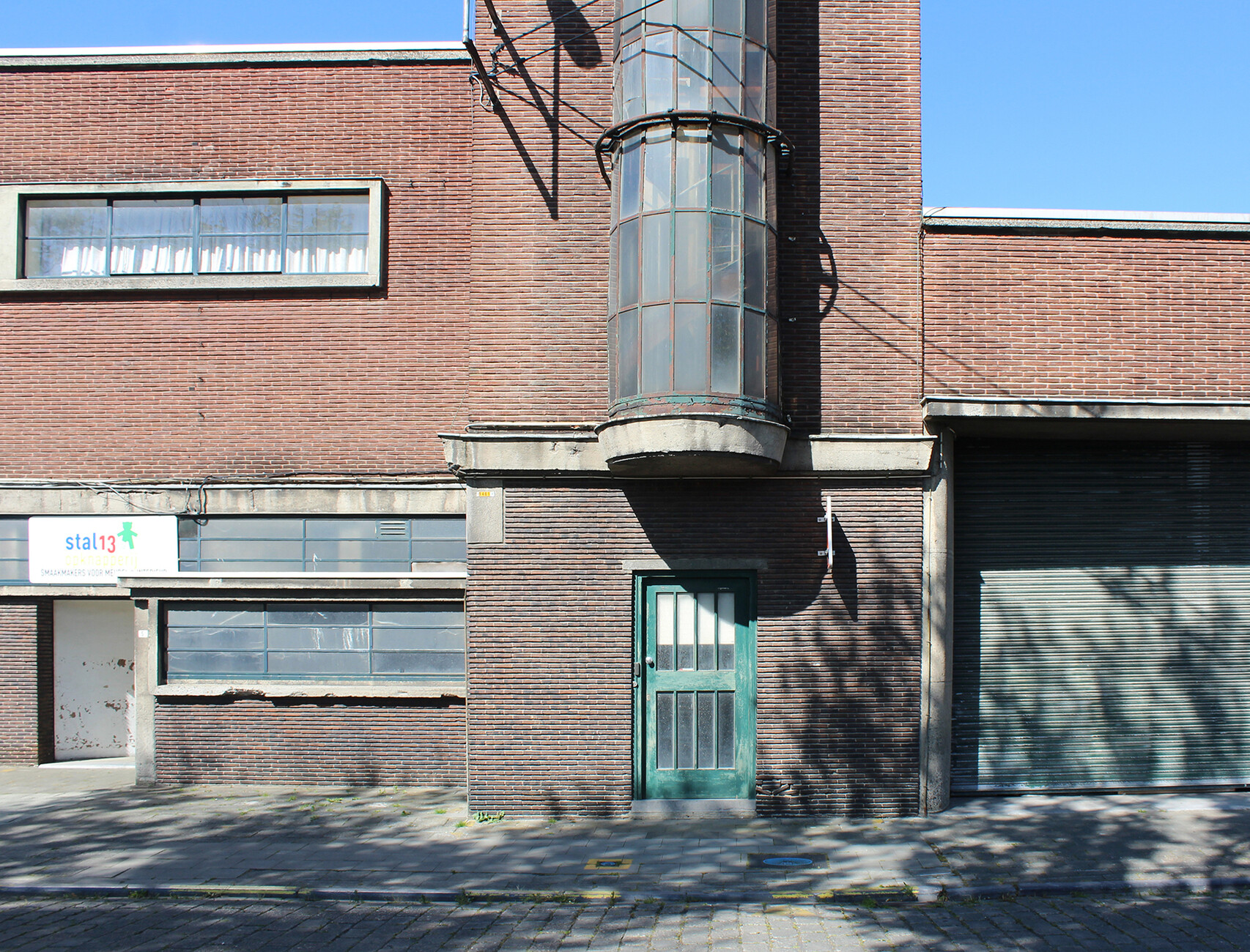
The old fire station dates back to 1940. The building is flat and elongated, and vivaciously occupies one corner of a road junction. It is a Modernist building through and through: The dark brick facade emphasizes the horizontal by a long strip of windows in a light gray concrete frame. On the ground floor, following the line of the street, sweeping flying roofs span glazed workspaces. Facing the crossroads is the old truck shed, and it is from its semi-circular sweep that the fire brigades once rushed out through the six large roller doors. However, the days of the sirens and flashing blue light are long since over. By 1982, the fire station and the firetruck shed had become too small and the fire brigade moved to larger quarters. The beautiful fire station served the volunteer fire department as a simple pump house and was used as a general warehouse by the local authorities. However, in 2003 it was placed under a preservation order, putting a swift stop to any talk of demolition.
It wasn’t until the second half of the 2010s that a viable proposal for a new use was tabled. In 2017, an initiative emerged as a loose coalition of several associations which focused on sharing, swapping, repairing, and making all kinds of things themselves and to this end set up the first “Deelfabriek” (literally: “Parts/Share Factory”) in an old warehouse. It was open to anyone who had something to swap or share. Self-help workshops for bicycles, children’s toys or buggies, swap shops for second-hand clothes, books or board games quickly sprang up. Materials, fabrics, or tools could also be donated or borrowed, used, and swapped for little or no money. Within a very short space of time the warehouse was bursting at the seams. The initiative approached the city authorities and presented a concept for transforming the old fire station, which they already had their eye on.
Only as much architecture as necessary
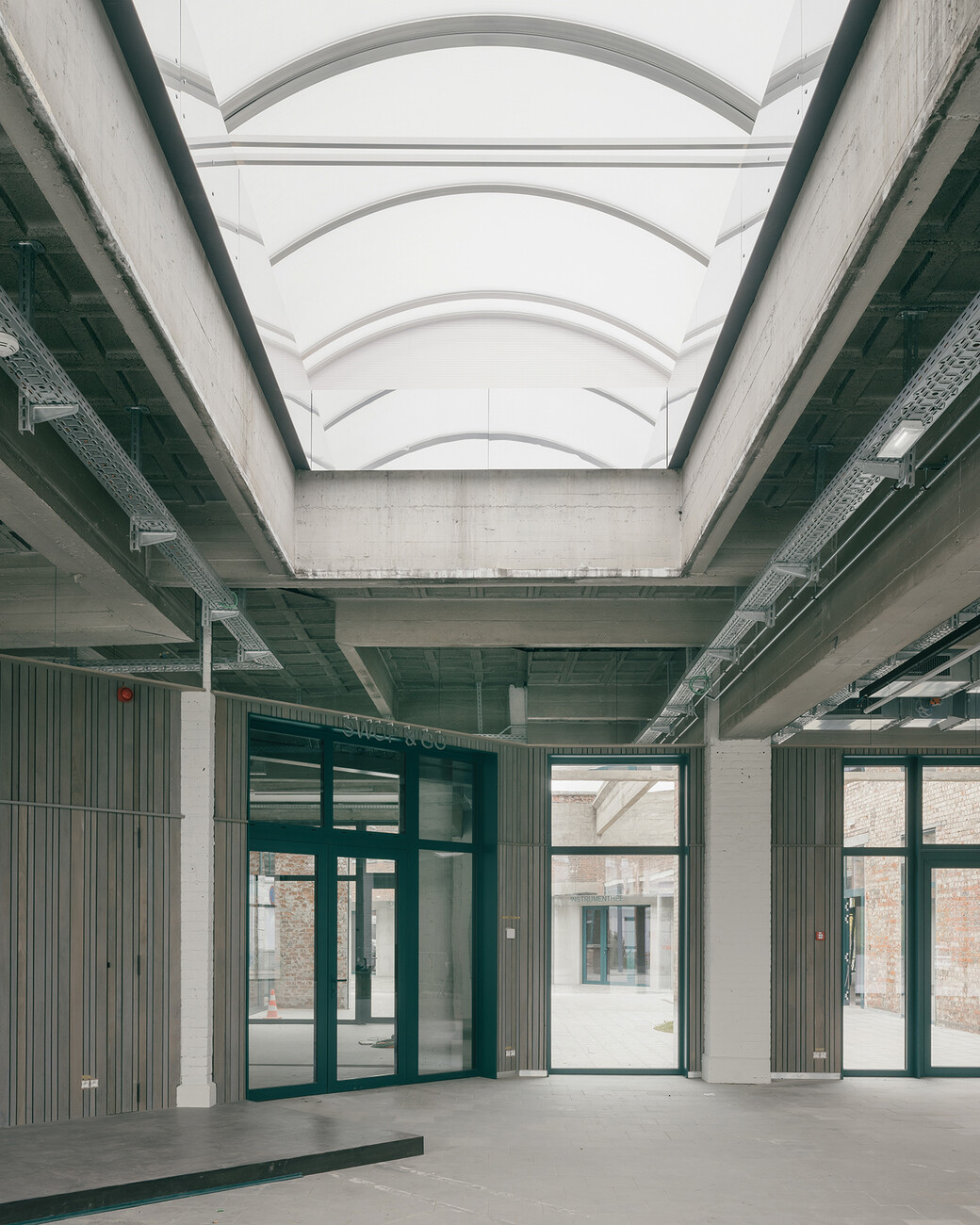
The city authorities were won over and launched an architectural competition. It turned out that the fire station’s spatial layout made it perfectly suitable for what Deelfabriek had in mind: A series of small workspaces for the clubs and groups in the building lining the street, while larger rooms around the shared inner courtyard make ideal workshops. Added to which, the large truck shed with its impressive concrete roof full of skylights functions as a new “market hall” which opens directly onto the sidewalk through the roller shutters.
The competition was won by Carolien Pasmans and Bram Aerts of the Atelier for Transformative Architecture & Masterplanning, or ATAMA for short. Their design demonstrates great architectural sensitivity as they are particularly careful in handling the existing building and considering the clearly-articulated wishes of the people who will be using it. Sometimes architects overdo it and think they have to come up with their own ideas. However, in Kortrijk the buildings along the street and the truck shed were revitalized extremely sparingly, with the measures being more repair work than restoration. Only as much was done as was necessary to render the rooms fit for use. A wall was removed here, new technology was installed there – cable ducts and pipes remain exposed, and the materials used for the walls remain exposed. The architecture merely provides a robust frame – at any rate the people using the building can do the rest better themselves with their arsenal of tools, ideas, and volunteers. The ultrathin spiral staircase which leads up the side of the tower and is encased in its own glass tube is finally visible again thanks to new glass panes, while the spectacular glass space at the top of the tower offers a sweeping, panoramic view out over the low-lying city and can now be used again for small events, workshops, or yoga courses. At the moment it is not exactly sure how this will work in practice as much is still in the experimental stage of trial and error.
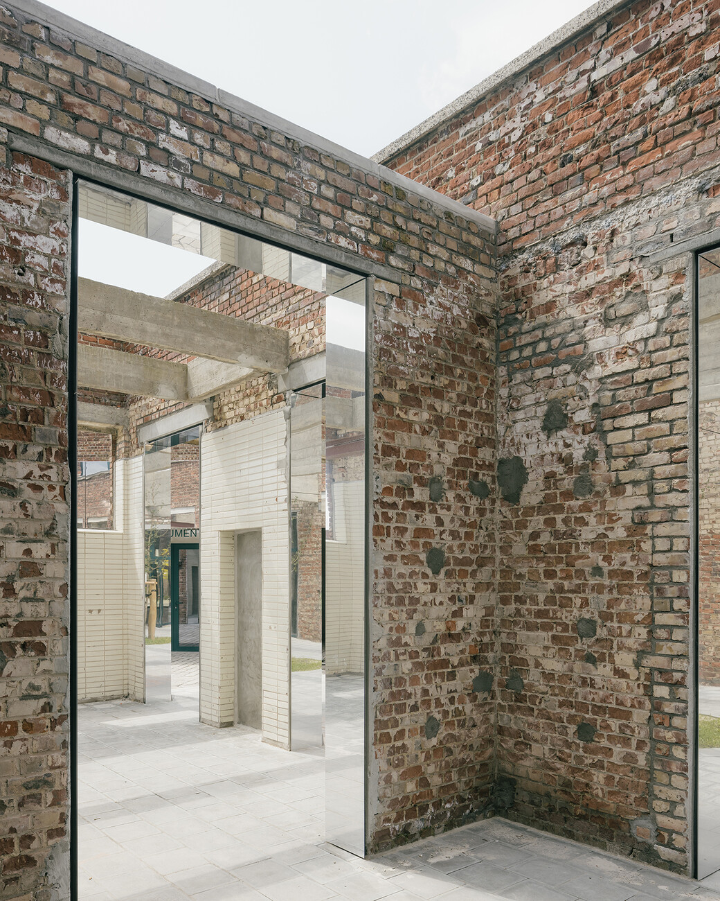
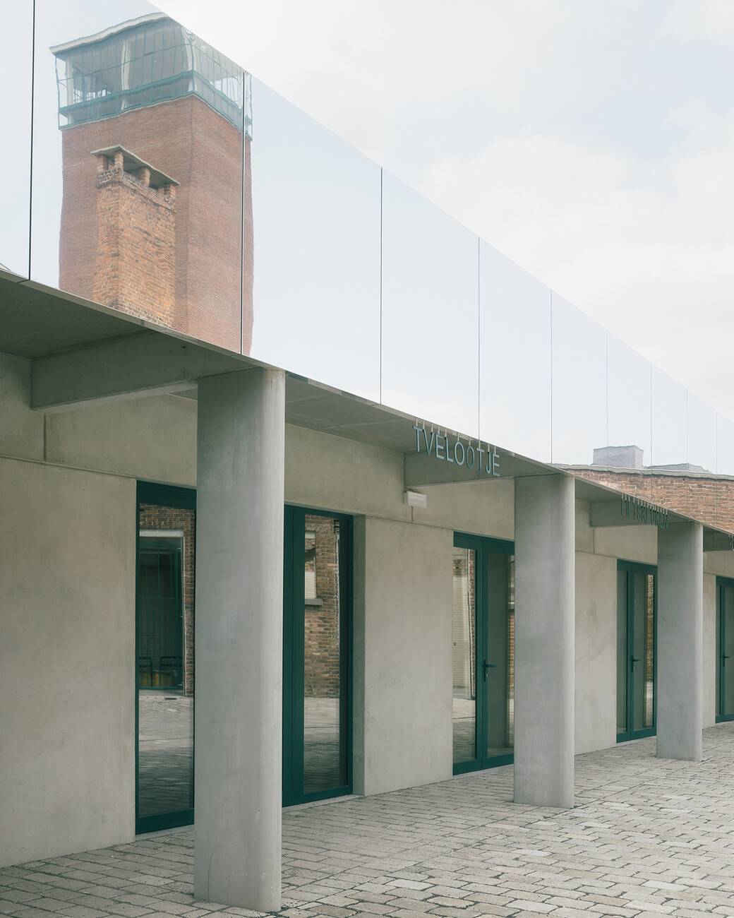
That said, major interventions were required around the inner courtyard at the rear. In order to create the space for workshops and stores, the existing building was first straightened, cleaned, and freed of all kinds of fixtures that had accumulated over the decades. One side wing was extended and the other shortened to create a clearly-defined, spacious courtyard. Each room has its own entrance to this courtyard beneath a new, simple colonnade. The name of the respective organization is displayed above the entrances in curved, illuminated lettering – which in turn ties in with the curved work of light art at the top of the tower. The architects only allowed themselves a single gag: All around the new courtyard the surviving fragments of the old fire station and the parapet above the colonnade have been clad with polished metal strips that reflect their surroundings. The result is a cheerful jumble of all manner of reflections, duplications and superimpositions of people and spaces that make the courtyard appear even larger.
Minimum intervention, maximum use
A building has been created with relatively little effort and a modest budget of 3.1 million euros that is now extremely open in nature and above all public, such as the city has never known before. Visitors and regular users enter the communal courtyard through the large entrance at the new market hall. Cyclists and delivery vehicles use what was once the side entrance, which is wider. The courtyard is already buzzing with activity; there are people repairing bicycles or putting up tables for a shared meal. Already, the very synergies that it was hoped would be created are visibly at work: People get talking about the one or other topic and so it’s not only materials that are swapped but also thoughts, which in turn leads to more new idea. The local press is already talking about an “alternative department store”, which could finally provide an alternative to the old temples of commerce that simply lurch from one crisis to the next. That in itself is cause for hope. You might argue that what belongs together has come together here: a wonderful idea for repurposing a beautiful building in a way that is proving to be extremely productive.
