Placed in the right light
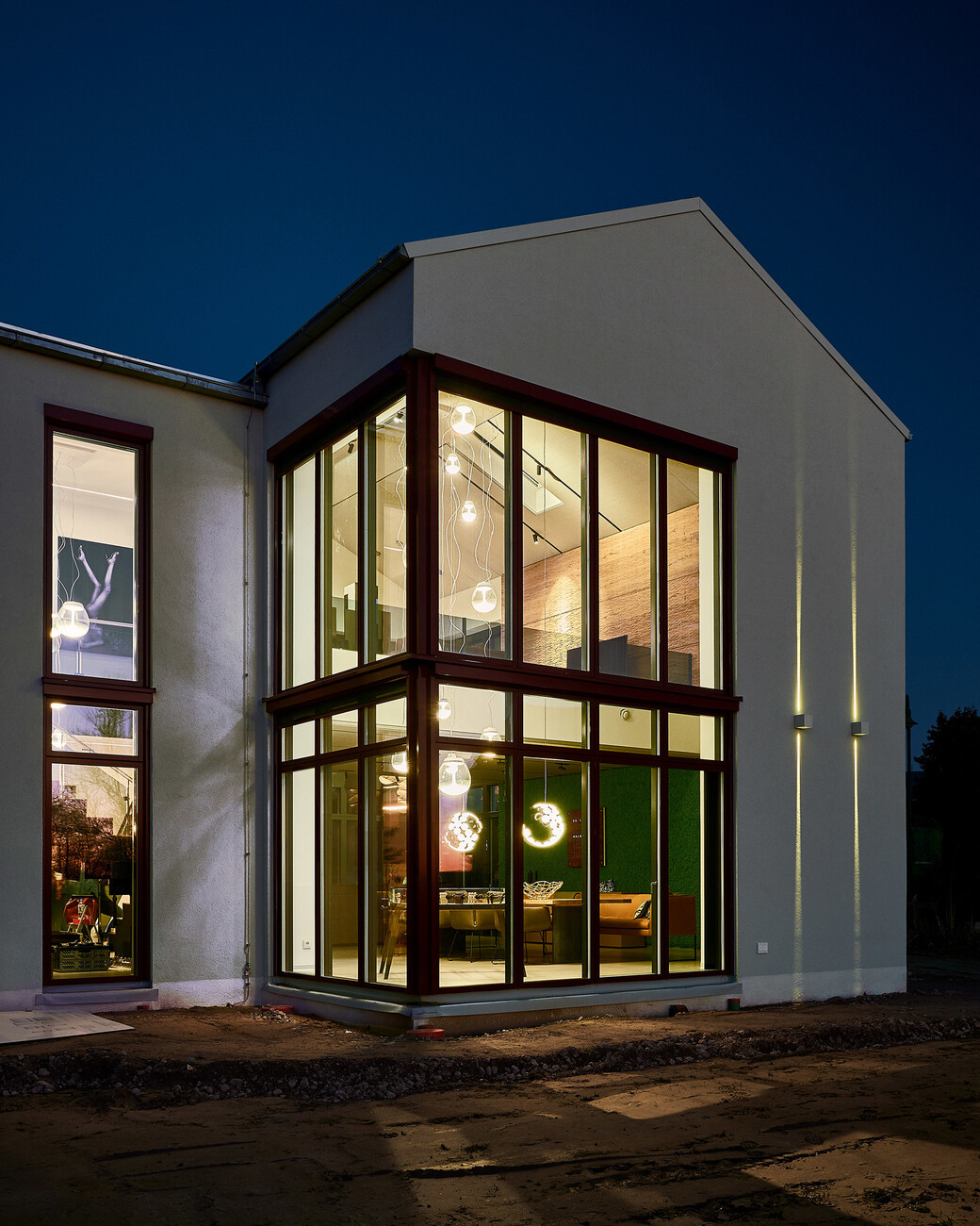
The client wanted her new home near Lübeck to be bright and spacious with a modern and open feel. However, she insisted the interior should not appear cool or spartan, but rather cozy and varied. Every area of the house was to reflect the occupant’s love of nature and be given a highly personal note both by relying on material and color accents as well as individual lighting. Ultimately, the interior designers at raumideen (based in Iserlohn) and the lighting experts at Artemide came up with a concept that perfectly transfers the client’s ideas into actual design elements.
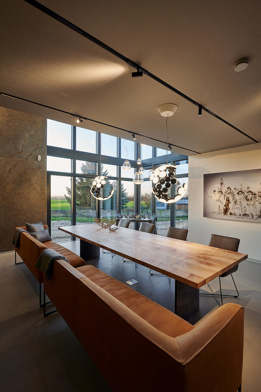
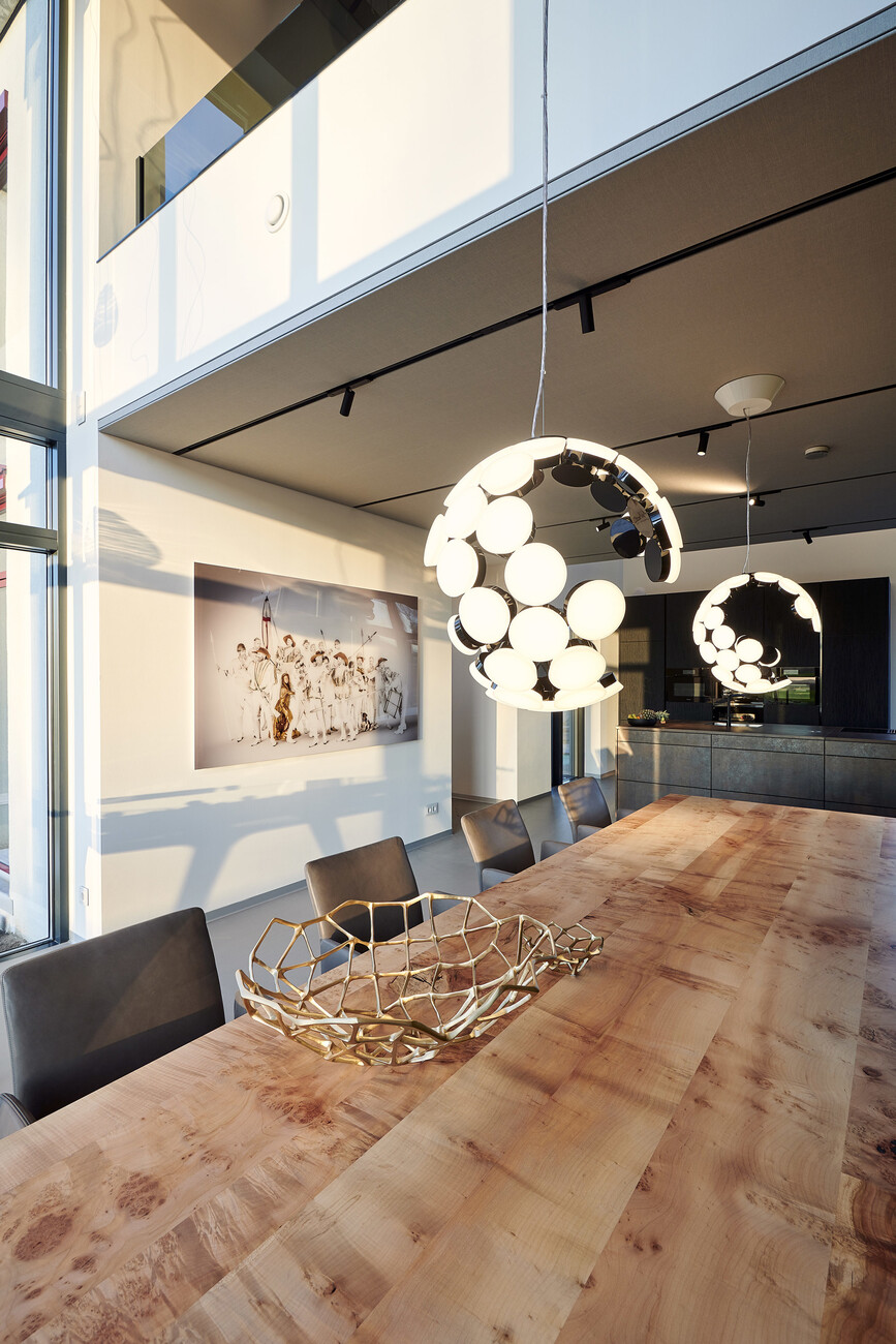
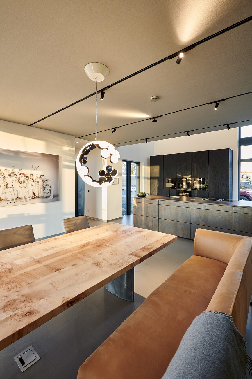
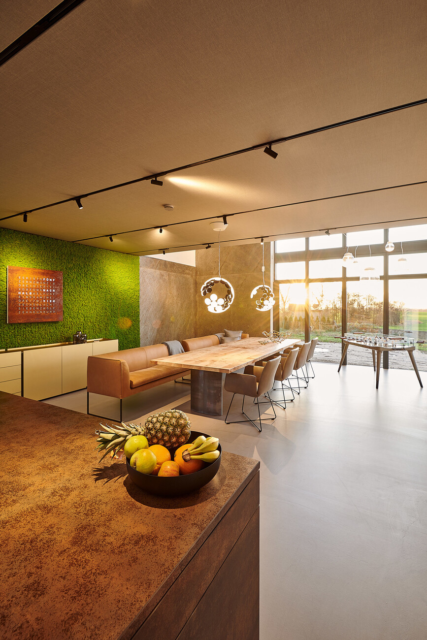
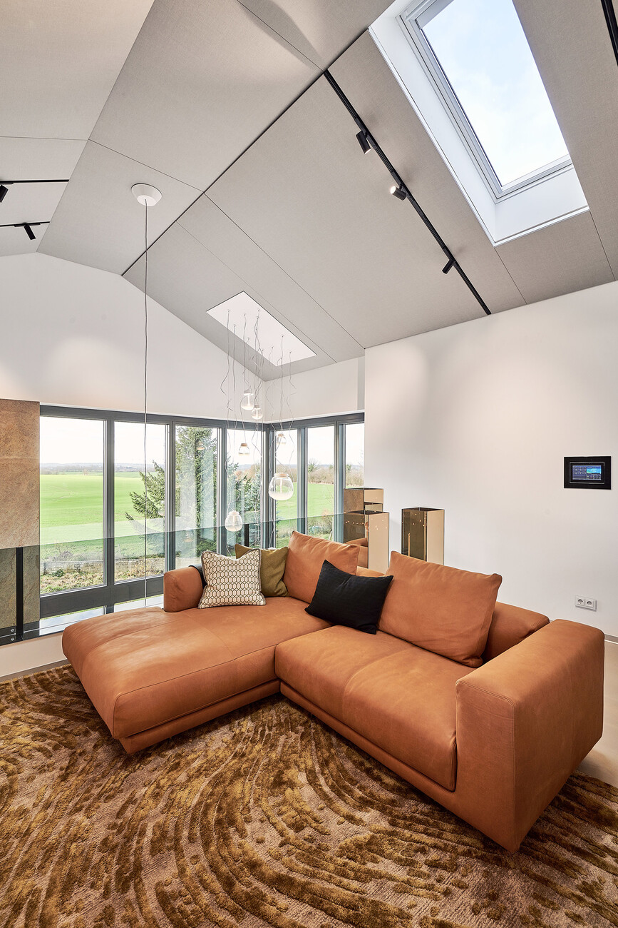
For example, the kitchen units appear to be made of rusty steel, a look inspired by a shipwreck off the coast of South Africa. The dining area adjoining the kitchen is dominated by an enormous table of bird’s eye maple, while a color contrast is provided by a wall of moss. The space behind the dining table extends up to below the roof ridge with ample light supplied by glazing extending over two storeys. On the upper level, a large gallery and living room opens out onto to this miniature atrium. Here the interior designers have created a cozy, calm retreat using wood-paneled walls, a large natural brown leather sofa and a rug whose structure and color recalls a forest floor.
A highly versatile lighting system
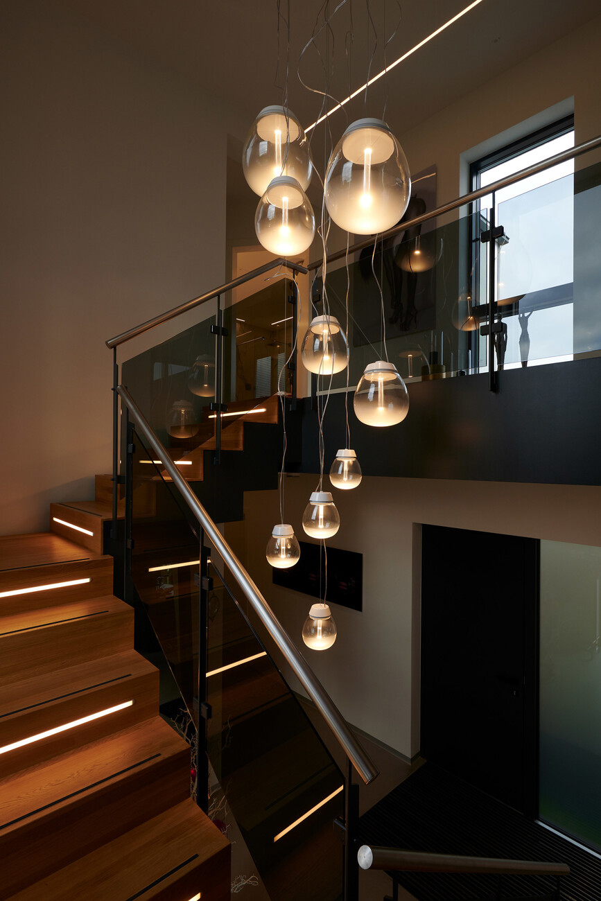
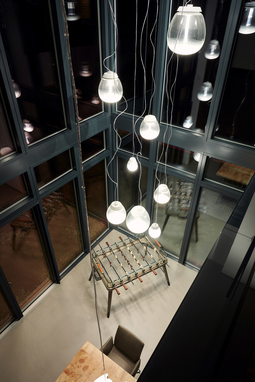
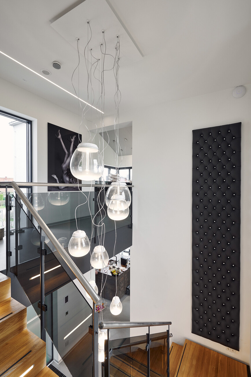
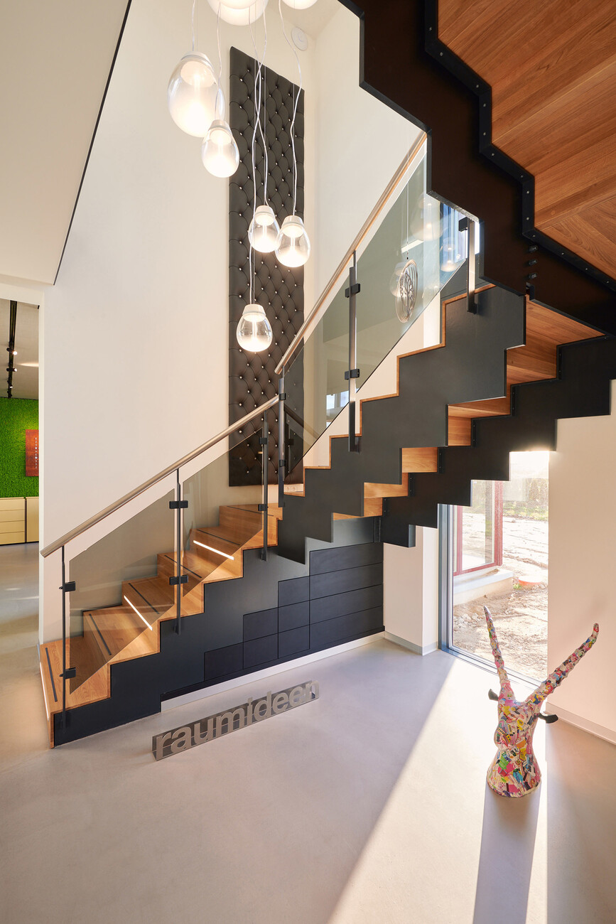
Providing suitable lighting for high, open spaces can be awkward, while such settings present lighting planners with particular problems. So raumideen decided to clad the ceilings and slanting ceilings with material-covered acoustic panels. The magnetic tracks of the “A.24” lighting system by Artemide fitted perfectly into the joints between the panels. This system provides the fundamental structure for the lighting and not only accommodates Vector Magnetic spotlights for direct light but also diffuse light sources for general lighting. Individual areas are lit by selected design luminaires by Artemide. Above the large dining table, for example, are two “Scopas”– a suspension model designed by Neil Poulton, in which LED discs combine to form a fragmented sphere. The interior designers made a striking statement by hanging evocative hand-blown suspension lumnaire “Empatia” in various sizes like a bunch of grapes in the eight meter airspace – a feature that is repeated in the stairwell.
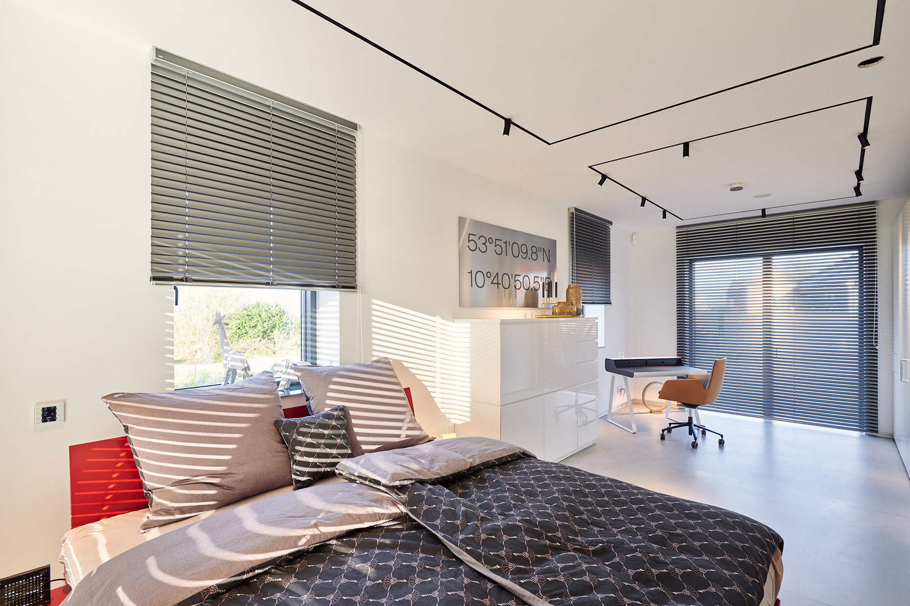
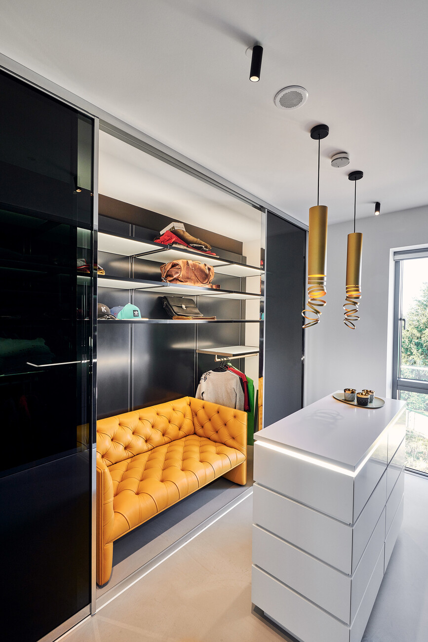
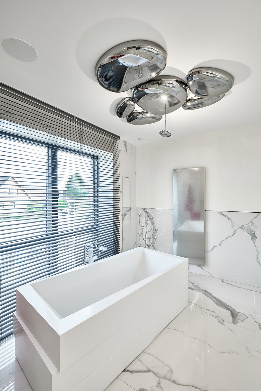
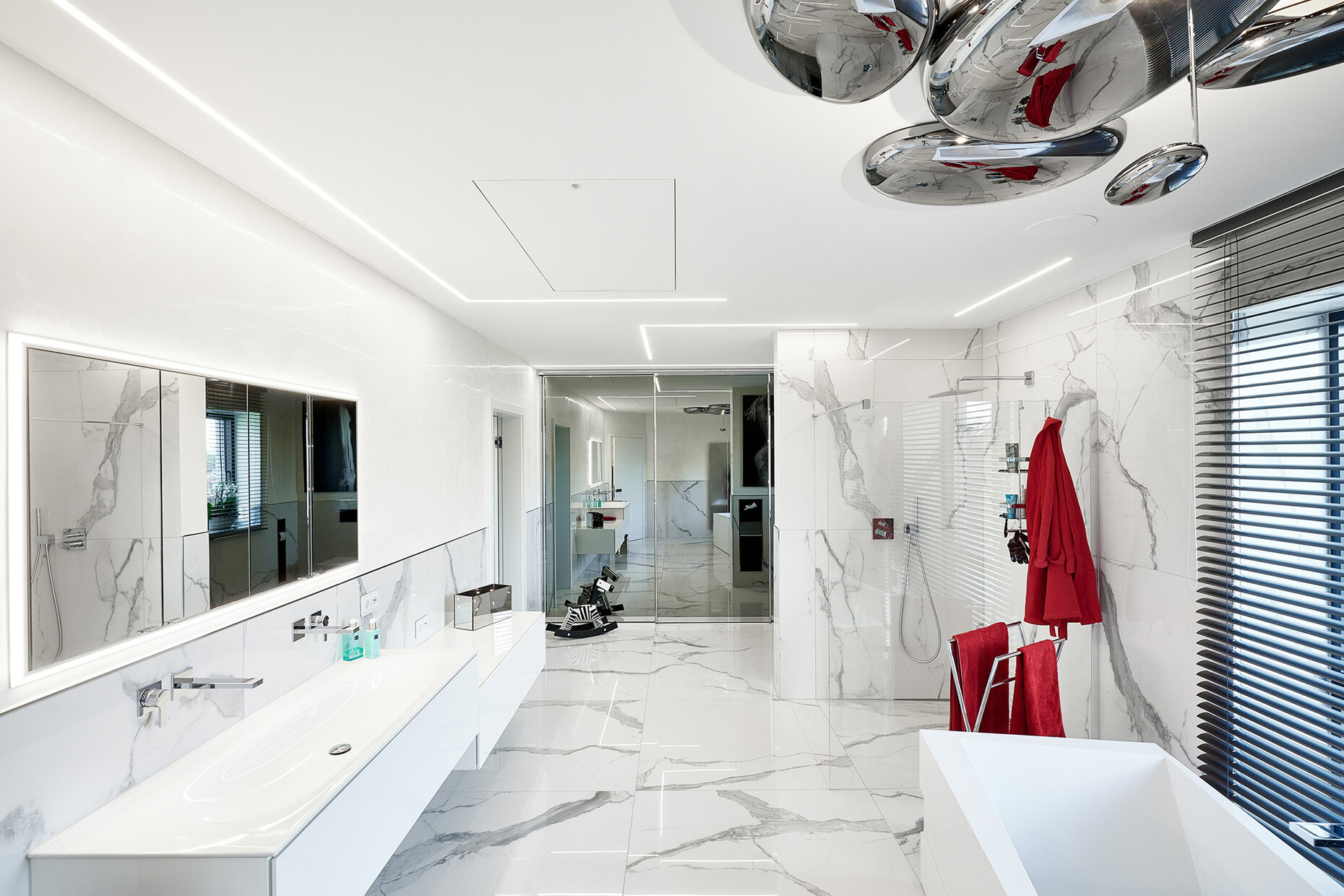
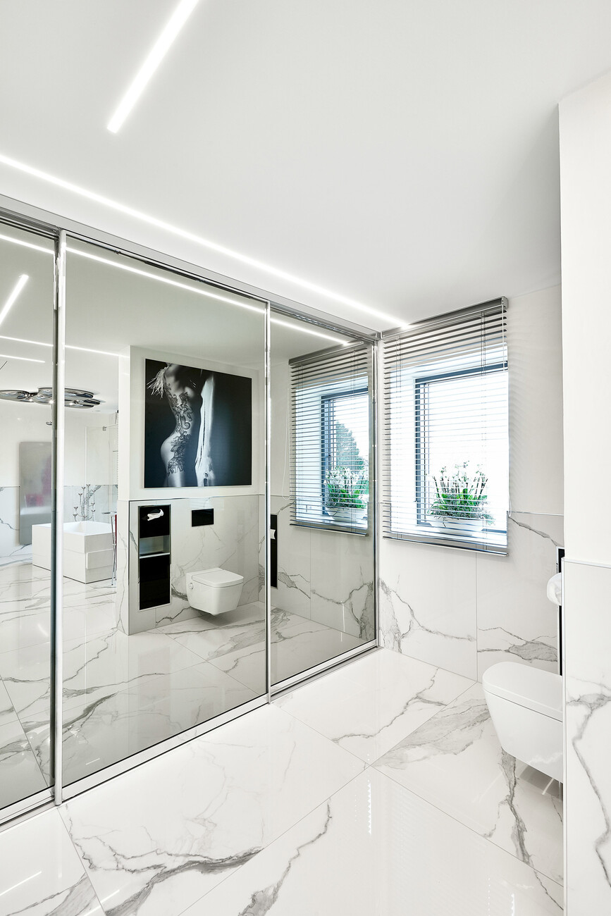
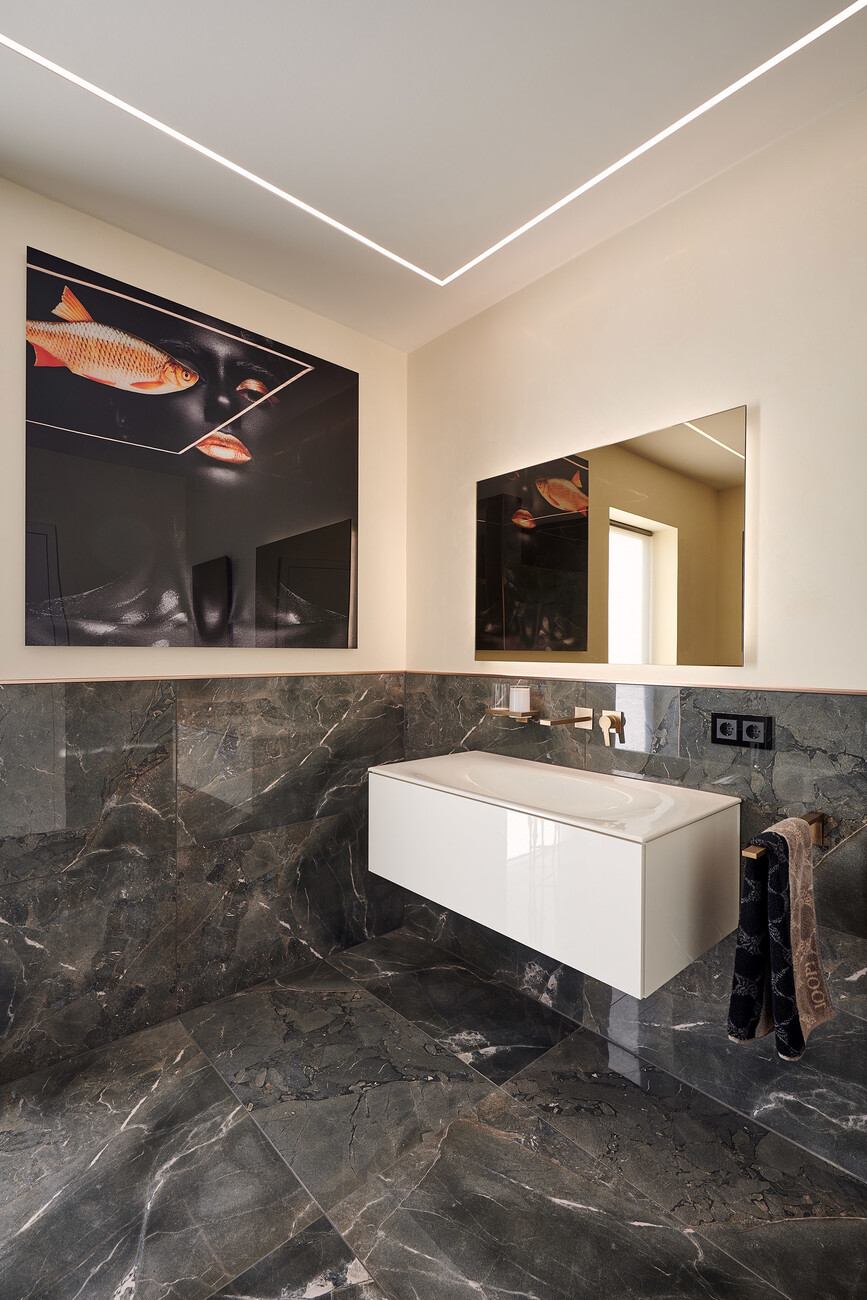
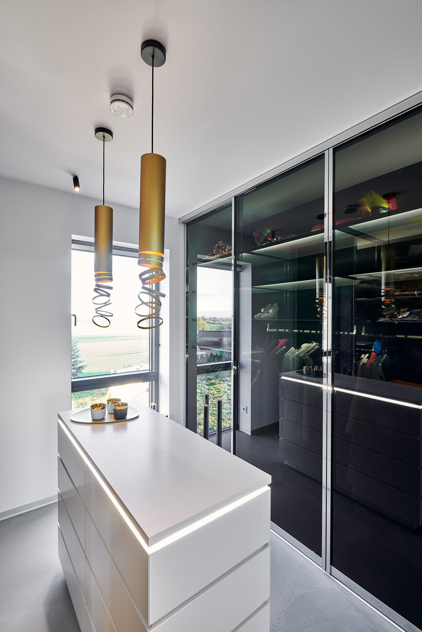
Similarly, in the bedrooms, dressing rooms and bathrooms raumideen uses the “A.24” lighting system by Artemide. In the master bathroom this is complemented by “Skydro” by Ross Lovegrove, an organically-shaped luminaire that is installed to great effect above the free-standing bathtub. By contrast, for the dressing room they chose the whimsical suspension luminaire “Decomposé” that Atelier Oï designed for Artemide. Thanks to its golden yellow color it corresponds beautifully with the original Chesterfield sofa that graces this room. Needless to say nature plays the main role in the bedroom with greenery visible through the large windows. The lighting system “A.24” and the minimalist standing luminaire “Mimesi” make unobtrusive complements to the setting, providing ideal light when it is needed. The all-round lighting concept for the new house also included the outdoor area. Here the wall luminaires from the “Effetto” series and the lighting system “Dedalo” places the house in the proper light.
