Anyone wanting to gain attention in the media needs images. And this also applies to the architecture business. But it simply takes time to produce architecture, meaning that media climaxes are few and far between, and basically only happen once the building has been commissioned. So it can’t hurt if in-between temporary buildings can be used to reduce the chronic shortfall in attention. They are interim stages that provide distraction, and a vehicle of keeping developers and architects in the limelight. And now and again, a temporary edifice, such as the Eiffel Tower or the Barcelona Pavilion, is still standing long after its planned due date.
This is not the case with the summer pavilions created by institutions such as the Serpentine Gallery or the MoMA PS1. Each year anew, they provide magnets for the “in-crowd” and stories to fill the news in the summer doldrums. At the same time, they function as a marketing instrument and a built experiment for the pavilion designers and in the age of social media have emerged as markers on the map of self-presentation for the creative industry staffers – as an Internet “I was here”. After all, a finely filtered image of or with the pavilion sheds warm, cosmopolitan light on one’s digital self, the digital images bequeathing us an image of the architecture itself. So judging by the photos on Instagram, the picture channel par excellence, what can be said about the short-lived architectures of (this) summer?

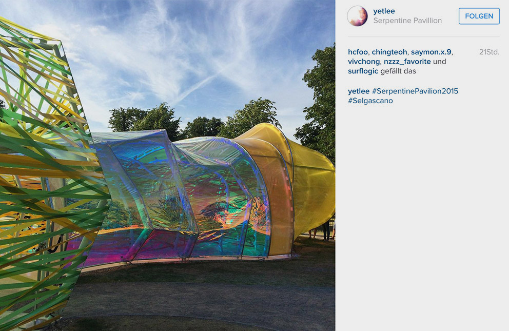
Space for self-realization – the Serpentine Pavilion by Selgascano
If one considers the Instragram images of this year’s Serpentine Pavilion, one thing becomes clear: Its shape simply eludes media images. There’s hardly an image showing a full view of it, let alone an overall impression of the polygonal structure, which from a bird’s eye view is a bit reminiscent of a rabbit warren. What is now the 15th pavilion sponsored by the Serpentine Gallery in London was devised by Spanish architects José Selgas and Lucía Cano, or Selgascano for short. It is not particularly interesting in terms of outer appearance, or at least that aspect of it doesn’t get photographed as often. While the images of voyages of discovery inside it attest to a blast of color that bring to mind the sweetest descriptions of acid trips – and tend to be portrayed in a vein intensified by photos filters. Evidently simply representations of reality do not suffice to express the visitor experience. Indeed, the Serpentine Pavilion truly lends itself to self-indulgent images (there’s a far higher number of selfies of it than of the other pavilions) as it offers sufficient motifs to present oneself in a colorful light at the very least. The spectacular swirl of colors arises from shimmering, colorful and translucent ETFE foils through which, if one looks outside from the inside, the surroundings seem completely distorted and dipped in surreal colors. Yet no one shot resembles another. The pavilion would appear, or so the images suggest, to be a festival of overlaid colors and spaces, and thus offers a concentrated experience of Selgascano architecture. Because here everything the architects have realized in their structures in recent years comes together: a space-capsule-like structure (as with their own offices), half of which has been sunk into the ground; the foil used is made of the same material that was utilized for a conference center in Badajoz, Spain; and the intense flow of colors is reminiscent of “Second Home”, a co-working space in London.


DJ with a light structure – "Cosmo" by Andrés Jaque
Unlike with Selgascano and the Serpentine Pavilion, “Cosmo” focuses on exploring spaces and tends to give the combination of “I and architecture” more of a backseat role. “Cosmo” can likewise not really be grasped as a whole. After all the installation by Andrés Jaque and his “Office for Political Innovation” for the “Young Architects Program” (YAP) at the MoMA PS1 is simply too large and too high for that. However, the images create a surprisingly homogeneous impression. The aesthetic confusion of rings, hoses and struts seemingly has a similar influence on viewers to that of a DJ up on stage. For some reason, the installation tends always to be photographed from below upwards, like some revered cult object.
Jaques’ edifice is after all, a bit of a marvel machine. Because unlike the Serpentine Pavilion, where architects can practically do whatever they like, the YAP sets certain parameters. The installation has to highlight an eco-specific aspect of building, must be able to be taken down with no waste, and of course provide shade, seating, and water, as the Website would have it, and a great scenery for parties. Cosmo can apparently purify 3,000 gallons of water without requiring power or chemicals, relying only on bacteria and plants to this end. Thanks to its wheels, the elegant water purification plant can practically be placed anywhere you want. None of which can be gauged from the photographs. These primarily offer views of sections from ostensibly aesthetic angles, which results in images of a lot of concept and a little well-conceived architecture. Thus, on Instagram Cosmo mainly looks like a stage set for events. Specifically at night, the pavilion has something extraterrestrial about it. For parties, it glows and gleams in a mysterious light – and would certainly have blended in well at the “Burning Man Festival”.


A forest of hashtags – KA300 by Jürgen Mayer H
Possibly the British and US Instragram users differ from their German counterparts, as the shots of the pavilion Jürgen Mayer H designed in Karlsruhe seem far less playful. At any rate, these distanced photos don’t really convey any sense of joy with architecture. Although maybe this can be attributed to the stiff and massive wooden structure of the slanting pavilion that the Berlin-based architect came up with for the 300th anniversary celebrations of the so-called “half-timbered town” – and which prompted the photographers to distance themselves from the building.
The pavilion is reminiscent of a forest of hashtags and everyone can recognize its appearance. No spatial surprises to be expected here; one image is pretty much identical to the rest. Whereby photographers like to focus on the architectural details, e.g., on how the slanted columns and beams are connected. No sense of spatial discovery trips, perceptual studies or party feeling here. It would seem that the structure is too much of a sculpture for that – and as such does not furnish a good backdrop for selfies or shots suitable for the social media.


Museum bubble – "Ode to Osaka" by Sverre Fehn
The images of Sverre Fehn’s Pavilion in the Norwegian National Museum of Art, Architecture and Design in Oslo seem very museum-ish: lighting that doesn’t vary and precise compositions rather than impromptu snapshots. This may be attributable to the fact that the Nordic Pavilion Fehn designed for the Osaka World Expo in 1970 stands inside the museum (itself a Fehn design) rather than outdoors. After all, it is a museum piece. The uncluttered images, often bereft of humans, present an amorphous space with walls made of soft, opaque material. The outside world can only vaguely be discerned when you are inside this bubble. It is consciously meant to be kept out, or at least the polluted air of the world, or so Fehn’s idea back then, when he sought to make certain people at least enjoyed clean air in his bubble. Otherwise, nothing happens in the pavilion: no selfies, no events – the space is enough in itself; the museum as venue itself makes sure that visitors keep their distance.


Does one need especially photogenic architecture to attract attention in the social media and thus to ensure images spread? An architecture that also helps the photographer take the limelight? If one considers the immense number of images made of or with one of these edifices, then one might be prompted to answer in the affirmative: Under the hashtag #serpentinepavilion2015 you can now already find almost twice as many images as of the prior year’s pavilion. Smiljan Radić’ obelisk was somewhat modest in spatial, visual and haptic terms compared with Selgascano’s wash of glimmering colors, to put it nicely. And the architecture of the KA300 Pavilion by Jürgen Mayer H and Sverre Fehn’s good-air bubble seem not so impressive. Both are simply visual one-liners, their spatial and material structure swiftly grasped. What they evidently lack is the requisite Wow effect, that extravagant and surprising touch you need to ensure something spreads virally in the social media. Which leaves the question: Is there a type of architecture best suited to the social media? Probably not. But whosoever seeks attention in the digital channels requires a form of architecture that celebrates the heterogeneous and offers any number of opportunities for self-presentation in the architecture and through it.


