Architects in commercial estates
For those with an appreciation for the aesthetic, commercial estates can be considered the seedbed of the ugly. They are landscapes of concrete and box-like buildings of colored corrugated iron, which we only drive through in our cars; furniture stores, garden centers, DIY superstores and fast-food restaurants are all glimpsed in passing and all that distinguishes them is the color of their closed walls and gigantic logos. There might be a few sad-looking office buildings dotted in-between where a few unfortunate staffers sit out 38.5 hours every week. Even the gas stations stopped years ago trying to find an architectural expression for a new, floored-pedal era. Their efforts were engulfed by fast consumption.
Building Ugly
If you walk through today’s commercial estates with open eyes your blood will curdle. But strangely nobody’s screaming. Apparently the view has already become so much a part of normal life you no longer actively perceive it. For our eyes are blinkered. Beauty is elsewhere. That’s just how it is. And perhaps this is why so many people want to see a return to the beauty of historical old towns. If the industrial buildings where we do our shopping no longer have a facade as such, we would like to think the new buildings in the old centers are nicely dressed in historic garb!
Sometimes the familiar non-design of industrial buildings is employed as criticism in a debate. For example, in Berlin recently the Herzog & de Meuron design for the “Museum des 20. Jahrhunderts” at the Kulturforum was quickly derided as a Lidl store because of its robust saddle roof look. Criticism clearly meant as an insult. So, “Lidl store” is already meant to spell the epitome of cheap, non-designed shapeless, introverted ugliness, which we silently concede a globally operating company, but do not want to experience in a museum
Façade competitions
Yet, even in downtown areas we have not been able to escape the ignorant attitude of suburban consumer worlds for some time now. As a means of protesting against it perhaps, some years ago the German journalist Harald Martenstein spoke out in the “Zeit” – in light of a newly-opened pink colored shopping mall on Alexanderplatz - for “architectural travesties” to be included in the statute book as a crime. He wanted to be able to call the police not only to report unacceptable noise levels or pollution, but also on account of ugliness. The responsible architects and owners were to be arrested and punished with a jail sentence not under two years, he suggested in his polemic.
Does that mean architects are also to blame for the visual wastelands of consumer culture? In the case of the shopping mall it was the renowned Ortner brothers who still have not come out and said clearly whether this pink facade is to be seen ironically or post-ironically. If the case came to court the defense lawyer would plead they were only responsible for the façade; Portuguese developer Sonae Sierra had the entire interior created by his own architect, but the City of Berlin urged the investor to hold a competition for the design of the façade. Subsequently, the winning design by the Ortners was altered and modified again and again when built. What then can architecture achieve if its influence is limited from the outset to a superficial decorative minimum?
At least in Germany, the façade competition is a frequent compromise reached between local authorities and investors. In Berlin for instance a large DIY superstore recently planned to build a large, new drive-in store on Kurfürstendamm. On the western, highly unglamorous end of the boulevard in West Berlin the structure continues as a bridge over the inner city autobahn and Berlin’s LRT. Beneath the bridge - wedged exactly between motorway and tracks - lay a long strip of land. There can be no objections to the industrial use of an urban island so buffeted by traffic – but it was evident that this building would be highly visible. Every day while on the train or stuck in gridlock thousands of commuters and travelers would stare at the box both from the train or their cars. So a façade competition was arranged.
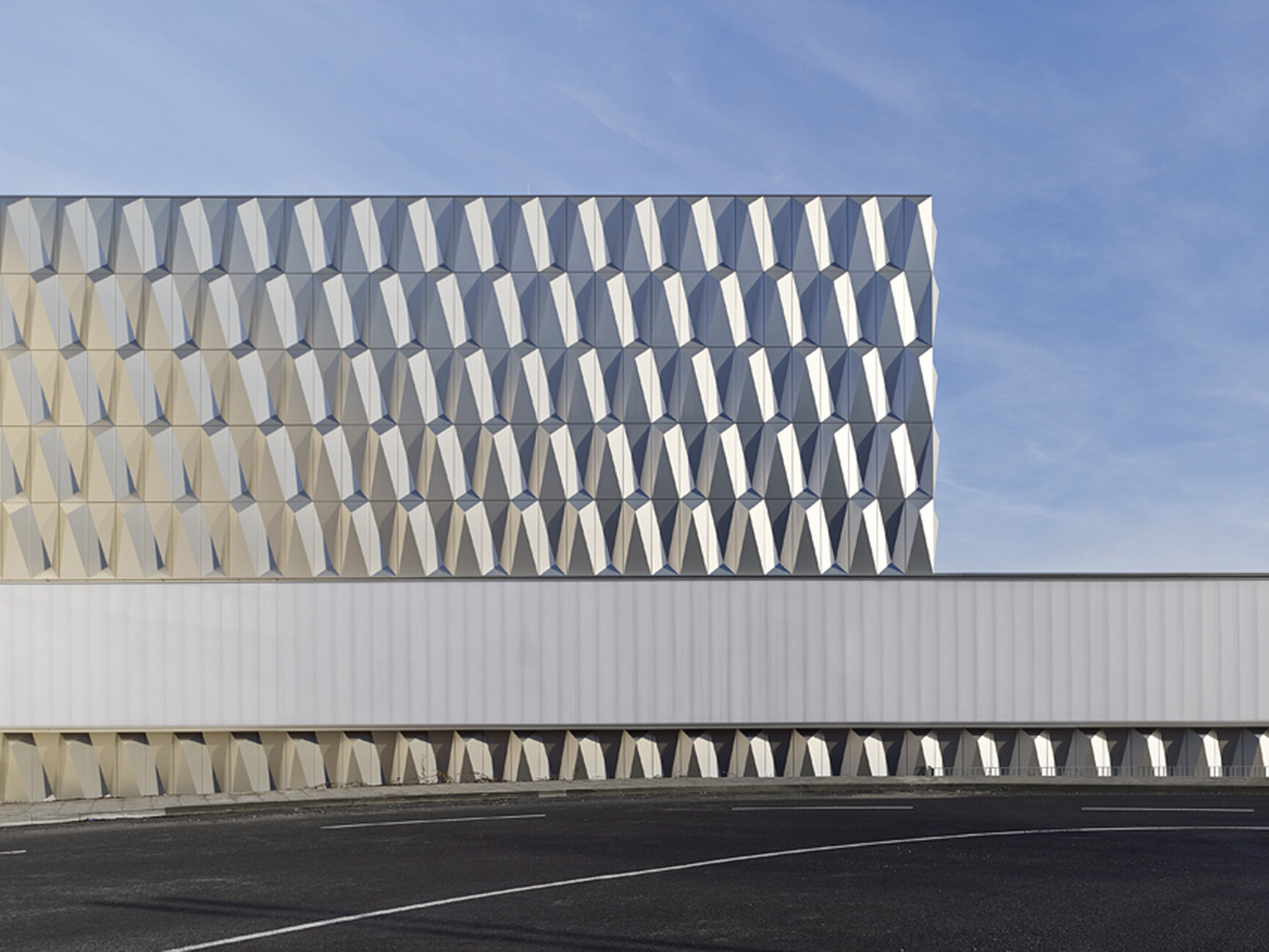
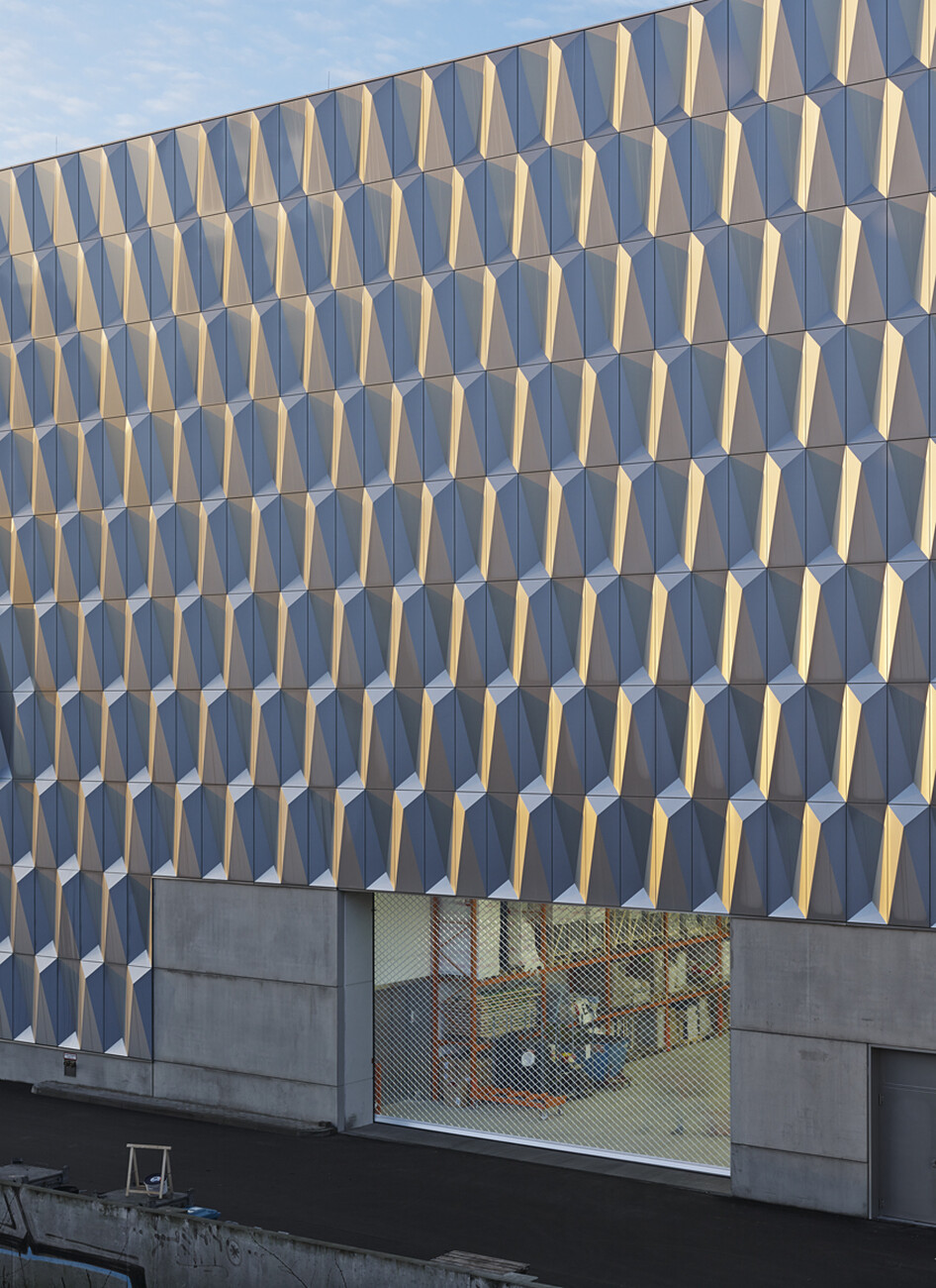
Winner of the competition Müller Reimann Architekten, compensated for the restricted scope of their design task by resorting to all manner of optical tricks. The large volumes of both buildings (one on the road bridge, one as a store and warehouse on the southern end of the plot) are concealed behind a slightly sculptural aluminum facade, which both provides sound proofing and is an attractive eye-catcher. As it reflects the light so it alters its color and appearance depending on the time of day and season – the changing light is witnessed by passengers and commuters. Similarly, the logo and advertising banners were integrated into the design to create an amazingly calm and subtle overall impact – a sharp contrast to the usual façade designs, which in keeping with advertising industry guidelines endeavor so stridently to attract the attention of passersby and customers by using brash colors.
Electronics store as urban interface
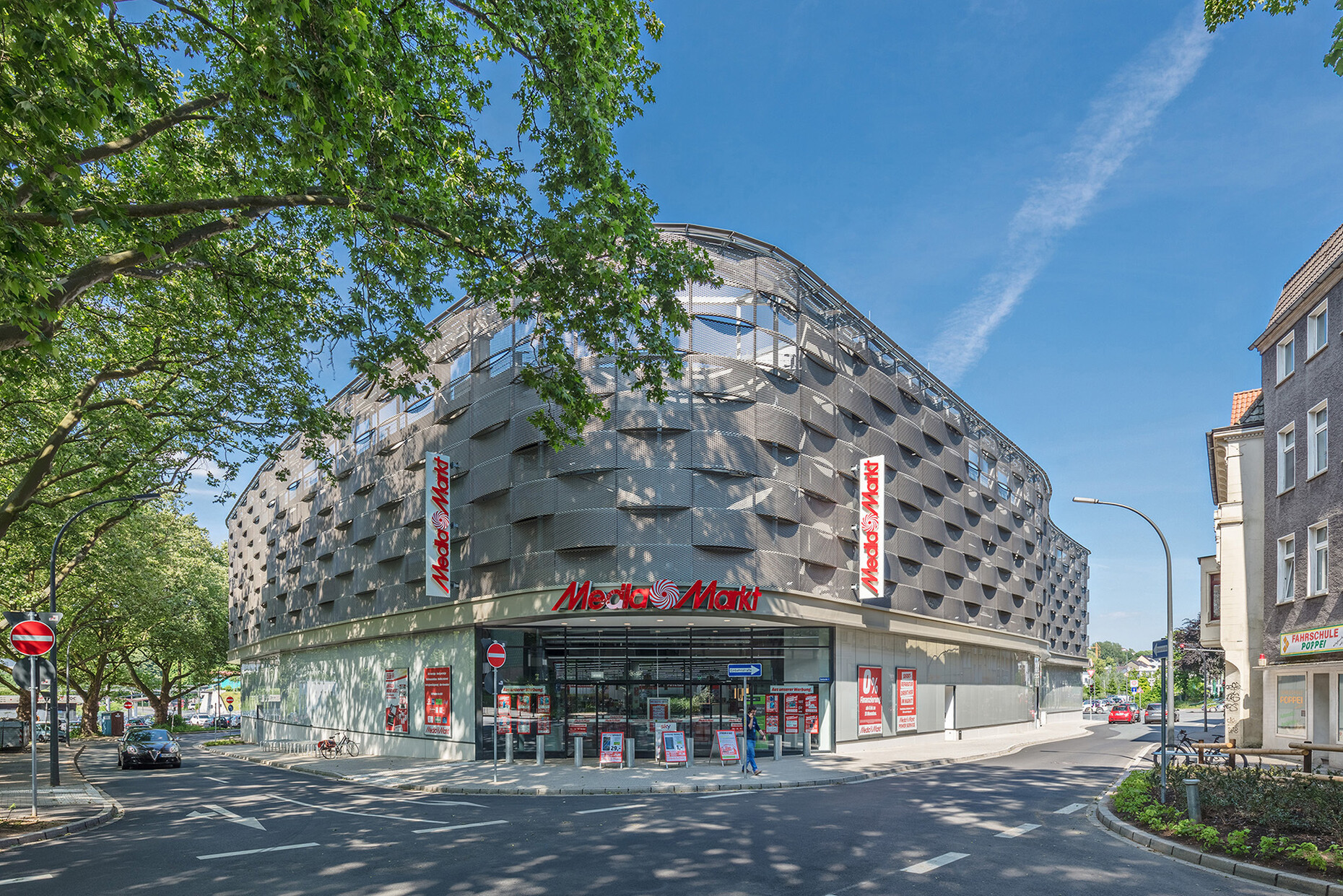
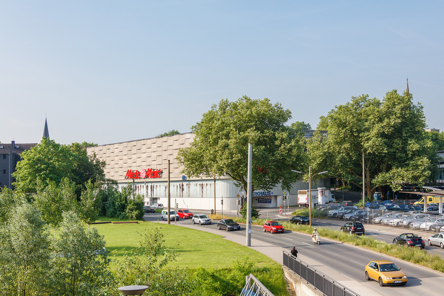
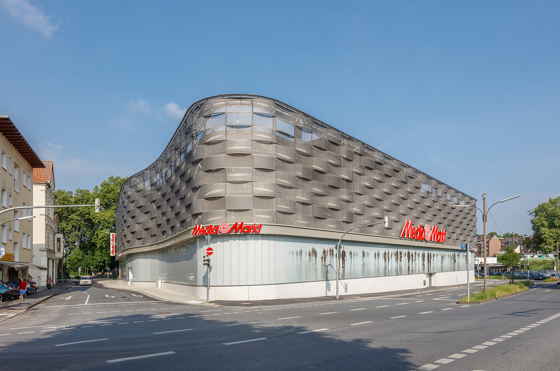
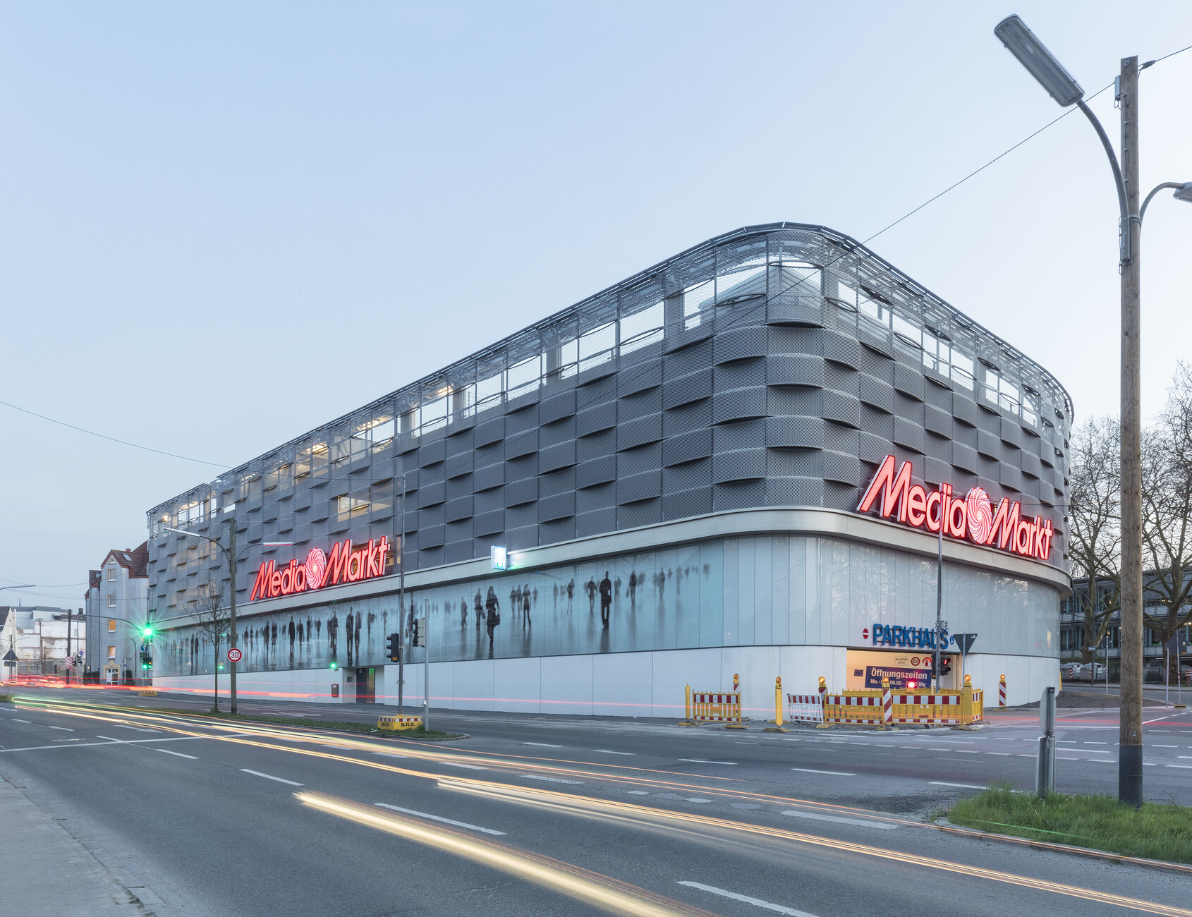
In Dortmund’s Hörde district, architects were again called in to design a facade. The building in question: A new electronics store, which was to be built in a prominent location close to the new Phönix Lake. The building was realized at an important urban interface, where a pedestrian zone encounters a four-lane traffic artery. The well-known store was “invited to open an outlet”, it was reported. But hardly because people were hoping for successful architecture, something for which the firm is definitely not known.
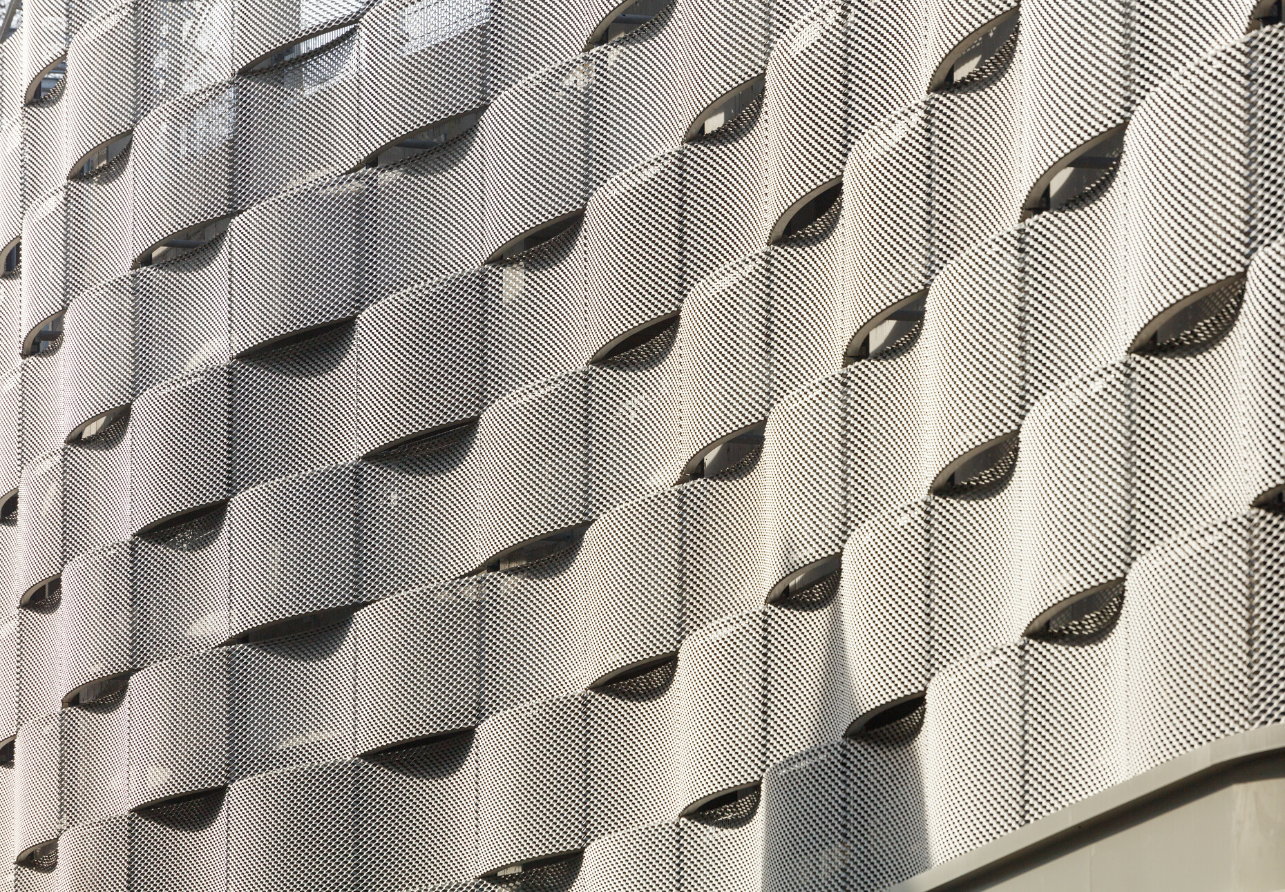
The building responds to its urban interface function rather simply: The main entrance faces the pedestrian area, while the entry to the multi-story carpark faces the main road. Sales rooms, storerooms and delivery bays occupy the ground floor, while customers can park their cars on the floors above. This was another case of solving the dilemma of having a “cheap” function at a “good location” in town through a facade competition. The design by Nattler Architekten reinforces the building’s introverted character, while also displaying it. The architects wrapped the upper levels of the multi-story carpark in bent rib-mesh like a basket that also reflects the fast moving traffic. The ground floor is designed as a light podium with white rendered areas and milky glass panels; but that does little to reduce the pain triggered by the bright shop displays and advertising boards with their glaring lettering. Maybe it is not the architect who is the criminal, as Harald Martenstein suspected, but the user?
Cheap meals, cheap buildings
It is difficult to understand why angry articles criticizing the design of fast-food restaurants like McDonald’s do not appear every week. That would be fitting given the many visual pollutants they deposit everywhere in our environment despite their huge global profit. Only recently the amusing film “The Founder” reminded cinema-goers that in the 1950s the architectural standards for diners were totally different: The tall curving arches of the familiar logo were to support jauntily protruding shed roofs as wing-like structures, and the drive-ins were to be a magnificent advertisement in every community, the new cathedrals of the American society as Ray Kroc (Michael Keaton) claims, talking himself into a rage. Roughly 60 years later all that remains is a globalized CI, of which you can concede that at best it is clean and horribly familiar.
At Mc Donald’s excellent architecture is only accepted at special places and as an exception. Back in 2013, in a development area in the coastal resort of Batumi, architect Georgi Khmaladze realized a complex interlocking structure of glass and steel that looks as if it had just landed briefly to fuel, before continuing its flight – in the midst of rectangular urban blocks erected hastily and badly. Yet the building is itself a gas station with an adjoining fast-food restaurant. Here the spectacular shape is not just a means to an end, but is filled inside with small niches and terraces. Rising up around the core, visitors encounter a terrace beneath an open roof, and a few plants form a green garden. In a part of town with typically poorly designed architecture this is a small, welcome oasis – serving greasy food.
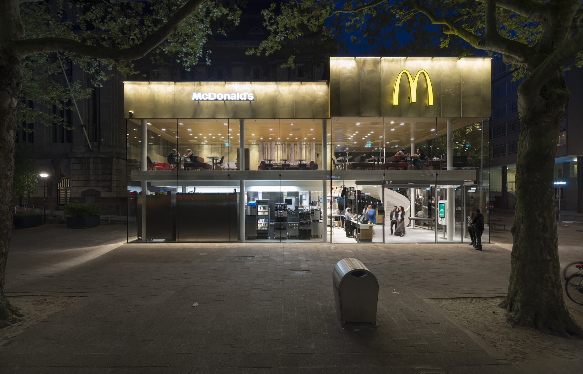
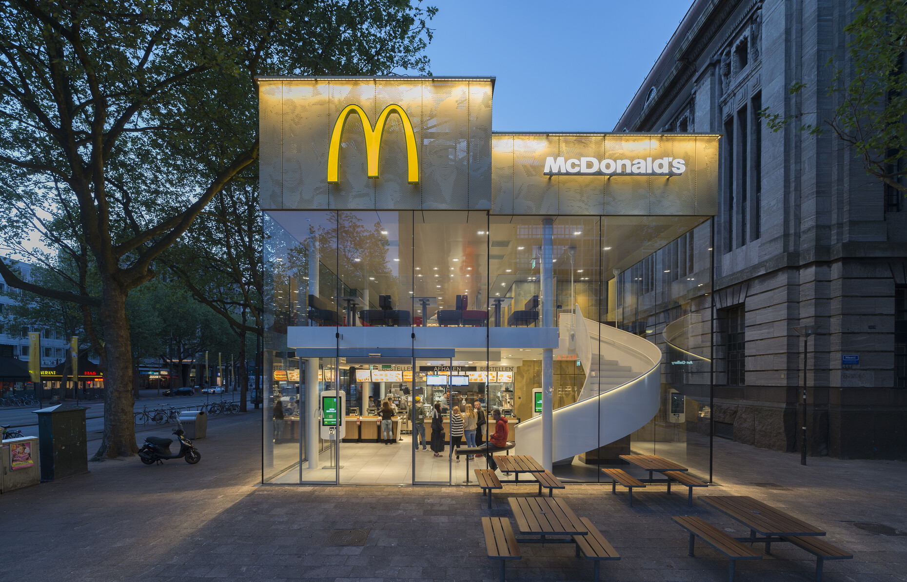
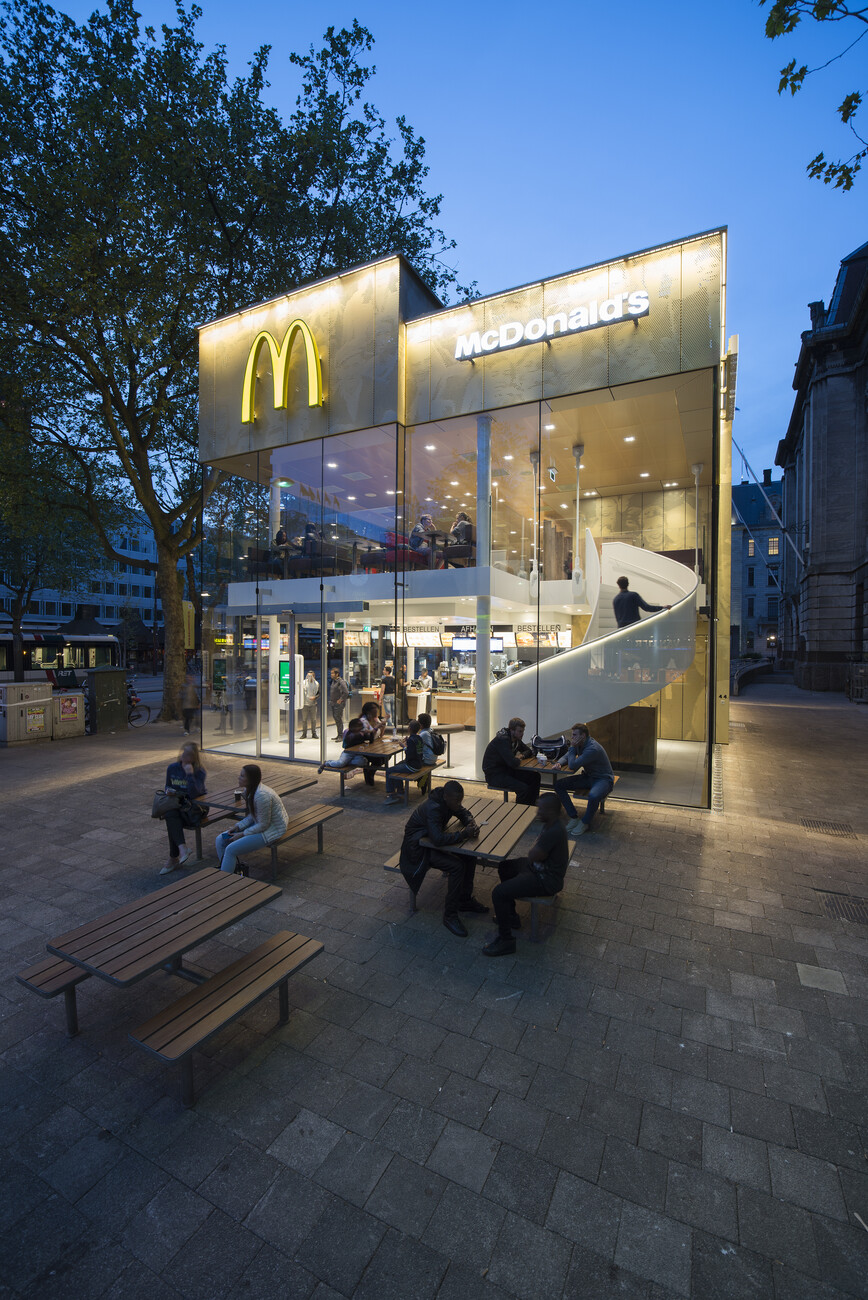
Similarly, in Rotterdam a restaurant with a highly sophisticated architecture opened recently. Here on one of the main thoroughfares of Vienna and directly in front of the imposing building (once the main post office with its massive classicist façade) stood an aged, cramped kiosk, which was famous for having being chosen by the locals as the city’s ugliest building. Mei Architekten were commissioned for the new building, the office of Robert Winkel, who has made a name for himself in Rotterdam in 1994 as a specialist for converting and transforming existing buildings. However, here Mei tore down the old pavilion and in just two months erected a new one which roughly follows the dimensions of the old structure. The cramped nature of the interior is offset by a great deal of glass. The closed sections – delivery bay, warehouse, kitchen and toilets – were all reduced to a compact minimum and enclosed in golden anodized sheet aluminum; the material has a warm look, is vandal proof and durable say the architects. At any rate it is highly striking. By day and night, the outlet on the downtown Coolsingel boulevard seems to glitter and beckon: come, come eat more mincemeat! Architects have done such a good job here it could truly be a McDonald’s of the future. It would signalize that bad food is not necessarily served in bad architecture. Sadly, there have been no indications to date that Mc Donald’s has drawn any conclusions from these two buildings in Batumi and Rotterdam with a view to deploying a different kind of design.
When architecture ventures into the world of a commercial estate it repeatedly has to prove that it has not cost more than the standard corrugated iron palaces - or that the additional costs are at least worth it. Given the widespread but mistaken belief that it is always more expensive with and because of architects, and because the benefits of good design and a sensible spatial structure can seldom be precisely estimated, architecture plays as minor role in commercial architecture as it does in the design of single-family houses.
Supermarket, super architecture
Only very few firms opt to go the other way. In Austria, supermarket chain M-Preis insisted on high-quality design for its shops from the very start; stores are always individually designed and the company logo is all they have in common. They work with local materials and a variety of architects, with sustainable building materials and cite their respective setting. This might involve more work than simply churning out the self-same Lidl store onto the blacktop parking lot, but now and again, you win design prizes for your efforts, and perhaps the one or other customer decides they would rather shop in a bright, open store than in a musty box full of easy to clean warehouse shelving.
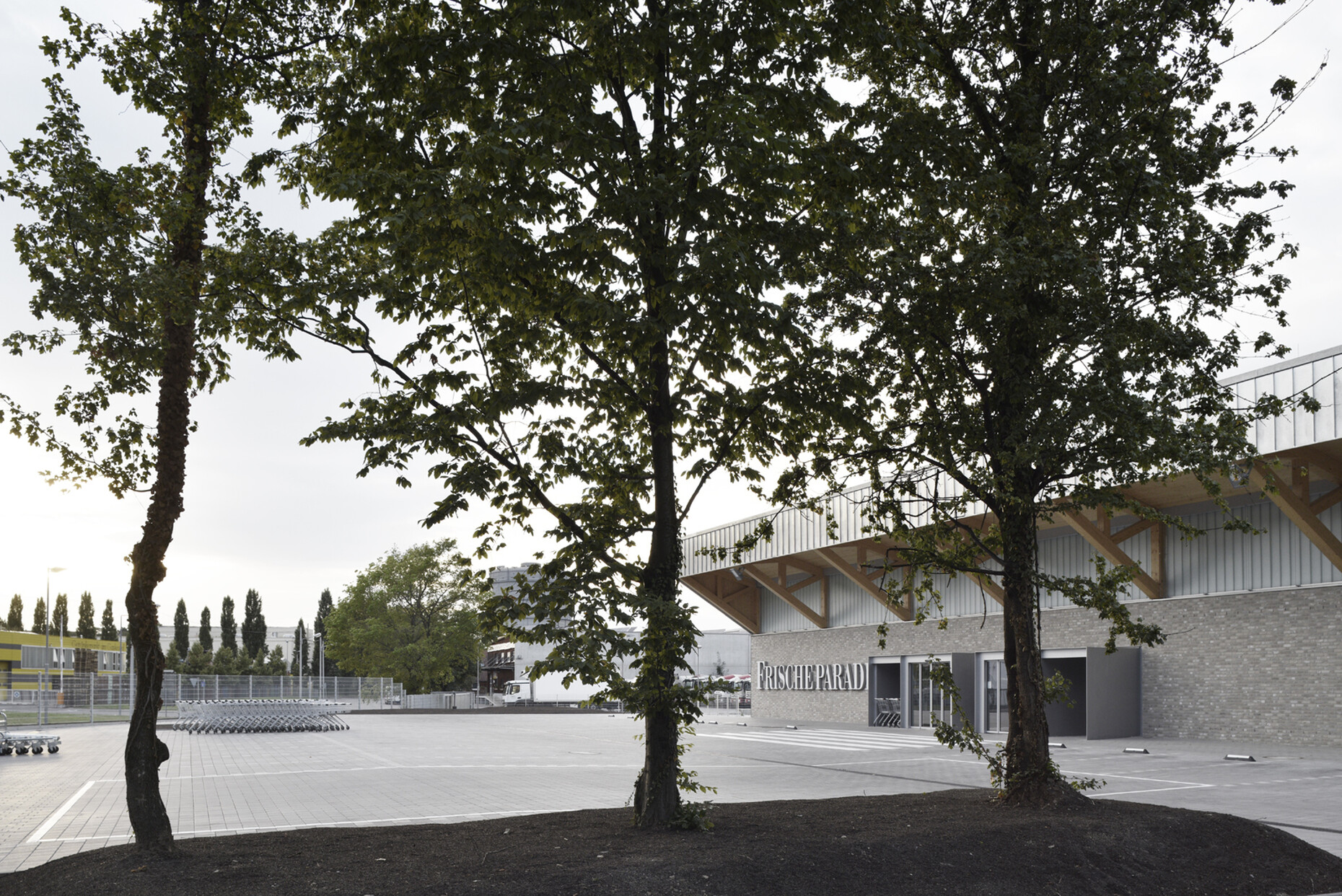
A similar line is being taken in Germany with “Frischeparadies”. Originally, the company was set up only to supply high-class restaurants with fish and meat, but from 2000 onwards the range of goods has gradually been expanded. The warehouse and distribution centers were also given small stores for normal customers. All these stores are individually designed, but from the start the chain has only worked with one architect’s office: Robertneun from Berlin. The eighth store has just opened in Stuttgart.
If you look at all eight designs by Robertneun since 2002 as a series, it is evident how well architects meanwhile approach the task. With few exceptions the buildings are always located in commercial estates or industrial zones, so that it would be only natural if the buildings were to be self-referential only and attempted to stand out as much as possible from their surroundings. Since designing the store in Essen (2004) Robertneun has opted for a different approach, and started looking for references in the neighborhood from which they can derive the coloring, choice of material, or the shapes of their designs. In Stuttgart the choice was sheet zinc, cast glass, a timber frame and reinforced concrete for the construction. They divided the volumes demanded into four connected halls, but which each have separate functions. From the outside this division into four is expressed in the striking shed roofs, which reflect the shape of a nearby banana ripening shed.
In the monotonous setting of a commercial estates such an approach by Robertneun is a veritable sensation: Rather than complaining about the conspicuous simplicity and flagrant disregard for good design in the area, precise analyses were conducted as to whether there were fundamental qualities to be discovered, which might serve as elements for the basis of their own design. Inside this “Frischeparadies” there are high, bright, and easy-to-clean spaces, and given the free-spanning design, the individual halls could later be put to a different use. You can generally say Robertneun has not only succeeded in designing something in a trading estate that hopefully other firms will adopt as a model. Not only have they achieved a high architectural and emphatically industrial quality, but for the first time a connection has been established between the otherwise so introverted large boxes.
Every culture gets the building it deserves
That said, is anything changing in the commercial estates of the world? It does not look that way. The successful examples still tend to be extremely rare one-offs in the monotonous sameness of the glaringly bright boxes. That is just how it is.
And maybe this is the most honest thing to do: Cheap content gets a cheap box. Only when the culture of quick consumption and mass marketing of chairs, beds, garden furniture and burgers at throwaway prices alters, can we seriously defend ourselves against the non-design of such boxes. So it seems that every culture gets precisely the houses it deserves. Yet behold! The gratifying exceptions shown here demonstrate that things could be done differently. Bad design in commercial zones is no natural law.
