RETAIL
Shopping in the 70s
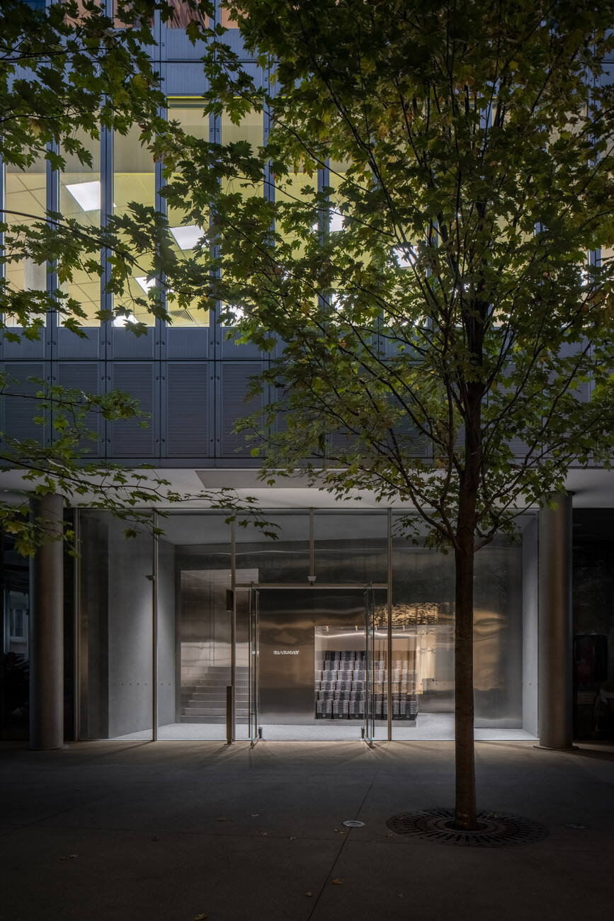
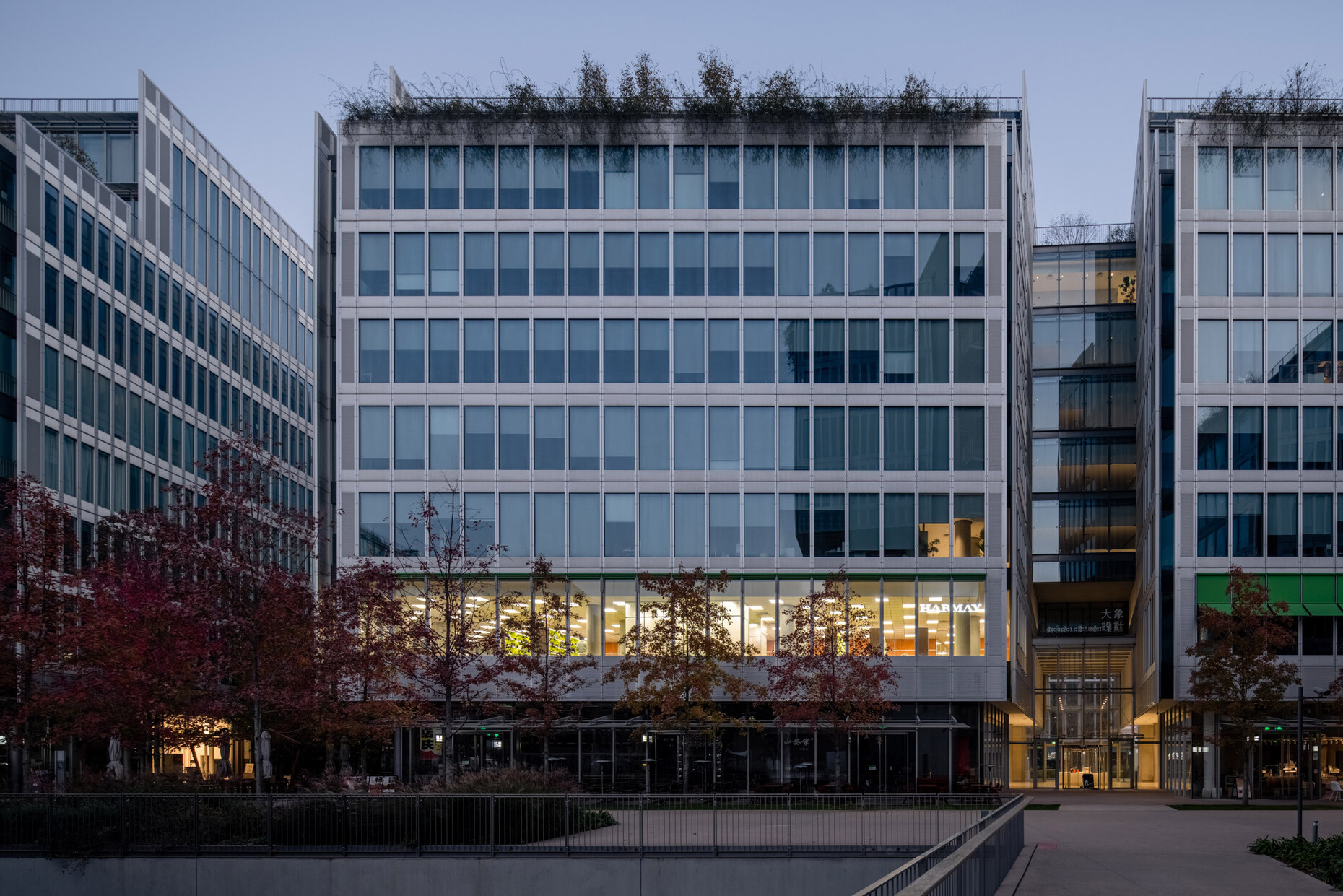
If you want to impress in retail today, you have to come up with something special – since most products can now be ordered quite conveniently and quickly on the internet. If you take the time to shop for luxury items such as cosmetics in a shop, it should offer something that websites cannot or can only offer to a limited extent: Inspiration through the staging of the rooms and an opportunity for advice on the part of the sales staff. AIM Architecture has already realised several retail concepts worth seeing for the Chinese cosmetics supplier Harmay. The company started as an online retailer and decided to open physical outlets despite the uncertain future of retail. What all of AIM Architecture's concepts for Harmay have in common is that you have to look twice before you realise that products are for sale in the stage-ready interior designs. Once the inconspicuous entrance to the shop has been found, a creative backdrop opens up for the visitor, which has been designed down to the last detail according to a specific theme - whether it is the "wet market" common in Asia, where meat and fish are sold, or the canteen kitchen of a hotel.
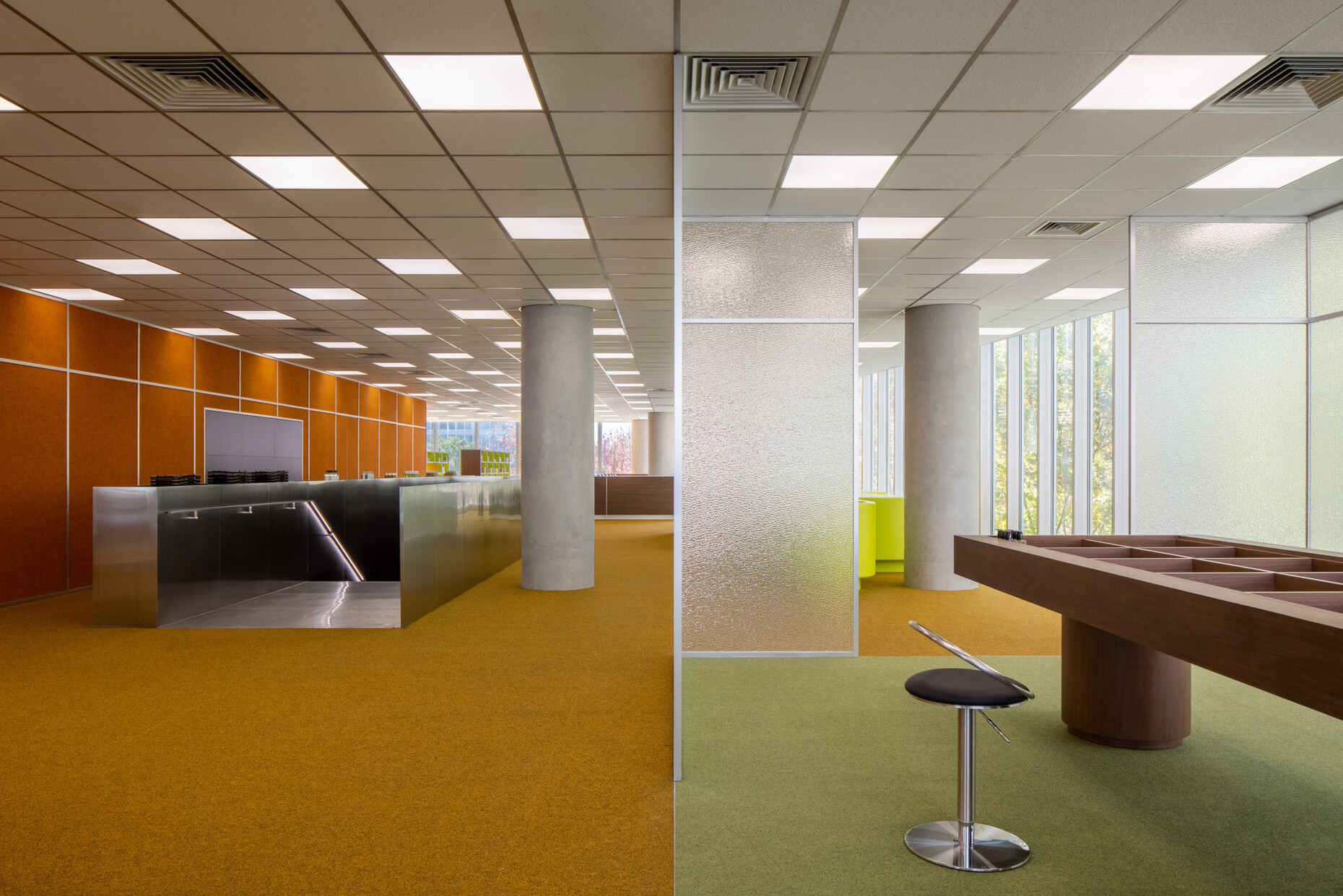
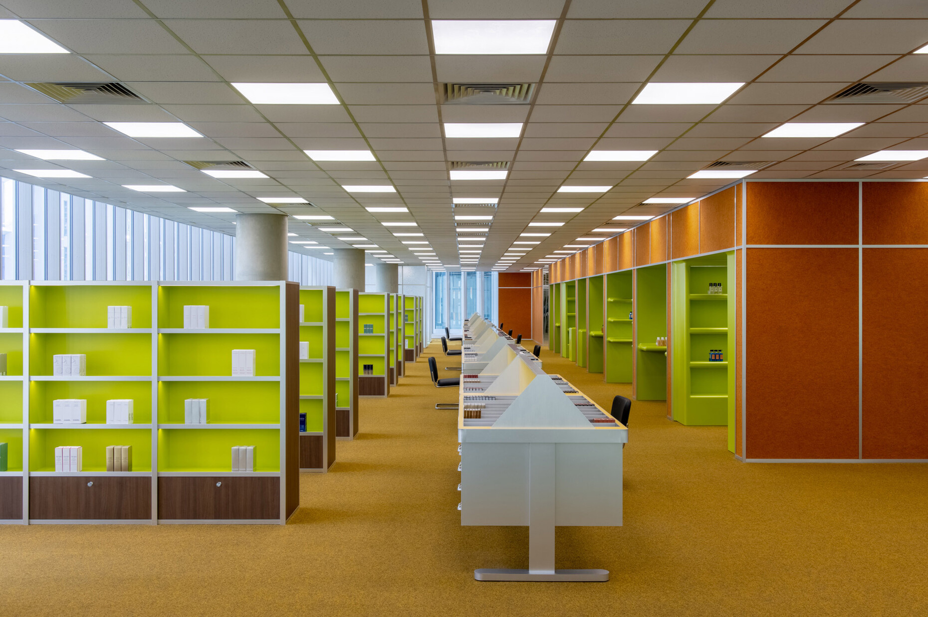
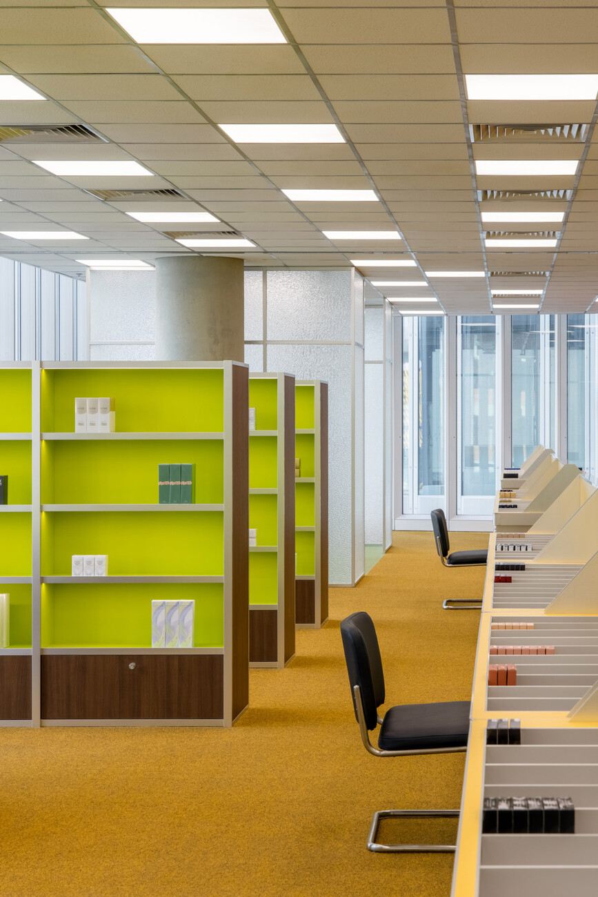
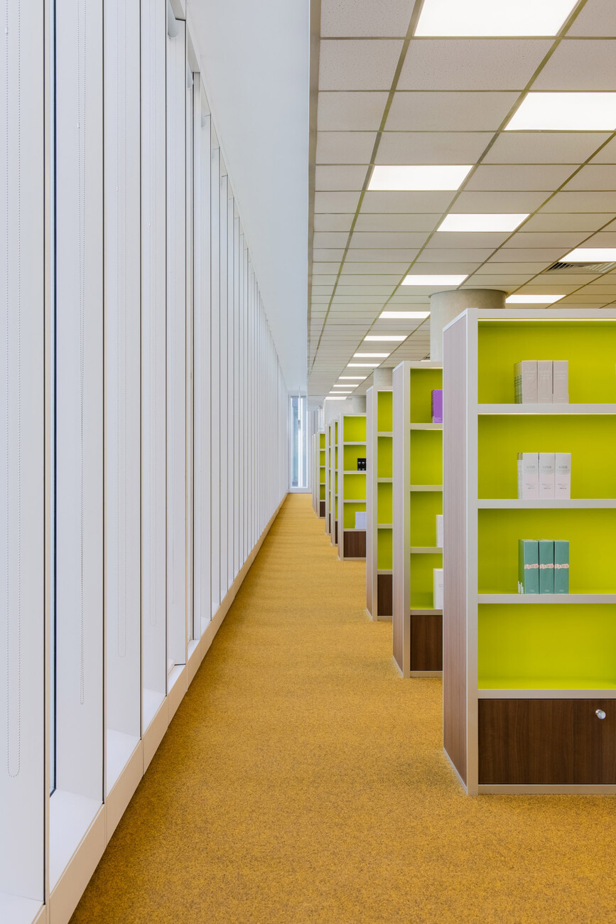
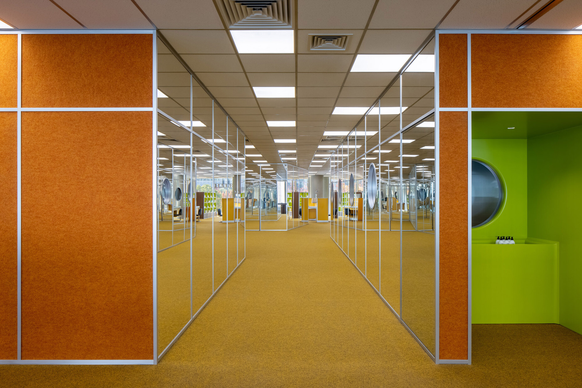
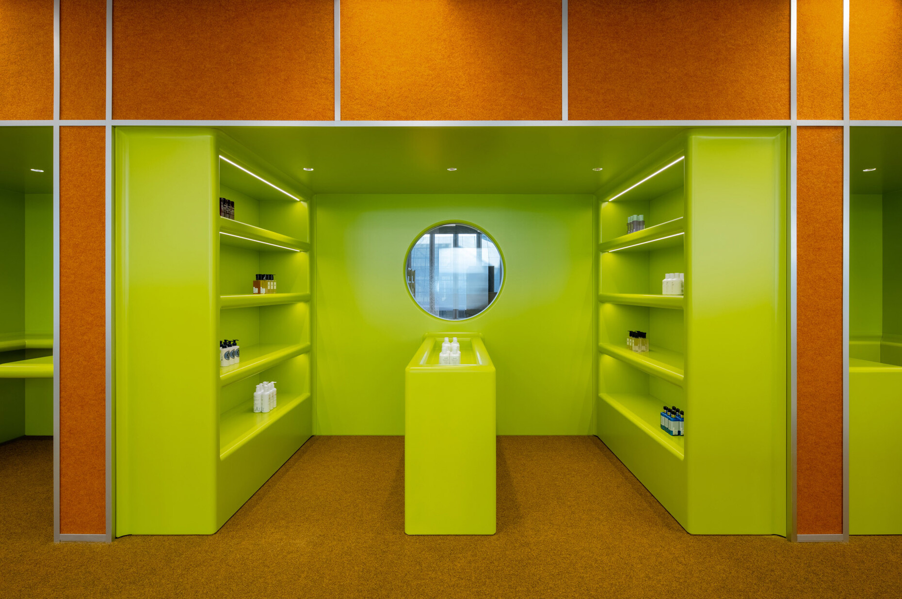
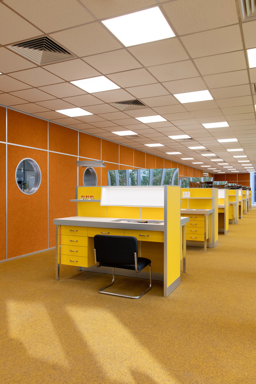
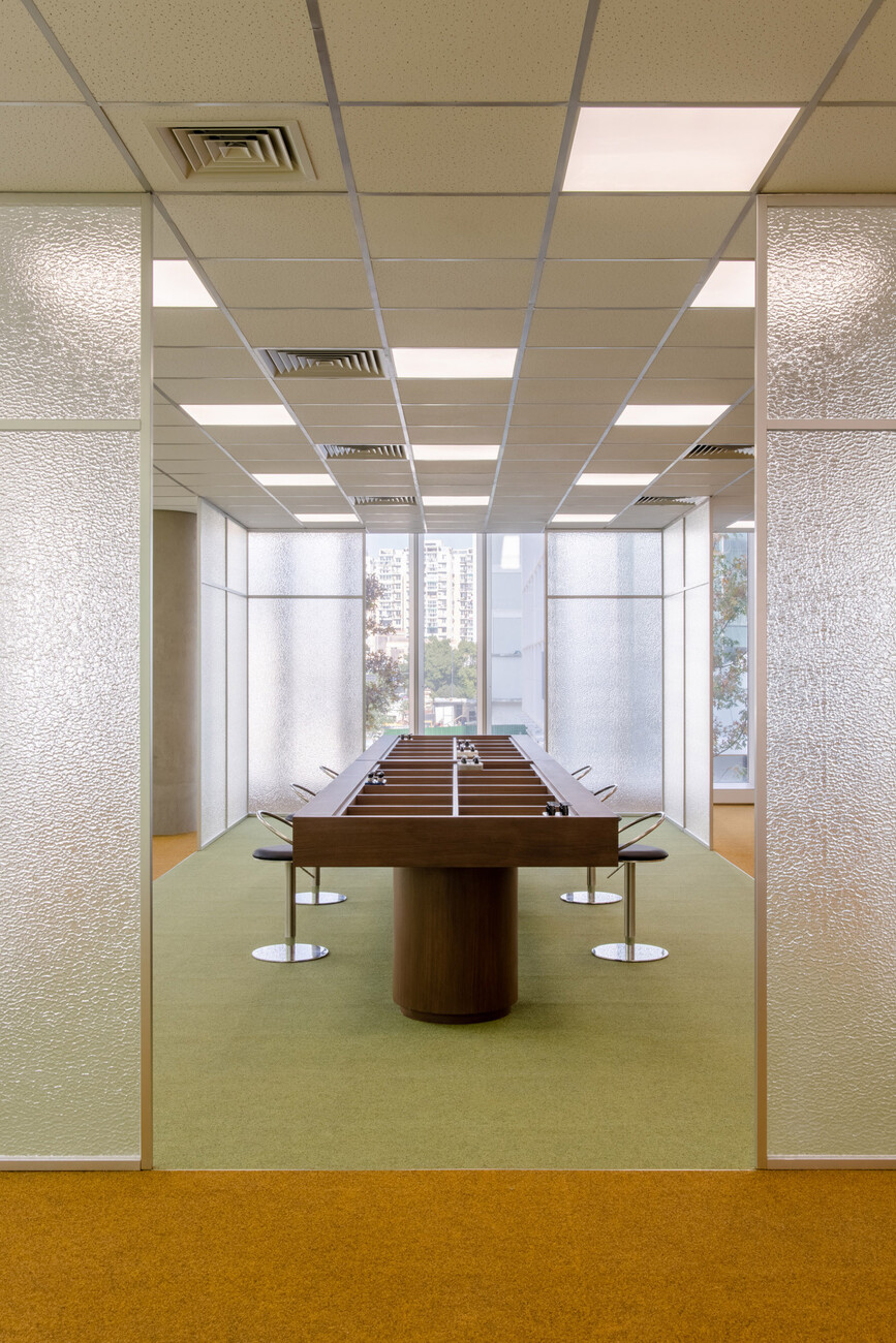
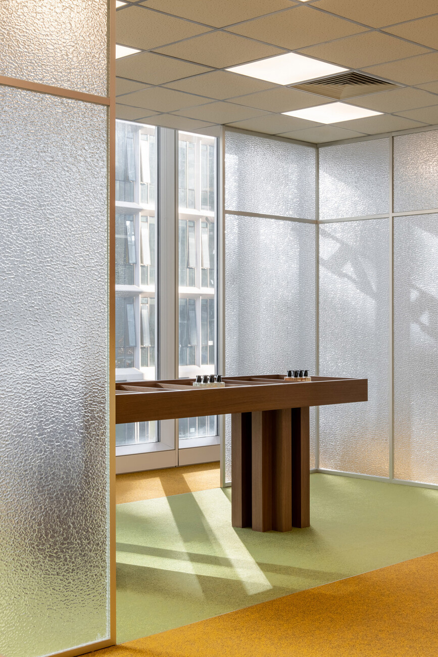
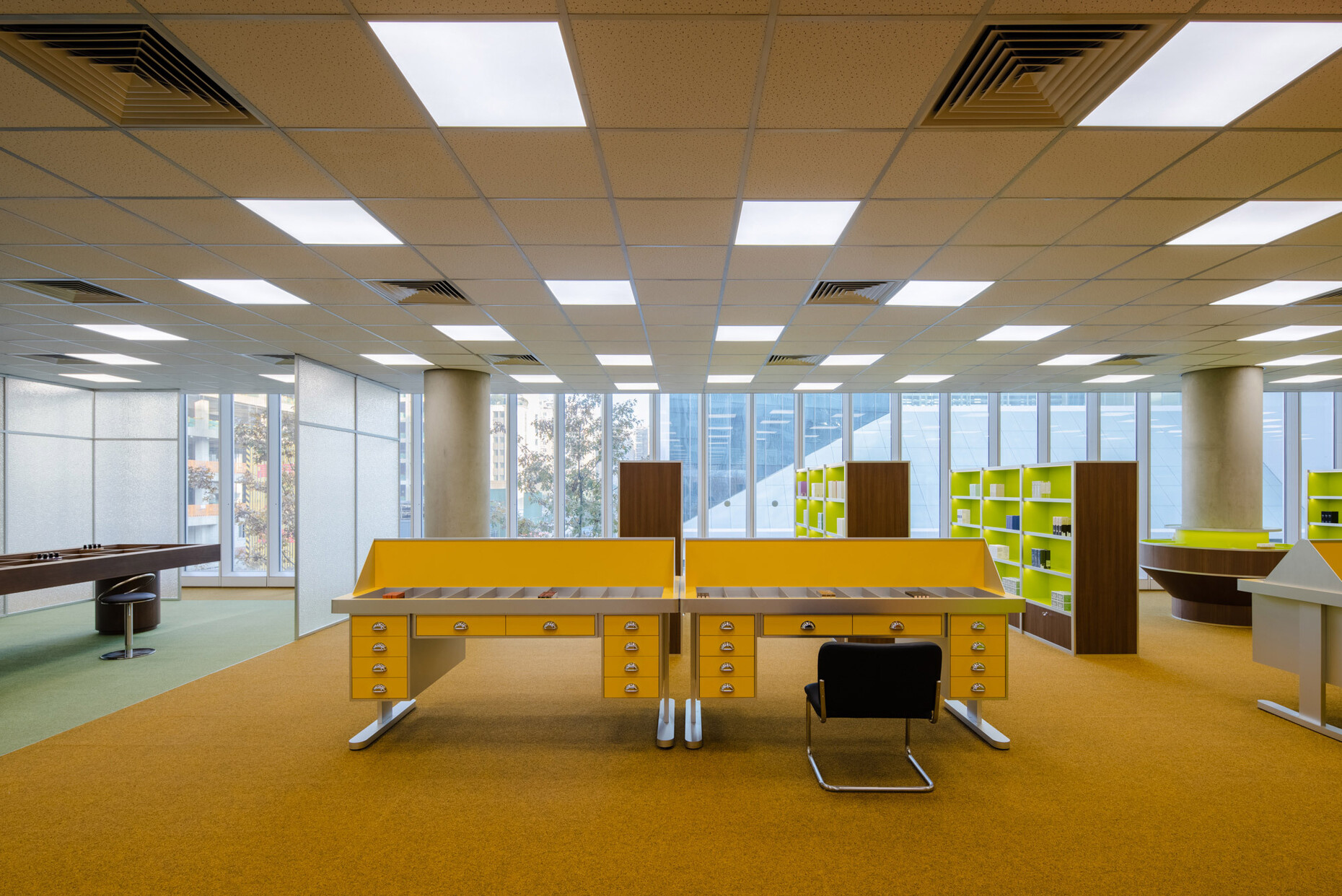
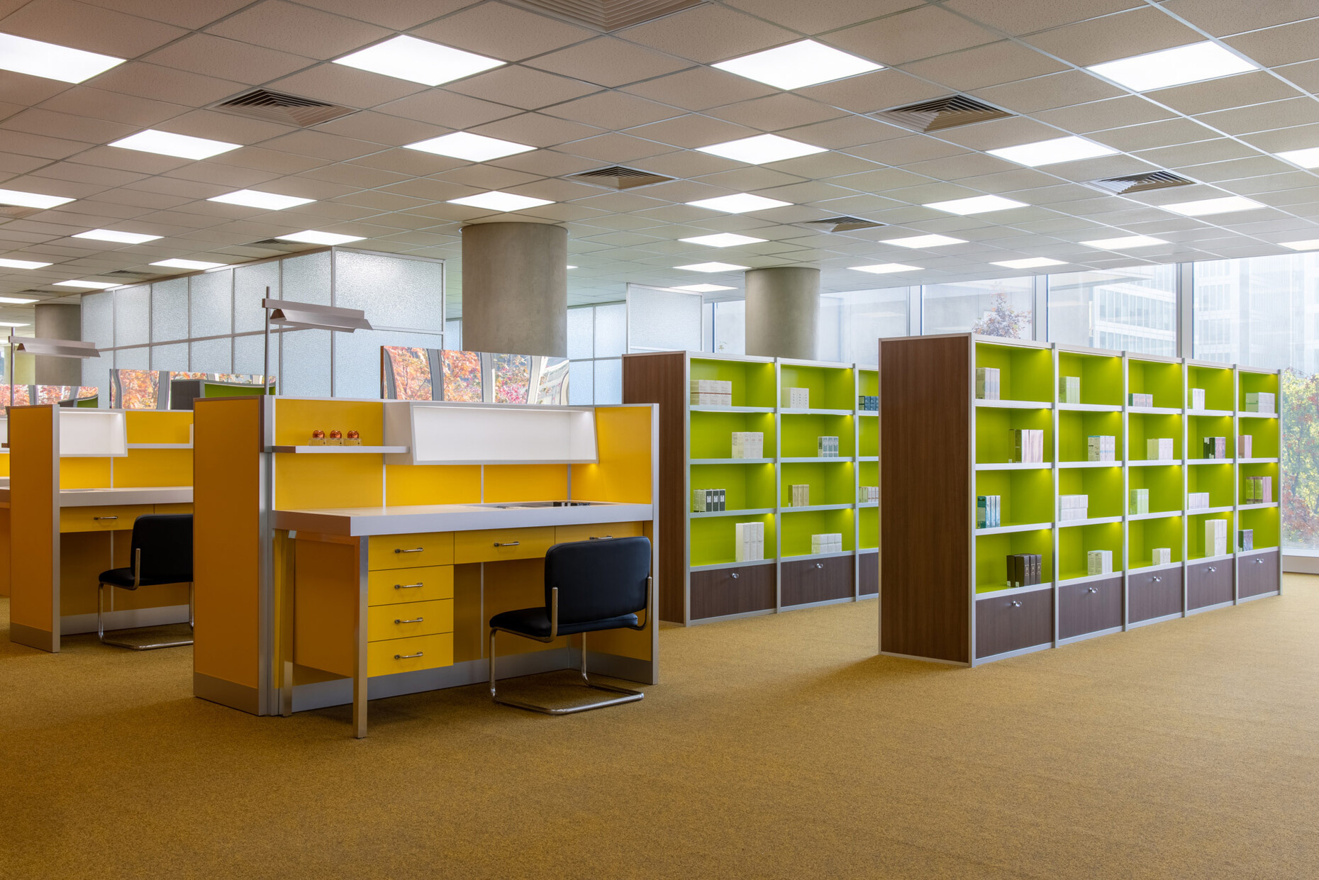
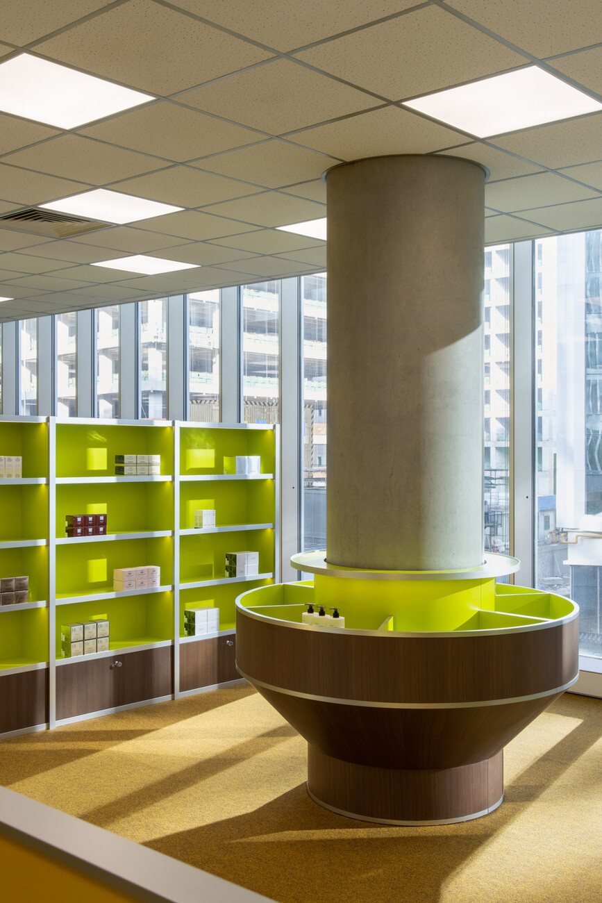
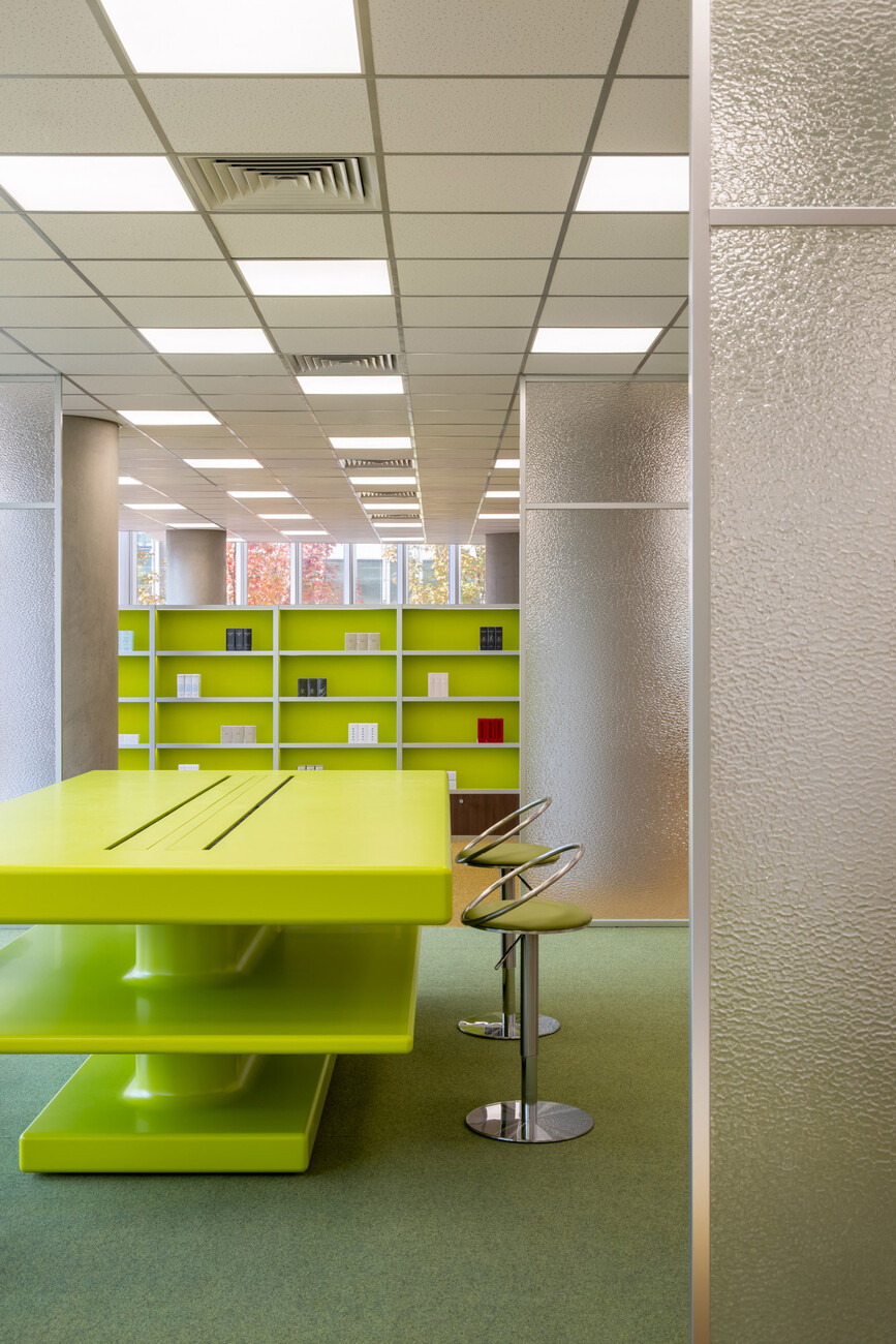
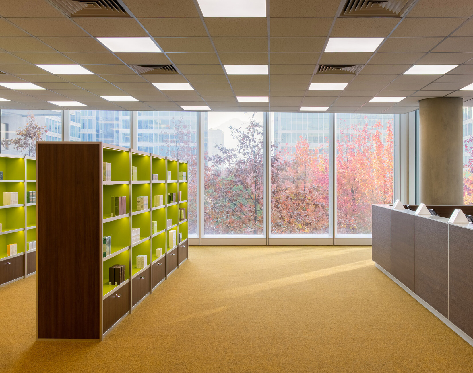
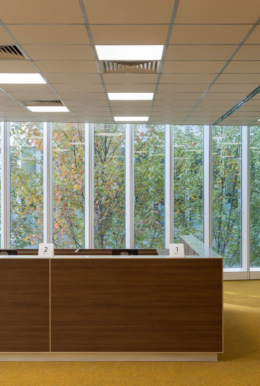
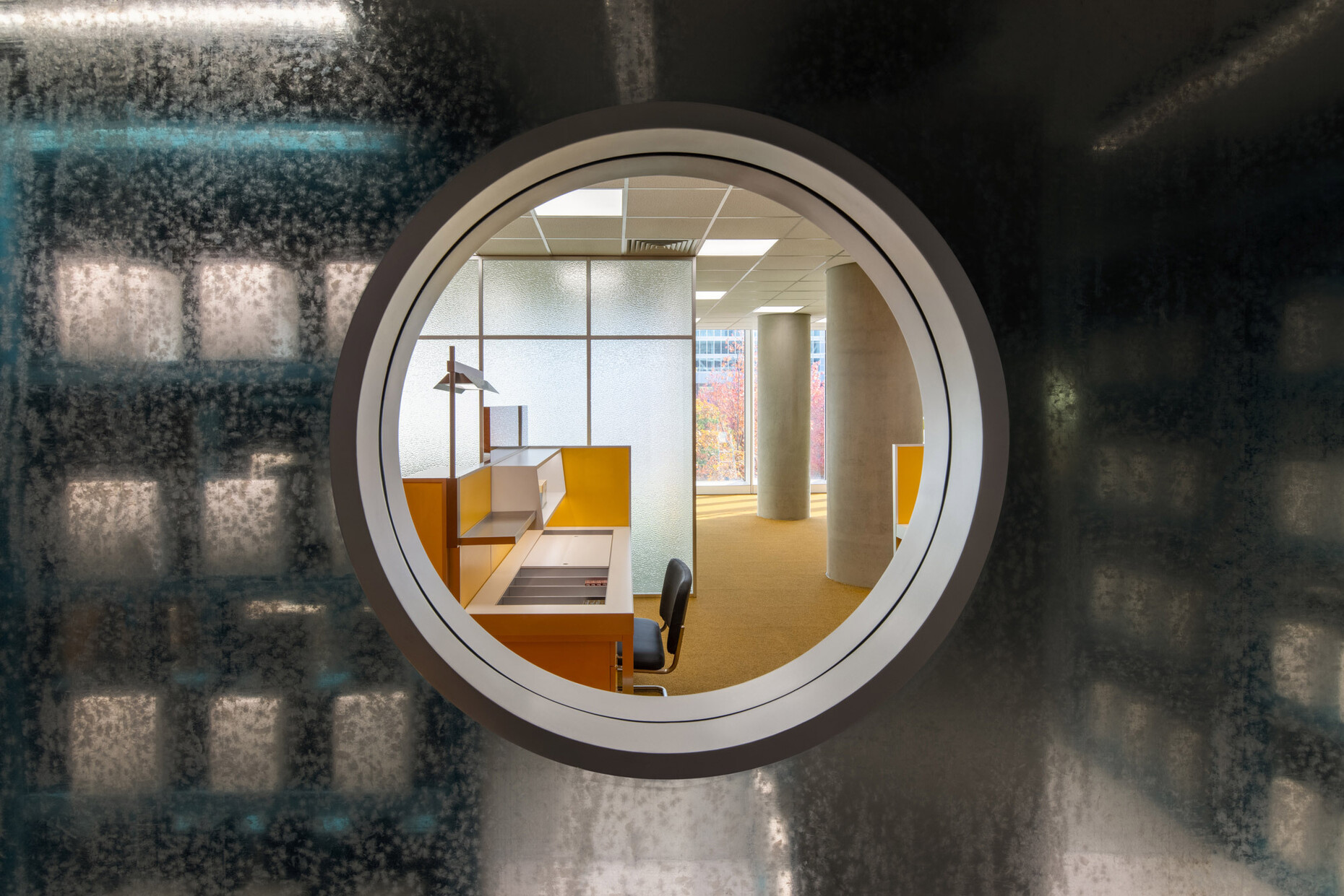
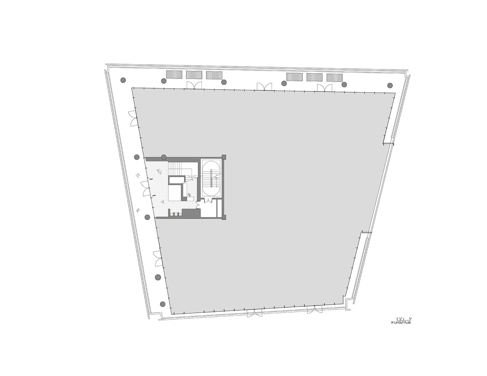
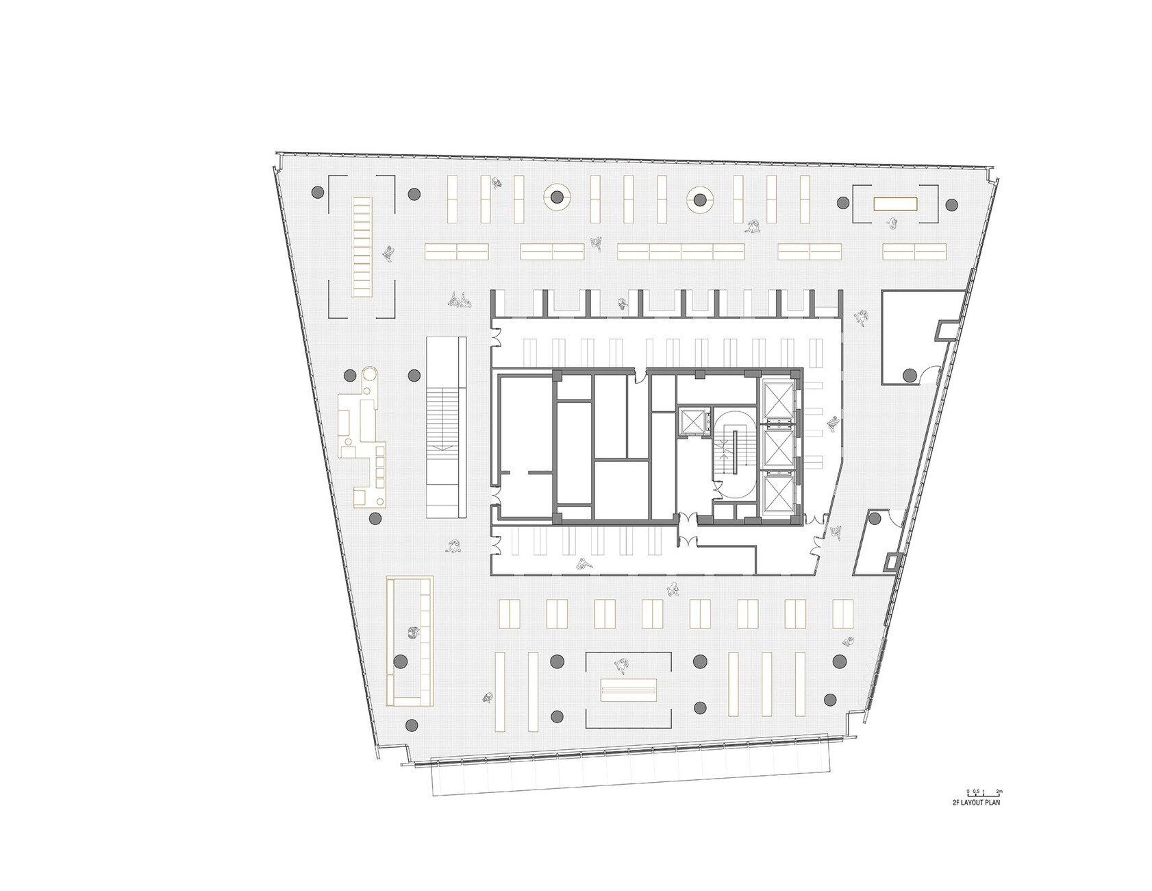
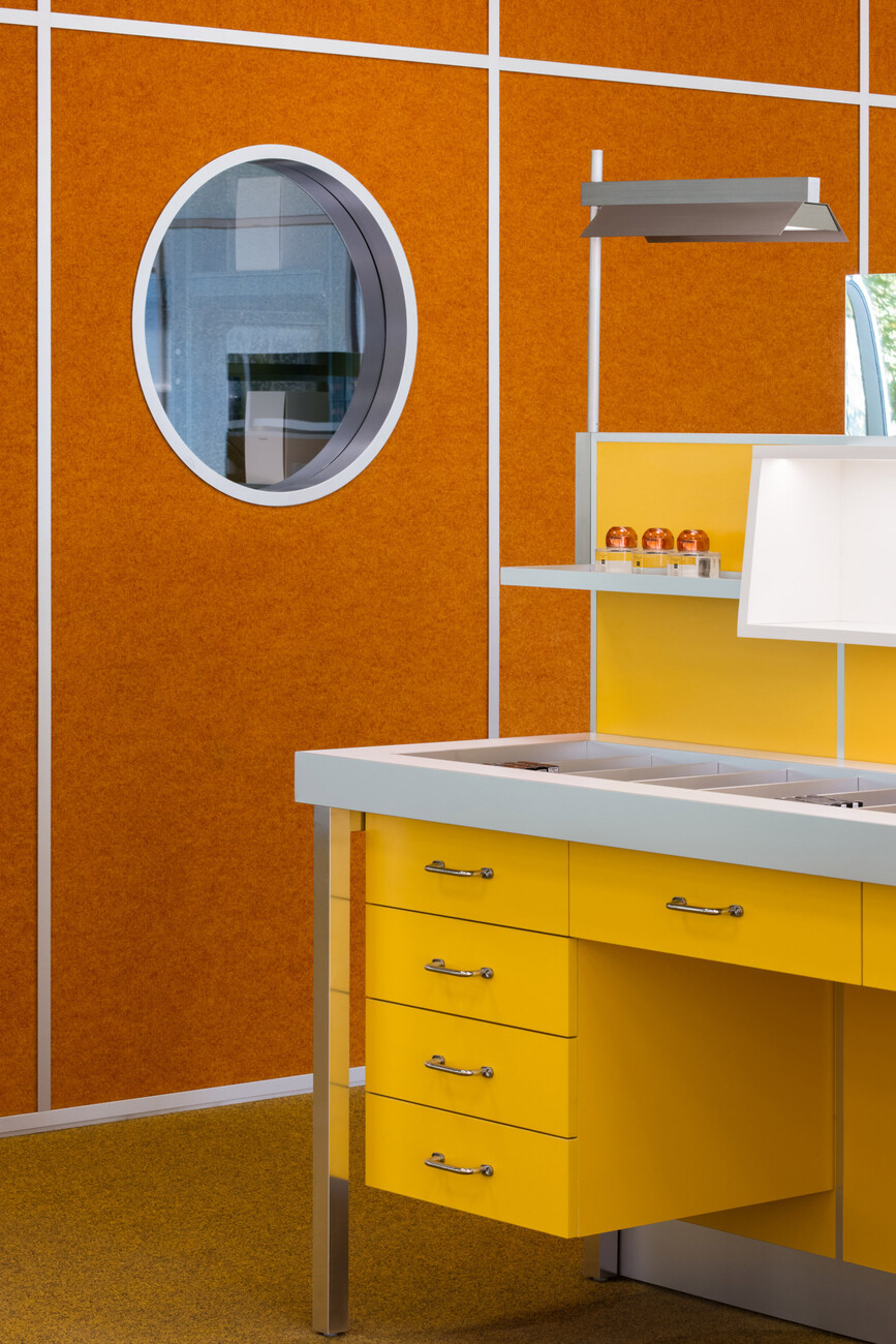
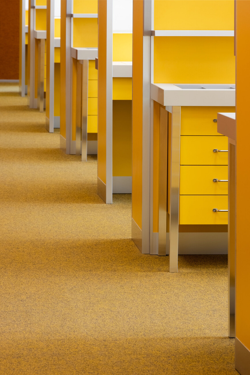
For the location in the OōEli complex of the Chinese megacity Hangzhou, the team from AIM Architecture took the aesthetics of an office from the 1970s as a creative starting point: fittingly located on the second floor of an office building, a landscape in mustard yellow, rust red, chocolate brown and cognac now opens up on 1,382 square metres: placed on the continuous display goods, the desks converted into make-up stations are lined up one behind the other and borrowed from the cubicle system of workplace arrangement often used at the time. Walls of ornamental glass separate a communal zone, while the structuring colour surfaces are broken up by linear elements of aluminium. Dark wood tables alternate with lime green shelving systems complete with rounded corners. Thanks to suspended ceilings in the same colour, small presentation bays are created that appear to be made of one piece. Narrow corridor structures, their alignment reinforced by floor-to-ceiling mirror surfaces, lead to wall coverings made of carpet. Clear, industrial-looking lines and round columns of concrete are contrasted with porthole-shaped recesses. Through the latter, one can look into the internal transit warehouse and thus look from the past into the present. For the sake of aesthetics, the interior designers have dispensed with an experimental patterning of the textile surfaces that was popular in the 1970s. The colour-intensive retro aesthetics convey the spirit of the time, but do not distract customers too much from the sales offer with visual stimuli.
Through the interplay of colour and structure, AIM Architecture has succeeded perfectly in capturing the atmosphere of an open-plan office in the 1970s, so that in your mind you can hear the typewriters clacking and the analogue telephones ringing – a look back at a decade in which the mobile phone had only just been invented and was years away from its market launch, just like the personal computer or the internet. Addresses were still laboriously searched for in thick telephone directories or crammed Rolodexes, mistakes in documents were corrected with Tipp-Ex, the stamp holder was an important utensil on every desk and the calculator a futuristic device. Shopping here truly feels like travelling back in time – except that the products on offer are from the present and there is certainly a modern card reader hidden behind the walnut-coloured wooden panelling of the checkout counter.
