Kitchens and bathrooms are both in the process of abandoning traditional footprints. Manufacturers of bathroom interiors and fittings increasingly seek to liberate what is a functional space where the outside of the body gets washed and turn it into a personal feelgood zone. Unlike with the kitchens, where the brands and products are spaciously on display at the Milan fair grounds and in the Fuori Salone showrooms around town, bathrooms tend to be presented in compact form in Milan this year. It is up to the imagination to decide how the new bathroom worlds meld with apartments. The industry primarily offers individual products that are ever more conceived and designed to be modular. While novelties may be not that few and far between, conceptual or strategy surprises tend to be a rarity.

At the Salone del Bagno Swiss ceramics maker Laufen presents additions to its co-brand programs “Il Bagno Alessi One” (with Stefano Giovannoni) and “Kartell by Laufen” (with Ludovica and Roberto Palomba). A highlight, indeed an exception: the staged settings by Toan Nguyen and Konstantin Grcic, which boast “Saphir Keramik” as a new material. It was already used for the bath collection developed jointly with Kartell and the innovation is the result of five full years of R&D by the long-standing Swiss company. By adding aluminum oxide, far finer tub thicknesses and radii are possible than with customary ceramics. “Saphir Keramik” is also far better in terms of hardness and resilience. Given that it’s easier to process, it is also lighter than bathroom ceramics, requires less material and energy inputs to produce, and involves lower transportation costs. Nguyen emphasizes that the material will in future change approaches to the bathroom ceramics. Based in Milan, he’s designed a wash basin that is illuminated in a dark room: hanging upright on the wall. It seems a little trivial, as the design’s refinement is only visible at second glance. By contrast, Grcic presents his designs in a bright workshop-like setting. He resolved against any superficial minimalist effects: His in part asymmetrical bathroom objects thrive on different levels, refined transitions, and functional patterns. The plan is for the prototypes to have morphed into mass products by the next ISH in Frankfurt.

“Masterpieces” will in future not only be available as writing utensils but for the bathroom, too. Thanks to modern production technology together with precise workmanship. Seamless enameled paneling is used for the standalone “Meisterstück Centro Duo Oval” tub made of enameled steel only 3.5mm thick. While standalone tubs have long since found their way into living rooms, the slip-less enameled shower tray enables a seamless transition between the shower and the surrounding bathroom. Axor/Hansgrohe presented shower fixtures at the fair with titled displays that explain the products and dish out the water at the press of a button without visitors getting wet. At the booth, the display idea means that the sheer diversity of the “Water Dream” shower systems by Front and the “Lamp Shower” by Nendo seem somewhat overly complex. We only get an intimation of how the products function spatially – there’s sadly not more space over at the new showroom in Via Durini either, which Axor shares with Porro. There, “Starck V” is at the center of things. The name does not attest to the introduction of some new design realm, however, as the “V” stands for Vortex and thus for a small tornado. That then takes place in the open Axor crystal glass fittings designed by Philippe Starck. “A revolution, a minimum, something completely transparent,” he suggests. “Starck V” can be removed and cleaned in the dishwasher. In addition to the version in chrome or in high-gloss white Axor also offers special surface treatments such as brushed nickel or with sand-blasted crystal glass for the body.

Dornbracht is presenting its new, refined version of the “MEM” fittings. The proportions of the body of the fitting and the design of the battery lever have been adjusted and technically optimized. The fittings can now be better combined with the electronic “Smart Water” controls. At the same time, a new galvanized surface called “Cyprum” is on display, which relies on 18-carat gold and real copper, generating a rosé tone that enhances the purist shapes. A comparatively decent way of melding minimalist design and visible opulence. At the moment, at least, this is a unique surface finish in a market segment in which innovative companies such as Dornbracht swiftly face the challenge of me-toos.

At the Zucchetti/Kos booth, we at long last catch a glimpse of an architectural realization of ideas for the bathroom. There’s a wall-mounted element with a counterweight and various swivel points, for example. “Closer” by Diego Grandi for Zucchetti looks like a luminaire, possibly from the 1950s. Whereas it is in fact an adjustable shower fitting. A young designer, in some of his ideas Grandi relies on rhombi such as Gio Ponti loved, and when asked which two persons he would love to work with on a fictive project, answers: “George Perec and Max Bill”. Grandi founded his own Milan studio in 2002, and ironically and playfully references 20th-century design Modernism. A name to be remembered.
Whereas these two names are well established in international bath design from Italy: Ludovica and Roberto Palomba. It would require a dedicated article to summarize their novelties in Milan. One almost casual product they have designed is “Wazebo” for Kos. It exits the space of the trade-fair booth as it is an open shower cabinet for outdoor use. A modular set of pipes, a wooden shower platform with an integrated overhead shower, either as a single or double unit, a few small shelves, a water connection, and off you go! With the idea, the duo could have evoked camp-site idylls. But they don’t. Instead they present a well-proportioned useful object. However, nothing for those wanting a hot shower, as water is sourced from a garden hosepipe.

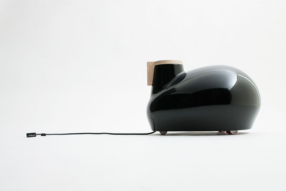
Anyone who just freezes at the thought, turn to Tubes. The manufacturers of radiators of all shapes and kinds had breathed life into Satyendra Pakhalé’s “Kangeri”. It’s a portable or rather roll-about radiator. On photos it looks like an early PC mouse, but is decidedly larger. The innards of the electric heat source are made of recycled aluminum and it boasts a marvelously crafted oak handle used to pull it. “Kanger” is what nomads in North India call vessels filled with hot coals and wear beneath their traditional robes as portable heaters. Designer Pakhalé is interested not only in the practical side to using objects, but also to their symbolic dimensions. And you see this in “Kangeri”: These are domestic companions, a cross between rocking horse, companion and abstract object.
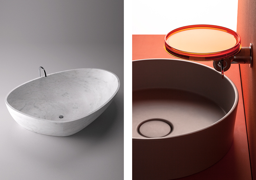
Symbolic, albeit not contemplative dimensions are something that the marble “Ishiburo collection” made by Kengo Kuma for Salvatori also possesses. You have to go to the very top floor of the side-wing at Via Solferino 11 to get to the Kuma tub, the basin and the wall shower. “Immersing oneself in hot water surrounded by a stone,” the architect suggests, “is something people immediately feel to be pleasant.” The outer skin of Kuma’s bathroom objects is made of little choice marble rods which only slightly impairs our sympathy for those who have to move the stone masses in and out for the fair.

Next door in the same building, Boffi presents not only kitchens, but also bathroom elements. For example, the “DueC” wash basin system created by architect Victor Vasilev. It consists of a white Corian basin and a shelf attached to the side and is made of black Paperstone – a material produced from recycled paper. The contrast is striking and creates the impression that the basin and shelf form a uniform body opening on one side.
Agape’s “Drop” bathtub designed by Benedini Associati is organically shaped and can be used by more than one person at the same time in several positions. Up to three people can bathe in it at once. Like the “Drop” wash basin, it consists of bio-based Cristalplant, a compound of aluminum hydroxide and plant resins. Anyone who sojourns to the client tub on the top floor of the Agape showroom at Via Statuto almost invariably feels tempted not only to close the door, but to wash away the dust of the hot spring day with a refreshing shower. There are even flipflops at hand. But no, that would be too daring, better to go down to the street and head for the next of the many showrooms and bask in the mass of furniture and design enthusiasts in Milan.
www.alessi.com
www.kartell.it
www.kaldewei.co.uk
www.hansgrohe.com
www.dornbracht.com
www.zucchettikos.com
www.tubesradiatori.com
www.salvatori.it
www.boffi.com
www.agapedesign.it
MORE on Stylepark:
Atmospheres created from water vapor: “Cersaie” in Bologna once again revealed just what can be achieved in the wellness zone.
(04 October 2013)
Can you show me the way to the techy toilet? The shower WC, long since the norm in Japan and the Arab world, is ready to delight Europeans – as a “fun feature” and “pleasurable health booster”.
(23 August 2013)


