How to turn a simple structure, basically an outsized box, into a place that gives people the feeling of “We belong here”? Put differently, what makes a house a home? On the one or other occasion, we’ve all faced this question. For example, when deciding how to furnish our first apartment. Or when you visit someone for the first time in their home. Before you get there, you invariably find yourself thinking: “What to expect?” And the question becomes a biggie when you decide to move in with someone else. As then it becomes: What style does my partner prefer? What furniture, accessories, mementos are indispensable to him or her? And how will all the preferences, pet hates and expectations spawn a shared home in which both partners if possible feel both good and at home?
Space can be found in even the smallest hut
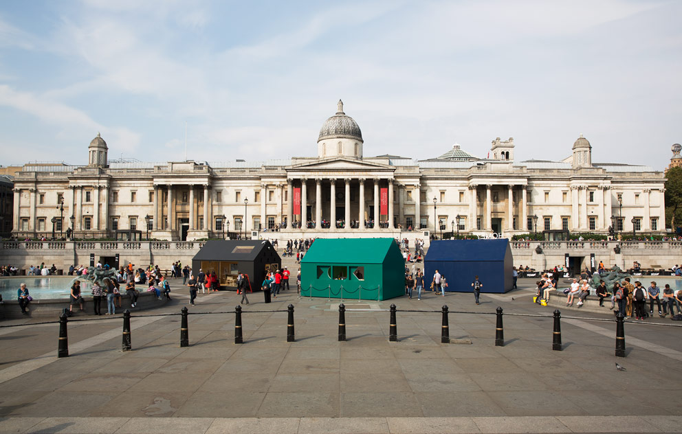
On the occasion of the London Design Festival, four houses were erected on London’s favorite plaza, namely Trafalgar Square. The “A Place Called Home” project was a joint venture with the Airbnb platform (an online marketplace for renting private accommodation) that asked visitors to concern themselves with the topic of “home”. To this end, the organizers made four identical huts available, each sized 4x6 meters, with a hip roof. The interiors were created by British designers Jasper Morrison, Ilse Crawford, Raw Edges as well as Anna Murray and Grace Winteringham of Patternity. “This installation presents a whole host of very different ideas on the topic of home, intended to make you think about how we live with design,” commented Ben Evans, Director of the London Design Festival, at the opening of the show.
It would seem obvious that everyone approaches the topic in a very personal way and that expectations differ greatly. And this applies to the range on display in the four huts on Trafalgar Square, too: While Patternity’s installations amount more to a philosophical consideration of the relationship between humans and the world, Raw Edges offer a solution hinging on mobile walls that is so ingenious many will no doubt immediately try and emulate it back home.
When the bathroom plays small
Yael Mer and Shay Alkalay have repeatedly opted for moving parts in their furniture designs for the likes of Arco and Established & Sons – with a view to saving space. For their little house on Trafalgar Square they’ve gone a step further, though: In their concept, the inside walls are on rails so that the individual living areas can be expanded or made smaller at will. Why, for example, does the bathroom have to be a large space when you’re in the bedroom? A spacious kitchen may be great, but when you’re cooking you’re not using the bedroom space. But if the bedroom, kitchen and bathroom can be made bigger or smaller as required, then the furniture, luminaires, shelves and washbasins have to be small, or stackable or used from two rooms, too. “It’s all very minimalist,” says Yael Mer, “but all the functions you expect of a residence, including sleeping, cooking and washing, are at hand in these few square meters.”

Jasper Morrison drew his inspiration from the square, and has created a home for pigeon-lovers: “Who else,” he asks, “would chose to live in the middle of Trafalgar Square?” Renowned for his feel for reduction, the Brit presents his furniture designs against the plain and sober backdrop of plywood walls. A small bed and a desk, and an armchair in front of the four large windows that give the inhabitant a view out over the lively plaza. Hmm, and if you don’t love pigeons? Well then you can wish to always enjoy a good view outside.
At home in the kaleidoscope
Patternity’s Anna Murray and Grace Winteringham have inserted a huge kaleidoscope into the side of their pavilion: You can look into it from both the outside and the inside. All you need to do to activate the optical effects is turn a dial. And a camera takes a photo that is automatically uploaded into an online gallery. The Patternity designers interpret the idea of the “home”, consider earth as the home we all share, and want to show us that our entire world is made up of simple shapes. Anna Murray explains: “With our house we’re celebrating the basic modules of circle, line, triangle and square that go to make up life.”
The blue pavilion by Studioilse asks: “Home?” – in neon letters on the roof, and inside on the floor the questions gleams: “What does home mean to you?” Videos projected onto two of the inside walls present everyday rituals, such as making tea or reading the paper. The moving images are accompanied by sounds: pots rattling, furniture being moved. And a fragrance exudes, because, or so Ilse Crawford says, “each house has its own unmistakable smell.” After all, “home is in your mind. It’s the rituals that lead to us feeling good and safe.”
In design terms, the most interesting house is clearly that created by Raw Edges, as it prompts us to revisit the idea of flexible living at an entirely new level. Otherwise, the Trafalgar Square project can best be pigeonholed as a nice meeting place during the London Design Festival – with no real aftershock. But good to have seen it. Because all of us at some time or another no doubt ask the interior-philosophy questions such as “What does home mean to me?”
www.londondesignfestival.com
www.airbnb.co.uk
www.raw-edges.com
www.jaspermorrison.com
www.patternity.org
www.studioilse.com


